
Toolbars & globals
Storybook 提供了控制故事渲染的 视口 和 背景 的功能。同样,您可以使用内置功能创建工具栏项来控制特殊的“全局变量”。然后,您可以读取全局变量值来创建 装饰器 来控制故事渲染。
全局变量
Storybook 中的全局变量代表了故事渲染的“全局”(非故事特定)输入。由于它们不是故事特定的,因此它们不会传递到故事函数中的 args 参数(尽管它们可以作为 context.globals 访问)。相反,它们通常用于装饰器中,这些装饰器应用于所有故事。
当全局变量更改时,故事会重新渲染,并且装饰器会使用新值重新运行。更改全局变量的最简单方法是为其创建工具栏项。
全局类型和工具栏注解
Storybook 具有用于配置工具栏菜单的简单声明式语法。在您的 .storybook/preview.js|ts 中,您可以通过创建带有 toolbar 注解的 globalTypes 来添加自己的工具栏。
// Replace your-framework with the framework you are using, e.g. react-vite, nextjs, vue3-vite, etc.
import type { Preview } from '@storybook/your-framework';

const preview: Preview = {
  globalTypes: {
    theme: {
      description: 'Global theme for components',
      toolbar: {
        // The label to show for this toolbar item
        title: 'Theme',
        icon: 'circlehollow',
        // Array of plain string values or MenuItem shape (see below)
        items: ['light', 'dark'],
        // Change title based on selected value
        dynamicTitle: true,
      },
    },
  },
  initialGlobals: {
    theme: 'light',
  },
};

export default preview;由于全局变量是全局的,因此您只能在 .storybook/preview.js|ts 中设置 globalTypes 和 initialGlobals。
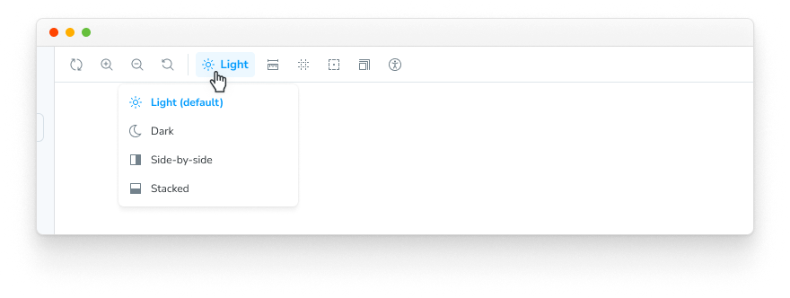
当您启动 Storybook 时,您的工具栏应该有一个新的下拉菜单,其中包含 light 和 dark 选项。
创建装饰器
我们已经实现了一个 global。让我们把它连接起来!我们可以使用 context.globals.theme 值在装饰器中消耗我们新 theme 的全局变量。
例如,假设您正在使用 styled-components。您可以在您的 .storybook/preview.js|ts 配置中添加一个主题提供者装饰器。
// Replace your-framework with the framework you are using, e.g. react-vite, nextjs, nextjs-vite, etc.
import type { Preview } from '@storybook/your-framework';

import { ThemeProvider } from 'styled-components';

import { MyThemes } from '../my-theme-folder/my-theme-file';

const preview: Preview = {
  decorators: [
    (Story, context) => {
      const theme = MyThemes[context.globals.theme];
      return (
        <ThemeProvider theme={theme}>
          <Story />
        </ThemeProvider>
      );
    },
  ],
};

export default preview;
在故事上设置全局变量
当 Storybook 中的工具栏菜单更改全局变量值时,该值将继续在您导航故事时使用。但有时故事需要特定的值才能正确渲染,例如,在特定环境中进行测试时。
为了确保故事始终使用特定的全局变量值,无论在工具栏中选择了什么,您都可以为故事或组件设置 globals 注解。这会覆盖这些故事的全局变量值,并在查看故事时禁用该全局变量的工具栏菜单。
// Replace your-framework with the name of your framework (e.g., react-vite, vue3-vite, etc.)
import type { Meta, StoryObj } from '@storybook/your-framework';

import { Button } from './Button';

const meta = {
  component: Button,
  globals: {
    // 👇 Set background value for all component stories
    backgrounds: { value: 'gray', grid: false },
  },
} satisfies Meta<typeof Button>;

export default meta;
type Story = StoryObj<typeof meta>;

export const OnDark: Story = {
  globals: {
    // 👇 Override background value for this story
    backgrounds: { value: 'dark' },
  },
};
在上面的示例中,Storybook 将强制所有 Button 故事使用灰色背景色,除了 OnDark 故事,它将使用深色背景。对于所有 Button 故事,backgrounds 全局变量的工具栏菜单将被禁用,并显示一个工具提示,解释该全局变量是在故事级别设置的。
配置故事的 globals 注解来覆盖项目级别的全局设置非常有用,但应适度使用。未在故事级别定义的全局变量可以在 Storybook 的 UI 中进行交互式选择,允许用户探索所有现有的值组合(例如,全局变量、args)。在故事级别设置它们将禁用该控件,阻止用户探索可用的选项。
高级用法
到目前为止,我们已经在 Storybook 中创建并使用了一个全局变量。
现在,让我们看一个更复杂的例子。假设我们想为国际化实现一个名为 locale 的新全局变量,该变量会在工具栏的右侧显示一个标志。
在您的 .storybook/preview.js|ts 中,添加以下内容:
// Replace your-framework with the framework you are using, e.g. react-vite, nextjs, vue3-vite, etc.
import type { Preview } from '@storybook/your-framework';

const preview: Preview = {
  globalTypes: {
    locale: {
      description: 'Internationalization locale',
      toolbar: {
        icon: 'globe',
        items: [
          { value: 'en', right: '🇺🇸', title: 'English' },
          { value: 'fr', right: '🇫🇷', title: 'Français' },
          { value: 'es', right: '🇪🇸', title: 'Español' },
          { value: 'zh', right: '🇨🇳', title: '中文' },
          { value: 'kr', right: '🇰🇷', title: '한국어' },
        ],
      },
    },
  },
  initialGlobals: {
    locale: 'en',
  },
};

export default preview;示例中使用的 icon 元素从 @storybook/icons 包加载图标。请参阅 此处 了解可用于工具栏或插件的可用图标列表。
添加 right 配置元素将在您将其连接到装饰器后,在工具栏菜单的右侧显示文本。
以下是可用配置选项的列表。
| 菜单项 | 类型 | 描述 | 必需 |
|---|---|---|---|
| value | 字符串 | 设置为全局变量的菜单的字符串值 | 是 |
| title | 字符串 | 标题的主要文本 | 是 |
| right | 字符串 | 在菜单右侧显示的字符串 | 否 |
| icon | 字符串 | 如果选中此项,将在工具栏中显示的图标 | 否 |
从故事中消耗全局变量
我们建议在装饰器中消耗全局变量,并为所有故事定义全局设置。
但我们也认识到,有时按故事级别使用工具栏选项更有益。
使用上面的示例,您可以修改任何故事以从故事上下文中检索 Locale global 变量。
// Replace your-framework with the framework you are using, e.g. react-vite, nextjs, nextjs-vite, etc.
import type { Meta, StoryObj } from '@storybook/your-framework';

import { MyComponent } from './MyComponent';

const meta = {
  component: MyComponent,
} satisfies Meta<typeof MyComponent>;

export default meta;
type Story = StoryObj<typeof meta>;

const getCaptionForLocale = (locale) => {
  switch (locale) {
    case 'es':
      return 'Hola!';
    case 'fr':
      return 'Bonjour!';
    case 'kr':
      return '안녕하세요!';
    case 'zh':
      return '你好!';
    default:
      return 'Hello!';
  }
};

export const StoryWithLocale = {
  render: (args, { globals: { locale } }) => {
    const caption = getCaptionForLocale(locale);
    return <p>{caption}</p>;
  },
};
从插件中消耗全局变量
如果您正在开发一个 Storybook 插件并需要检索全局变量,您可以这样做。storybook/manager-api 模块为这种情况提供了一个钩子。您可以使用 useGlobals() 钩子来检索您想要的任何全局变量。
使用上面的 ThemeProvider 示例,您可以将其扩展为在面板中显示当前激活的主题,如下所示:
import React from 'react';

import { useGlobals } from 'storybook/manager-api';

import {
  AddonPanel,
  Placeholder,
  Separator,
  Source,
  Spaced,
  Title,
} from 'storybook/internal/components';

import { MyThemes } from '../my-theme-folder/my-theme-file';

// Function to obtain the intended theme
const getTheme = (themeName) => {
  return MyThemes[themeName];
};

const ThemePanel = (props) => {
  const [{ theme: themeName }] = useGlobals();

  const selectedTheme = getTheme(themeName);

  return (
    <AddonPanel {...props}>
      {selectedTheme ? (
        <Spaced row={3} outer={1}>
          <Title>{selectedTheme.name}</Title>
          <p>The full theme object</p>
          <Source
            code={JSON.stringify(selectedTheme, null, 2)}
            language="js"
            copyable
            padded
            showLineNumbers
          />
        </Spaced>
      ) : (
        <Placeholder>No theme selected</Placeholder>
      )}
    </AddonPanel>
  );
};
从插件中更新全局变量
如果您正在开发一个需要更新全局变量并刷新 UI 的 Storybook 插件,您可以做到。如前所述,storybook/manager-api 模块为此场景提供了必要的钩子。您可以使用 updateGlobals 函数来更新您需要的任何全局变量。
例如,如果您正在开发一个 工具栏插件,并且希望在用户单击按钮后刷新 UI 并更新全局变量
import React, { useCallback } from 'react';
import { OutlineIcon } from '@storybook/icons';
import { useGlobals } from 'storybook/manager-api';
import { addons } from 'storybook/preview-api';
import { IconButton } from 'storybook/internal/components';
import { FORCE_RE_RENDER } from 'storybook/internal/core-events';

const ExampleToolbar = () => {
  const [globals, updateGlobals] = useGlobals();

  const isActive = globals['my-param-key'] || false;

  // Function that will update the global value and trigger a UI refresh.
  const refreshAndUpdateGlobal = () => {
    // Updates Storybook global value
    updateGlobals({
      ['my-param-key']: !isActive,
    }),
      // Invokes Storybook's addon API method (with the FORCE_RE_RENDER) event to trigger a UI refresh
      addons.getChannel().emit(FORCE_RE_RENDER);
  };

  const toggleOutline = useCallback(() => refreshAndUpdateGlobal(), [isActive]);

  return (
    <IconButton
      key="Example"
      active={isActive}
      title="Show a Storybook toolbar"
      onClick={toggleOutline}
    >
      <OutlineIcon />
    </IconButton>
  );
};