
自动文档和 Storybook
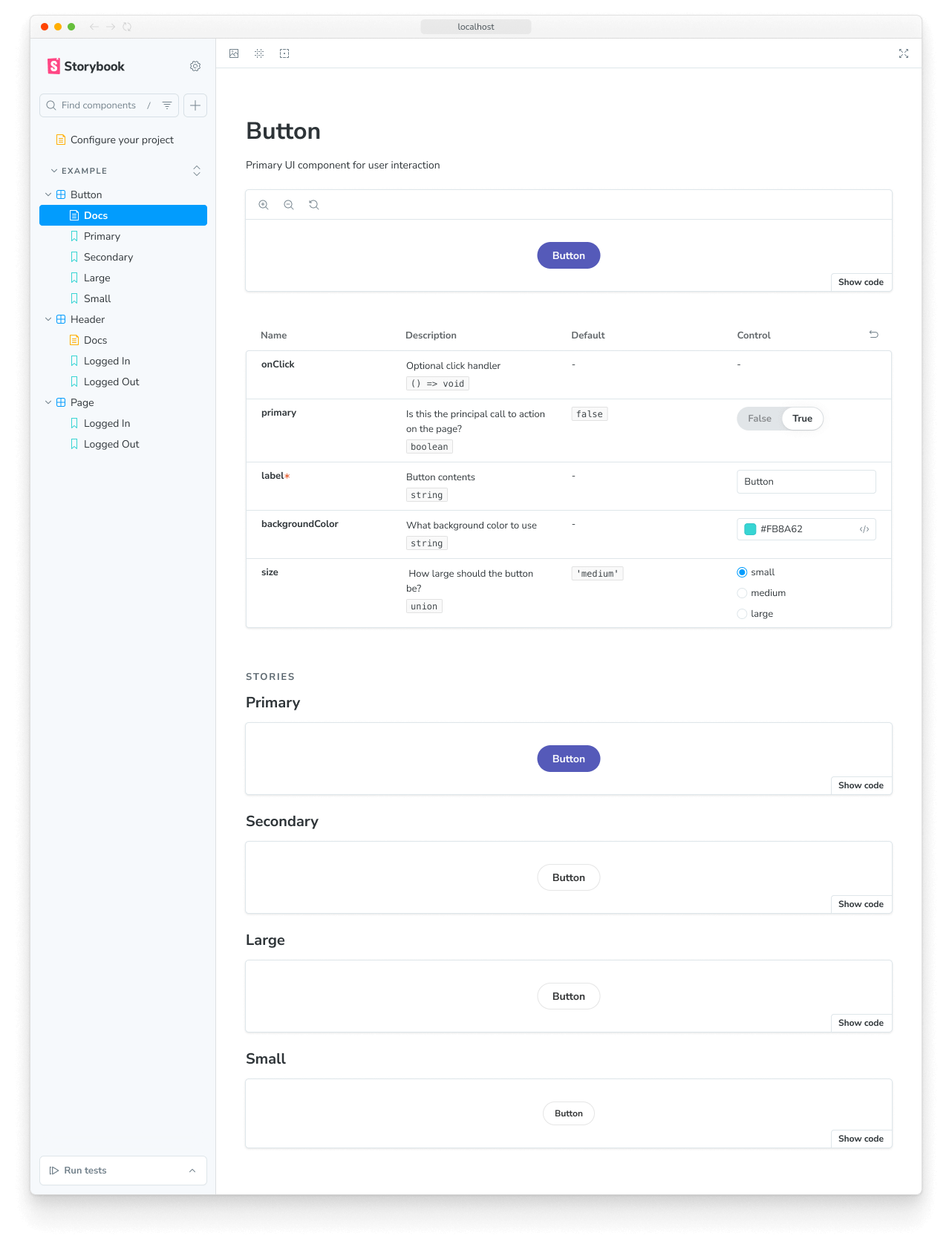
Storybook Autodocs 是一个强大的工具,可以帮助您快速为 UI 组件生成全面的文档。通过利用 Autodocs,您可以将您的故事转化为动态文档,还可以使用 MDX 和 Doc Blocks 进一步扩展,从而清晰简洁地理解组件的功能。
Storybook 会推断相关的元数据(例如 args、argTypes、parameters),并自动生成一个包含这些信息的文档页面,该页面将位于侧边栏组件树的根级别。
设置自动化文档
Autodocs 是通过 tag 进行配置的。如果一个 CSF 文件至少包含一个带有 autodocs 标签的故事,那么就会为该组件生成一个文档页面。
要为项目中的所有故事启用自动文档,请在 .storybook/preview.js|ts 文件中将其添加到 tags 中
// Replace your-framework with the framework you are using, e.g. react-vite, nextjs, vue3-vite, etc.
import type { Preview } from '@storybook/your-framework';

const preview: Preview = {
  // ...rest of preview
  //👇 Enables auto-generated documentation for all stories
  tags: ['autodocs'],
};

export default preview;
您也可以在组件(或故事)级别启用它
// Replace your-framework with the framework you are using, e.g. react-vite, nextjs, vue3-vite, etc.
import type { Meta } from '@storybook/your-framework';

import { Button } from './Button';

const meta = {
  component: Button,
  //👇 Enables auto-generated documentation for this component and includes all stories in this file
  tags: ['autodocs'],
} satisfies Meta<typeof Button>;
export default meta;
您可以通过 移除 tag 来禁用特定组件的自动文档
// Replace your-framework with the framework you are using, e.g. react-vite, nextjs, vue3-vite, etc.
import type { Meta } from '@storybook/your-framework';

import { Page } from './Page';

const meta = {
  component: Page,
  // 👇 Disable auto-generated documentation for this component
  tags: ['!autodocs'],
} satisfies Meta<typeof Page>;
export default meta;
同样,您可以通过移除 tag 来将某个故事从自动文档页面中排除
// Replace your-framework with the framework you are using, e.g. react-vite, nextjs, vue3-vite, etc.
import type { Meta, StoryObj } from '@storybook/your-framework';

import { Button } from './Button';

const meta = {
  component: Button,
  //👇 Enables auto-generated documentation for this component and includes all stories in this file
  tags: ['autodocs'],
} satisfies Meta<typeof Button>;
export default meta;

type Story = StoryObj<typeof meta>;

export const UndocumentedStory: Story = {
  // 👇 Removes this story from auto-generated documentation
  tags: ['!autodocs'],
};
配置
除了使用 tags 启用该功能外,您还可以扩展您的 Storybook 配置文件(即 .storybook/main.js|ts|cjs),并提供额外的选项来控制文档的生成方式。下面列出了可用选项以及使用它们的示例。
// Replace your-framework with the framework you are using, e.g. react-vite, nextjs, vue3-vite, etc.
import type { StorybookConfig } from '@storybook/your-framework';

const config: StorybookConfig = {
  framework: '@storybook/your-framework',
  stories: ['../src/**/*.mdx', '../src/**/*.stories.@(js|jsx|mjs|ts|tsx)'],
  addons: ['@storybook/addon-docs'],
  docs: {
    //👇 See the table below for the list of supported options
    defaultName: 'Documentation',
    docsMode: true,
  },
};

export default config;| 选项 | 描述 |
|---|---|
defaultName | 重命名自动生成的文档页面 默认值: docs: { defaultName: 'Docs' } |
docsMode | 切换文档模式,该模式仅在侧边栏中显示文档页面 默认值: docs: { docsMode: false } |
编写自定义模板
要替换 Storybook 使用的默认文档模板,您可以扩展 UI 配置文件(即 .storybook/preview.js|ts)并引入一个 docs 参数。此参数接受一个返回 React 组件的 page 函数,您可以使用该函数来生成所需的模板。例如:
import * as React from 'react';

// Replace your-framework with the framework you are using, e.g. react-vite, nextjs, vue3-vite, etc.
import type { Preview } from '@storybook/your-framework';
import {
  Title,
  Subtitle,
  Description,
  Primary,
  Controls,
  Stories,
} from '@storybook/addon-docs/blocks';

const preview: Preview = {
  parameters: {
    controls: {
      matchers: {
        color: /(background|color)$/i,
        date: /Date$/,
      },
    },
    docs: {
      page: () => (
        <>
          <Title />
          <Subtitle />
          <Description />
          <Primary />
          <Controls />
          <Stories />
        </>
      ),
    },
  },
};

export default preview;在内部,Storybook 使用类似的实现来生成默认模板。请参阅 Doc Blocks API 参考,了解 Doc Blocks 的工作原理。
详细查看代码片段。当 Storybook 启动时,它将用自定义模板覆盖默认模板,该模板由以下内容组成:
- 一个标题,包含由
Title、Subtitle和DescriptionDoc Blocks 检索到的组件元数据。 - 文件中的第一个故事,通过
PrimaryDoc Block 定义,并配有一组方便的 UI 控件,用于放大和缩小组件。 - 一个交互式表格,包含通过
ControlsDoc Block 在故事中定义的、所有相关的args和argTypes。 - 通过
StoriesDoc Block 对其余故事进行概述。
使用 MDX
您还可以使用 MDX 来生成文档模板。这在未配置 JSX 处理的非 React 项目中很有用。通常,当您在项目中创建 MDX 文件时,它会被当作普通文档。要指示 MDX 文件是一个文档模板,请将其 isTemplate 属性提供给它的 Meta Doc Block。例如:
import { Meta, Title, Primary, Controls, Stories } from '@storybook/addon-docs/blocks';

{/*
  * 👇 The isTemplate property is required to tell Storybook that this is a template
  * See https://storybook.org.cn/docs/api/doc-blocks/doc-block-meta
  * to learn how to use
*/}

<Meta isTemplate />

<Title />

# Default implementation

<Primary />

## Inputs

The component accepts the following inputs (props):

<Controls />

---

## Additional variations

Listed below are additional variations of the component.

<Stories />
然后,您可以通过导入它在 .storybook/preview.js|ts 或单个故事文件中使用它
// Replace your-framework with the framework you are using, e.g. react-vite, nextjs, vue3-vite, etc.
import type { Preview } from '@storybook/your-framework';

import DocumentationTemplate from './DocumentationTemplate.mdx';

const preview = {
  parameters: {
    docs: {
      page: DocumentationTemplate,
    },
  },
} satisfies Preview;

export default preview;如果您只需要覆盖单个组件的文档页面,我们建议创建一个 MDX 文件并通过 <Meta of={} /> Doc Block 直接引用它。
生成目录
Storybook 自动生成的文档页面可能很长且难以导航。为了解决这个问题,您可以启用目录功能,以快速概览文档页面并允许用户跳转到特定部分。要启用它,请扩展您的 Storybook UI 配置文件(即 .storybook/preview.js|ts)并提供一个带 toc 属性的 docs 参数。
// Replace your-framework with the framework you are using, e.g. react-vite, nextjs, vue3-vite, etc.
import type { Preview } from '@storybook/your-framework';

const preview: Preview = {
  parameters: {
    docs: {
      toc: true, // 👈 Enables the table of contents
    },
  },
};

export default preview;
配置目录
默认情况下,文档页面上的目录将只显示自动生成的 h3 标题。但是,如果您想自定义目录,可以向 toc 属性添加更多参数。以下是可用的选项和使用它们的示例。
| 选项 | 描述 |
|---|---|
contentsSelector | 定义用于搜索标题的容器 CSS 选择器toc: { contentsSelector: '.sbdocs-content' } |
disable | 隐藏文档页面的目录toc: { disable: true } |
headingSelector | 定义要显示在目录中的标题列表toc: { headingSelector: 'h1, h2, h3' } |
ignoreSelector | 配置目录以忽略特定标题或故事。默认情况下,目录将忽略 Story 块中的所有内容toc: { ignoreSelector: '.docs-story h2' } |
title | 为目录定义标题说明。 接受以下之一: string、null、React 元素toc: { title: 'Table of Contents' } |
unsafeTocbotOptions | 提供额外的 TocBot 配置选项toc: { unsafeTocbotOptions: { orderedList: true } } |
contentsSelector、headingSelector 和 ignoreSelector 属性允许进一步自定义。有关使用它们的更多信息,请参阅 Tocbot 文档。
// Replace your-framework with the framework you are using, e.g. react-vite, nextjs, vue3-vite, etc.
import type { Preview } from '@storybook/your-framework';

const preview: Preview = {
  parameters: {
    docs: {
      toc: {
        contentsSelector: '.sbdocs-content',
        headingSelector: 'h1, h2, h3',
        ignoreSelector: '#primary',
        title: 'Table of Contents',
        disable: false,
        unsafeTocbotOptions: {
          orderedList: false,
        },
      },
    },
  },
};

export default preview;
组件级别配置
如果您想为特定故事自定义目录,可以在故事的默认导出中包含一个 toc 属性,并提供所需的 配置。例如,如果您需要隐藏特定故事的目录,请按如下方式调整您的故事:
// Replace your-framework with the framework you are using, e.g. react-vite, nextjs, vue3-vite, etc.
import type { Meta } from '@storybook/your-framework';

import { MyComponent } from './MyComponent';

const meta = {
  component: MyComponent,
  tags: ['autodocs'],
  parameters: {
    docs: {
      toc: {
        disable: true, // 👈 Disables the table of contents
      },
    },
  },
} satisfies Meta<typeof MyComponent>;

export default meta;
自定义组件文档
使用 Storybook 的 Autodocs 创建用于文档的自动化文档为您构建可持续文档模式提供了起点。尽管如此,它可能不适合所有情况,您可能希望扩展它并提供额外的信息。我们建议在此类情况下将 MDX 与 Storybook 的 Doc Blocks 结合使用来编写文档。
高级配置
文档化多个组件
有时将多个组件一起文档化会很有帮助。例如,组件库的 ButtonGroup 和 Button 组件可能没有单独的意义。
Autodocs 允许您文档化由 component 属性定义的“主”组件,以及一个或多个与其相关的 subcomponents。
import * as React from 'react';

// Replace your-framework with the framework you are using, e.g. react-vite, nextjs, nextjs-vite, etc.
import type { Meta, StoryObj } from '@storybook/your-framework';

import { List } from './List';
import { ListItem } from './ListItem';

const meta = {
  component: List,
  subcomponents: { ListItem }, //👈 Adds the ListItem component as a subcomponent
} satisfies Meta<typeof List>;
export default meta;

type Story = StoryObj<typeof meta>;

export const Empty: Story = {};

export const OneItem: Story = {
  render: (args) => (
    <List {...args}>
      <ListItem />
    </List>
  ),
};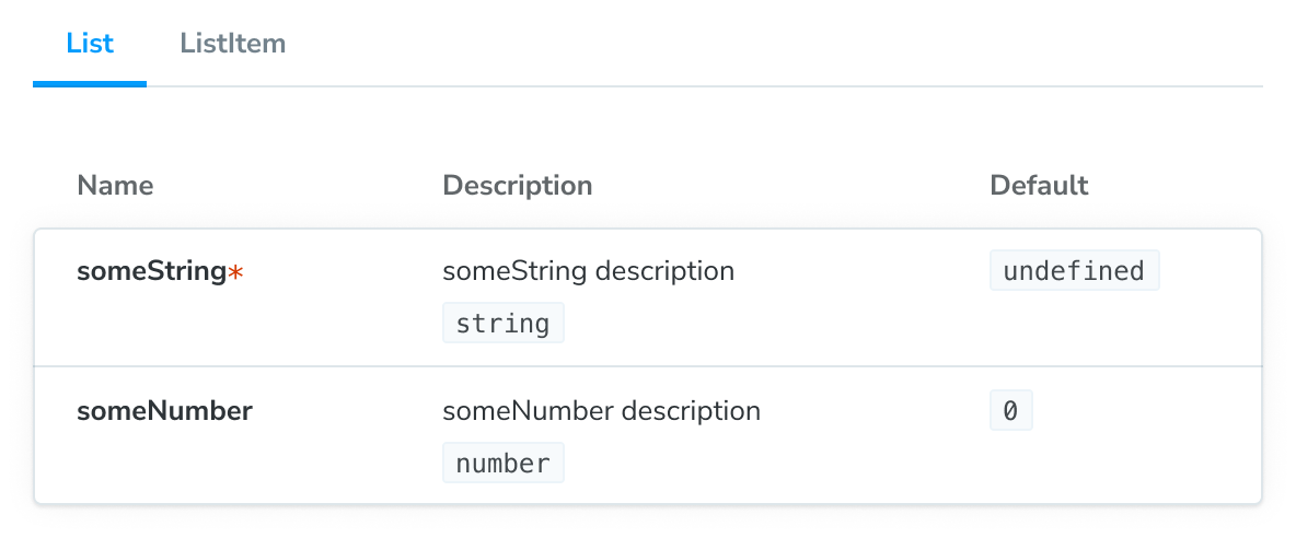
主组件及其子组件将显示在 ArgTypes 文档块 的选项卡版本中。选项卡标题将对应于 subcomponents 对象的键。
如果您想以不同的方式组织组件组的文档,我们建议 使用 MDX。它让您完全控制组件的显示方式并支持任何配置。
自定义文档容器
Docs Container 是包装文档页面的组件。它负责在 Storybook UI 中渲染文档页面。您可以通过创建自己的组件并更新 Storybook UI 配置文件(即 .storybook/preview.js|ts)来引用它来自定义它。
import * as React from 'react';

// Replace your-framework with the framework you are using, e.g. react-vite, nextjs, vue3-vite, etc.
import type { Preview } from '@storybook/your-framework';
import { DocsContainer } from '@storybook/addon-docs/blocks';

const ExampleContainer = ({ children, ...props }) => {
  return <DocsContainer {...props}>{children}</DocsContainer>;
};

const preview: Preview = {
  parameters: {
    controls: {
      matchers: {
        color: /(background|color)$/i,
        date: /Date$/,
      },
    },
    docs: {
      container: ExampleContainer,
    },
  },
};

export default preview;
覆盖默认主题
默认情况下,Storybook 为 UI 提供了两种主题:light 和 dark。如果您需要自定义文档所使用的主题以匹配现有主题,可以更新 Storybook UI 配置文件(即 .storybook/preview.js|ts)并应用它。
// Replace your-framework with the framework you are using, e.g. react-vite, nextjs, vue3-vite, etc.
import type { Preview } from '@storybook/your-framework';

import { themes, ensure } from 'storybook/theming';

const preview: Preview = {
  parameters: {
    controls: {
      matchers: {
        color: /(background|color)$/i,
        date: /Date$/,
      },
    },
    docs: {
      theme: ensure(themes.dark), // The replacement theme to use
    },
  },
};

export default preview;
使用自定义 MDX 组件
开箱即用,Storybook 提供了一组组件,您可以使用它们来定制文档页面。如果您正在使用设计系统或组件库,并希望将它们添加到文档页面中,您可以覆盖从 @mdx-js/react 继承的 MDXProvider 组件。但是,有一个注意事项,组件替换只有在您使用 Markdown 语法(例如,用于标题的 #)编写文档时才会生效。原生 HTML 元素(如 <h1>)不会被您的自定义实现替换。
import * as React from 'react';
import { MDXProvider } from '@mdx-js/react';

// Replace your-framework with the framework you are using, e.g. react-vite, nextjs, vue3-vite, etc.
import type { Preview } from '@storybook/your-framework';
import { DocsContainer } from '@storybook/addon-docs/blocks';

import * as DesignSystem from 'your-design-system';

export const MyDocsContainer = (props) => (
  <MDXProvider
    components={{
      h1: DesignSystem.H1,
      h2: DesignSystem.H2,
    }}
  >
    <DocsContainer {...props} />
  </MDXProvider>
);

const preview: Preview = {
  parameters: {
    controls: {
      matchers: {
        color: /(background|color)$/i,
        date: /Date$/,
      },
    },
    docs: {
      container: MyDocsContainer,
    },
  },
};

export default preview;这不是 Storybook 的问题,而是 MDX 工作方式的一个细节。摘自他们的 迁移指南
“我们现在‘沙盒化’组件,找不到更好的词来形容。这意味着当您为 h1 传递一个组件时,它会被用于 # hi,但不会用于 <h1>hi</h1>”
插件选项
docs 插件接受选项来自定义文档页面的行为。您可以将它们添加到 Storybook UI 配置文件(即 .storybook/main.js|ts)中,作为注册插件的一部分。以下是可用选项
| 选项 | 描述 |
|---|---|
csfPluginOptions | 为 Storybook 的 CSF 插件提供额外的配置。可以使用 null 禁用。 |
mdxPluginOptions | 为 MDX 文档 提供额外的配置选项和插件配置。 |
此示例演示了如何应用这些选项。
// Replace your-framework with the framework you are using, e.g. react-vite, nextjs, vue3-vite, etc.
import type { StorybookConfig } from '@storybook/your-framework';

const config: StorybookConfig = {
  framework: '@storybook/your-framework',
  stories: ['../src/**/*.mdx', '../src/**/*.stories.@(js|jsx|mjs|ts|tsx)'],
  addons: [
    {
      name: '@storybook/addon-docs',
      options: {
        csfPluginOptions: null,
        mdxPluginOptions: {
          mdxCompileOptions: {
            remarkPlugins: [],
          },
        },
      },
    },
  ],
};

export default config;
故障排除
目录未按预期渲染
在使用 Autodocs 的目录时,您可能会遇到目录显示不符合预期的情况。为了帮助您解决这些问题,我们汇总了一些可能导致问题的场景。
带有简单文档页面
如果您有一个只包含一个匹配标题的文档页面并为此创建了目录,则默认情况下目录不会隐藏。解决此问题的潜在方法是添加第二个标题或完全关闭它。
在小屏幕上
如果屏幕宽度小于 1200px,目录将默认隐藏。目前,没有内置解决方案可以在不影响文档页面样式兼容性的情况下解决此问题。
使用 MDX
如果您正在使用 MDX 编写独立文档,则由于当前实现不支持基于当前实现定义参数,因此无法自定义目录。因此,目录将始终恢复为全局提供的默认配置。
在 monorepo 设置中自动生成的文档未显示
开箱即用,Storybook 的 Autodocs 功能旨在自动为您的故事生成文档。但是,如果您使用的是 monorepo 设置(例如 Yarn Workspaces、pnpm Workspaces),您可能会遇到部分文档未为您生成的问题。为了帮助您解决这些问题,我们准备了一些可能有所帮助的建议。
更新您的导入语句,以直接引用组件而不是包的根目录。例如:
// Replace your-framework with the framework you are using, e.g. react-vite, nextjs, vue3-vite, etc.
import type { Meta } from '@storybook/your-framework';

// ❌ Don't use the package's index file to import the component.
// import { MyComponent } from '@component-package';

// ✅ Use the component's export to import it directly.
import { MyComponent } from '@component-package/src/MyComponent';

const meta = {
  /* 👇 The title prop is optional.
   * See https://storybook.org.cn/docs/configure/#configure-story-loading
   * to learn how to generate automatic titles
   */
  title: 'MyComponent',
  component: MyComponent,
} satisfies Meta<typeof MyComponent>;

export default meta;
此外,如果您使用 TypeScript 进行开发,您可能需要更新 Storybook 的配置文件(即 .storybook/main.js|ts)以包含以下内容:
// Replace your-framework with the framework you are using, e.g. react-vite, nextjs, vue3-vite, etc.
import type { StorybookConfig } from '@storybook/your-framework';

const config: StorybookConfig = {
  framework: '@storybook/your-framework',
  stories: ['../src/**/*.mdx', '../src/**/*.stories.@(js|jsx|mjs|ts|tsx)'],
  typescript: {
    // Overrides the default Typescript configuration to allow multi-package components to be documented via Autodocs.
    reactDocgen: 'react-docgen',
    check: false,
  },
};

export default config;如果您仍然遇到问题,我们建议您通过默认的沟通渠道(例如,GitHub discussions)与社区联系。
控件未在自动生成的文档中更新故事
如果您通过 inline 配置选项关闭了故事的内联渲染,您将遇到一个问题,即关联的控件不会更新文档页面中的故事。这是当前实现的一个已知限制,将在未来的版本中得到解决。
详细了解 Storybook 文档
- 使用 Autodocs 为您的故事创建文档
- MDX,用于自定义您的文档。
- Doc Blocks,用于编写您的文档。
- 发布文档 以自动化文档发布过程