
Backgrounds
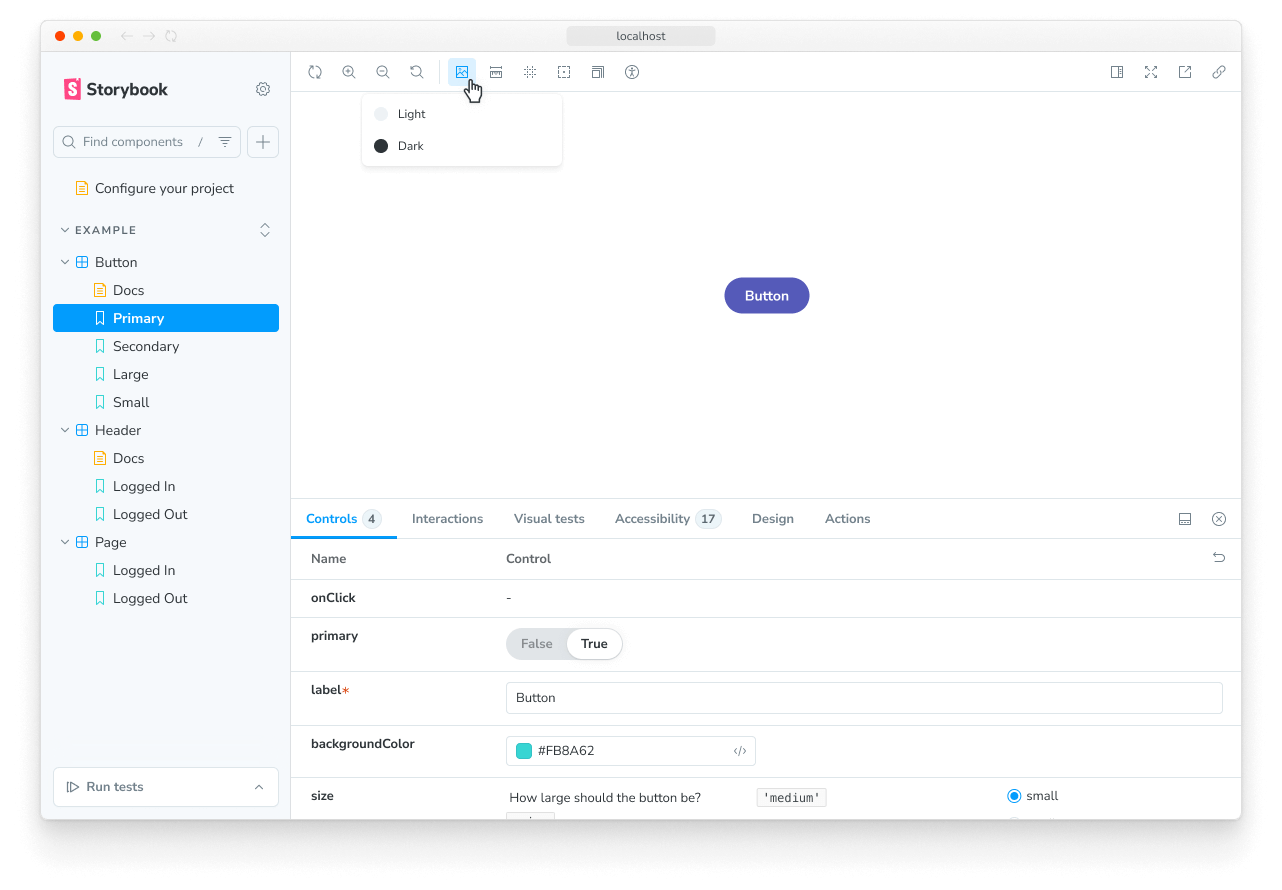
背景功能允许您在 Storybook UI 中设置故事渲染的背景颜色。
配置
默认情况下,背景功能包含浅色和深色背景。
但您不受限于这些背景。您可以使用 backgrounds 参数 和 .storybook/preview.js|ts 中的 backgrounds 参数来配置您自己的颜色集。
您可以使用 options 属性 定义可用的背景颜色,并使用 initialGlobals 属性设置初始背景颜色。
// Replace your-framework with the framework you are using, e.g. react-vite, nextjs, vue3-vite, etc.
import type { Preview } from '@storybook/your-framework';

const preview: Preview = {
  parameters: {
    backgrounds: {
      options: {
        // 👇 Default options
        dark: { name: 'Dark', value: '#333' },
        light: { name: 'Light', value: '#F7F9F2' },
        // 👇 Add your own
        maroon: { name: 'Maroon', value: '#400' },
      },
    },
  },
  initialGlobals: {
    // 👇 Set the initial background color
    backgrounds: { value: 'light' },
  },
};

export default preview;
为故事定义背景
背景功能使您能够通过选择工具栏中预定义的背景颜色列表来更改应用于故事的背景颜色。如果需要,您可以使用 globals 选项将故事设置为默认使用特定背景颜色。
// Replace your-framework with the name of your framework (e.g., react-vite, vue3-vite, etc.)
import type { Meta, StoryObj } from '@storybook/your-framework';

import { Button } from './Button';

const meta = {
  component: Button,
  globals: {
    // 👇 Set background value for all component stories
    backgrounds: { value: 'gray', grid: false },
  },
} satisfies Meta<typeof Button>;

export default meta;
type Story = StoryObj<typeof meta>;

export const OnDark: Story = {
  globals: {
    // 👇 Override background value for this story
    backgrounds: { value: 'dark' },
  },
};当您使用 globals 为故事(或组件的故事)指定背景颜色时,该颜色将被应用,并且无法通过工具栏更改。这有助于确保故事始终以特定的背景颜色渲染。
扩展配置
您还可以通过 参数继承 在每个组件或每个故事的基础上配置背景。
要设置可用的背景颜色,请使用 options 属性。在此示例中,我们将调整所有 Button 组件故事的颜色。
// Replace your-framework with the framework you are using, e.g. react-vite, nextjs, nextjs-vite, etc.
import type { Meta } from '@storybook/your-framework';

import { Button } from './Button';

const meta = {
  component: Button,
  parameters: {
    backgrounds: {
      options: {
        // 👇 Override the default `dark` option
        dark: { name: 'Dark', value: '#000' },
        // 👇 Add a new option
        gray: { name: 'Gray', value: '#CCC' },
      },
    },
  },
} satisfies Meta<typeof Button>;

export default meta;
禁用背景
如果您想关闭故事中的背景,可以通过如下方式配置 backgrounds 参数来做到。
// Replace your-framework with the framework you are using, e.g. react-vite, nextjs, vue3-vite, etc.
import type { Meta, StoryObj } from '@storybook/your-framework';

import { Button } from './Button';

const meta = {
  component: Button,
} satisfies Meta<typeof Button>;

export default meta;
type Story = StoryObj<typeof meta>;

export const Large: Story = {
  parameters: {
    backgrounds: { disable: true },
  },
};
网格
背景功能还包括一个网格选择器,可让您快速查看组件是否对齐。
您无需额外配置即可开始使用。但其属性是完全可定制的;如果您不为任何属性提供值,它们将默认为以下值。
// Replace your-framework with the framework you are using, e.g. react-vite, nextjs, vue3-vite, etc.
import type { Meta } from '@storybook/your-framework';

import { Button } from './Button';

// To apply a set of backgrounds to all stories of Button:
const meta = {
  component: Button,
  parameters: {
    backgrounds: {
      grid: {
        cellSize: 20,
        opacity: 0.5,
        cellAmount: 5,
        offsetX: 16, // Default is 0 if story has 'fullscreen' layout, 16 if layout is 'padded'
        offsetY: 16, // Default is 0 if story has 'fullscreen' layout, 16 if layout is 'padded'
      },
    },
  },
} satisfies Meta<typeof Button>;

export default meta;
API
全局变量
此模块在 Storybook 中贡献了以下全局变量,命名空间为 backgrounds。
grid
类型:boolean
是否显示 网格。
value
类型:string
设置后,将应用背景颜色,并且无法通过工具栏更改。必须匹配 可用颜色 中的一个键。
参数
此模块在 Storybook 中贡献了以下 参数,命名空间为 backgrounds。
disable
类型:boolean
禁用此功能的行为。如果您希望为整个 Storybook 禁用此功能,您应该 在您的主配置文件中进行。
此参数对于允许在更具体的级别进行覆盖非常有用。例如,如果此参数在项目级别设置为 `true`,则可以通过在 meta(组件)或 story 级别将其设置为 `false` 来重新启用它。
grid
类型
{
  cellAmount?: number;
  cellSize?: number;
  disable?: boolean;
  offsetX?: number;
  offsetY?: number;
  opacity?: number;
}
关于 背景网格 的配置。
grid.cellAmount
类型:number
默认:5
指定次网格线的大小。
grid.cellSize
类型:number
默认:20
指定主网格线的大小。
grid.disable
类型:boolean
关闭网格。
grid.offsetX
类型:number
如果 故事布局 为 'fullscreen',则默认值为 0;如果故事布局为 'padded',则默认为 16。
网格的水平偏移量。
grid.offsetY
类型:number
如果 故事布局 为 'fullscreen',则默认值为 0;如果故事布局为 'padded',则默认为 16。
网格的垂直偏移量。
grid.opacity
类型:number
默认:0.5
网格线的透明度。
options
(必需,请参阅说明)
类型
{
  [key: string]: {
    name: string;
    value: string;
  };
}
可用的背景颜色。请参阅上文的 使用示例。