
编写插件
Storybook 插件是扩展 Storybook 功能和自定义开发体验的强大方式。它们可用于添加新功能、自定义 UI 或与第三方工具集成。
我们将构建什么?
本参考指南旨在通过构建一个基于流行的Outline 插件(它是内置outline 功能的历史基础)的简单插件,帮助您建立对 Storybook 插件工作原理的理解。在本指南中,您将学习插件的结构、Storybook 的 API、如何在本地测试您的插件以及如何发布它。
插件结构剖析
插件主要分为两类,每类都有自己的作用
- 基于 UI 的:这些插件负责自定义界面、为常见任务启用快捷方式或在 UI 中显示额外信息。
- 预设:它们是预先配置好的设置或配置,使开发者能够快速搭建和自定义他们的环境,并带有一组特定的特性、功能或技术。
基于 UI 的插件
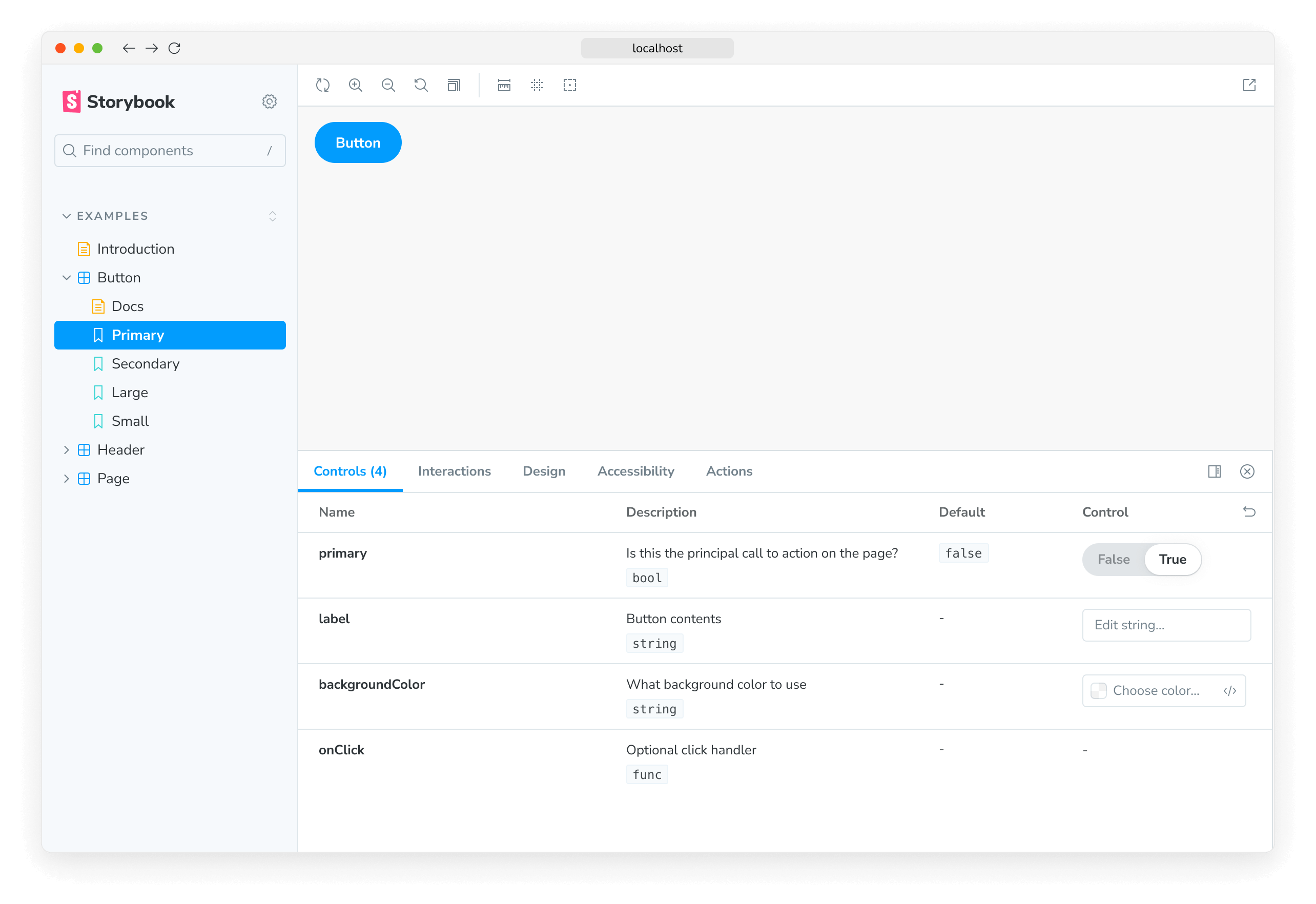
本指南中构建的插件是一个基于 UI 的插件,具体来说是一个工具栏插件,允许用户通过快捷方式或点击按钮在 story 中的每个元素周围绘制轮廓。UI 插件可以创建其他类型的 UI 元素,每种元素都有自己的功能:面板和标签页,为用户提供了多种与 UI 交互的方式。
import React, { memo, useCallback, useEffect } from 'react';

import { useGlobals, useStorybookApi } from 'storybook/manager-api';
import { IconButton } from 'storybook/internal/components';
import { LightningIcon } from '@storybook/icons';

import { ADDON_ID, PARAM_KEY, TOOL_ID } from './constants';

export const Tool = memo(function MyAddonSelector() {
  const [globals, updateGlobals] = useGlobals();
  const api = useStorybookApi();

  const isActive = [true, 'true'].includes(globals[PARAM_KEY]);

  const toggleMyTool = useCallback(() => {
    updateGlobals({
      [PARAM_KEY]: !isActive,
    });
  }, [isActive]);

  useEffect(() => {
    api.setAddonShortcut(ADDON_ID, {
      label: 'Toggle Measure [O]',
      defaultShortcut: ['O'],
      actionName: 'outline',
      showInMenu: false,
      action: toggleMyTool,
    });
  }, [toggleMyTool, api]);

  return (
    <IconButton key={TOOL_ID} active={isActive} title="Enable my addon" onClick={toggleMyTool}>
      <LightningIcon />
    </IconButton>
  );
});
设置
要创建你的第一个插件,你将使用Addon Kit,这是一个开箱即用的模板,包含所有必需的构建块、依赖项和配置,帮助你开始构建插件。在 Addon Kit 仓库中,点击使用此模板按钮,基于 Addon Kit 的代码创建一个新仓库。
克隆你刚刚创建的仓库并安装其依赖项。安装过程完成后,系统会提示你回答问题以配置你的插件。回答完问题后,当你准备好开始构建插件时,运行以下命令以开发模式启动 Storybook 并在观察模式下开发你的插件
npm run startAddon Kit 默认使用Typescript。如果你想使用 JavaScript,可以运行eject-ts命令将项目转换为 JavaScript。
理解构建系统
在 Storybook 生态系统中构建的插件依赖于tsup,这是一个快速、零配置的打包器,由esbuild提供支持,用于将你的插件代码转换为可在浏览器中运行的现代 JavaScript。Addon Kit 开箱即用地提供了一个预配置的tsup配置文件,你可以用它来自定义插件的构建过程。
构建脚本运行时,它会查找配置文件,并根据提供的配置预打包插件代码。插件可以通过多种方式与 Storybook 交互。它们可以定义预设来修改配置,为管理器 UI 添加行为,或为预览 iframe 添加行为。这些不同的用例需要不同的打包输出,因为它们针对不同的运行时和环境。预设在 Node 环境中执行。Storybook 的管理器和预览环境在全局作用域中提供某些包,因此插件不需要将它们打包或将它们作为依赖项包含在其package.json文件中。
The tsup 配置默认处理这些复杂性,但你可以根据自己的需求自定义。有关所用打包技术的详细说明,请参阅addon-kit 的 README,并在此处查看默认的tsup配置这里。
注册插件
默认情况下,基于 UI 的插件代码位于以下文件之一,具体取决于构建的插件类型:src/Tool.tsx、src/Panel.tsx或src/Tab.tsx。由于我们正在构建一个工具栏插件,我们可以安全地删除Panel和Tab文件,并将剩余的文件更新为以下内容
import React, { memo, useCallback, useEffect } from 'react';

import { useGlobals, useStorybookApi } from 'storybook/manager-api';
import { IconButton } from 'storybook/internal/components';
import { LightningIcon } from '@storybook/icons';

import { ADDON_ID, PARAM_KEY, TOOL_ID } from './constants';

export const Tool = memo(function MyAddonSelector() {
  const [globals, updateGlobals] = useGlobals();
  const api = useStorybookApi();

  const isActive = [true, 'true'].includes(globals[PARAM_KEY]);

  const toggleMyTool = useCallback(() => {
    updateGlobals({
      [PARAM_KEY]: !isActive,
    });
  }, [isActive]);

  useEffect(() => {
    api.setAddonShortcut(ADDON_ID, {
      label: 'Toggle Addon [8]',
      defaultShortcut: ['8'],
      actionName: 'myaddon',
      showInMenu: false,
      action: toggleMyTool,
    });
  }, [toggleMyTool, api]);

  return (
    <IconButton key={TOOL_ID} active={isActive} title="Enable my addon" onClick={toggleMyTool}>
      <LightningIcon />
    </IconButton>
  );
});
按顺序浏览代码块
import { useGlobals, useStorybookApi } from 'storybook/manager-api';
import { IconButton } from 'storybook/internal/components';
import { LightningIcon } from '@storybook/icons';来自manager-api包的useGlobals和useStorybookApi hooks 用于访问 Storybook 的 API,允许用户与插件交互,例如启用或禁用它。
来自storybook/internal/components模块的IconButton或Button组件可用于在工具栏中渲染按钮。@storybook/icons包提供了大量尺寸合适、风格统一的图标供选择。
export const Tool = memo(function MyAddonSelector() {
  const [globals, updateGlobals] = useGlobals();
  const api = useStorybookApi();

  const isActive = [true, 'true'].includes(globals[PARAM_KEY]);

  const toggleMyTool = useCallback(() => {
    updateGlobals({
      [PARAM_KEY]: !isActive,
    });
  }, [isActive]);

  useEffect(() => {
    api.setAddonShortcut(ADDON_ID, {
      label: 'Toggle Addon [8]',
      defaultShortcut: ['8'],
      actionName: 'myaddon',
      showInMenu: false,
      action: toggleMyTool,
    });
  }, [toggleMyTool, api]);

  return (
    <IconButton key={TOOL_ID} active={isActive} title="Enable my addon" onClick={toggleMyTool}>
      <LightningIcon />
    </IconButton>
  );
});
The Tool 组件是插件的入口点。它在工具栏中渲染 UI 元素,注册键盘快捷键,并处理启用和禁用插件的逻辑。
接下来转到管理器,这里我们使用唯一的名称和标识符向 Storybook 注册插件。由于我们已经删除了Panel和Tab文件,我们需要调整该文件使其仅引用我们正在构建的插件。
import { addons, types } from 'storybook/manager-api';
import { ADDON_ID, TOOL_ID } from './constants';
import { Tool } from './Tool';

// Register the addon
addons.register(ADDON_ID, () => {
  // Register the tool
  addons.add(TOOL_ID, {
    type: types.TOOL,
    title: 'My addon',
    match: ({ tabId, viewMode }) => !tabId && viewMode === 'story',
    render: Tool,
  });
});
有条件地渲染插件
注意match属性。它允许你控制工具栏插件在何种视图模式(story 或 docs)和标签页(story 画布或自定义标签页)中可见。例如
({ tabId }) => tabId === 'my-addon/tab'将在查看 ID 为my-addon/tab的标签页时显示你的插件。({ viewMode }) => viewMode === 'story'将在画布中查看 story 时显示你的插件。({ viewMode }) => viewMode === 'docs'将在查看组件文档时显示你的插件。({ tabId, viewMode }) => !tabId && viewMode === 'story'将在画布中查看 story 且不在自定义标签页中时(即tabId === undefined时)显示你的插件。
运行start脚本来构建并启动 Storybook,验证插件是否正确注册并显示在 UI 中。
设置插件样式
在 Storybook 中,为插件应用样式被认为是副作用。因此,我们需要对插件进行一些更改,使其在激活时应用样式,在禁用时移除样式。我们将依赖 Storybook 的两个特性来处理此事:decorators和globals。为了处理 CSS 逻辑,我们必须包含一些辅助函数来将样式表注入和从 DOM 中移除。首先创建一个辅助文件,内容如下
import { global } from '@storybook/global';

export const clearStyles = (selector: string | string[]) => {
  const selectors = Array.isArray(selector) ? selector : [selector];
  selectors.forEach(clearStyle);
};

const clearStyle = (input: string | string[]) => {
  const selector = typeof input === 'string' ? input : input.join('');
  const element = global.document.getElementById(selector);
  if (element && element.parentElement) {
    element.parentElement.removeChild(element);
  }
};

export const addOutlineStyles = (selector: string, css: string) => {
  const existingStyle = global.document.getElementById(selector);
  if (existingStyle) {
    if (existingStyle.innerHTML !== css) {
      existingStyle.innerHTML = css;
    }
  } else {
    const style = global.document.createElement('style');
    style.setAttribute('id', selector);
    style.innerHTML = css;
    global.document.head.appendChild(style);
  }
};
接下来,创建一个包含要注入样式的以下内容的文件
import { dedent } from 'ts-dedent';

export default function outlineCSS(selector: string) {
  return dedent/* css */ `
    ${selector} body {
      outline: 1px solid #2980b9 !important;
    }

    ${selector} article {
      outline: 1px solid #3498db !important;
    }

    ${selector} nav {
      outline: 1px solid #0088c3 !important;
    }

    ${selector} aside {
      outline: 1px solid #33a0ce !important;
    }

    ${selector} section {
      outline: 1px solid #66b8da !important;
    }

    ${selector} header {
      outline: 1px solid #99cfe7 !important;
    }

    ${selector} footer {
      outline: 1px solid #cce7f3 !important;
    }

    ${selector} h1 {
      outline: 1px solid #162544 !important;
    }

    ${selector} h2 {
      outline: 1px solid #314e6e !important;
    }

    ${selector} h3 {
      outline: 1px solid #3e5e85 !important;
    }

    ${selector} h4 {
      outline: 1px solid #449baf !important;
    }

    ${selector} h5 {
      outline: 1px solid #c7d1cb !important;
    }

    ${selector} h6 {
      outline: 1px solid #4371d0 !important;
    }

    ${selector} main {
      outline: 1px solid #2f4f90 !important;
    }

    ${selector} address {
      outline: 1px solid #1a2c51 !important;
    }

    ${selector} div {
      outline: 1px solid #036cdb !important;
    }

    ${selector} p {
      outline: 1px solid #ac050b !important;
    }

    ${selector} hr {
      outline: 1px solid #ff063f !important;
    }

    ${selector} pre {
      outline: 1px solid #850440 !important;
    }

    ${selector} blockquote {
      outline: 1px solid #f1b8e7 !important;
    }

    ${selector} ol {
      outline: 1px solid #ff050c !important;
    }

    ${selector} ul {
      outline: 1px solid #d90416 !important;
    }

    ${selector} li {
      outline: 1px solid #d90416 !important;
    }

    ${selector} dl {
      outline: 1px solid #fd3427 !important;
    }

    ${selector} dt {
      outline: 1px solid #ff0043 !important;
    }

    ${selector} dd {
      outline: 1px solid #e80174 !important;
    }

    ${selector} figure {
      outline: 1px solid #ff00bb !important;
    }

    ${selector} figcaption {
      outline: 1px solid #bf0032 !important;
    }

    ${selector} table {
      outline: 1px solid #00cc99 !important;
    }

    ${selector} caption {
      outline: 1px solid #37ffc4 !important;
    }

    ${selector} thead {
      outline: 1px solid #98daca !important;
    }

    ${selector} tbody {
      outline: 1px solid #64a7a0 !important;
    }

    ${selector} tfoot {
      outline: 1px solid #22746b !important;
    }

    ${selector} tr {
      outline: 1px solid #86c0b2 !important;
    }

    ${selector} th {
      outline: 1px solid #a1e7d6 !important;
    }

    ${selector} td {
      outline: 1px solid #3f5a54 !important;
    }

    ${selector} col {
      outline: 1px solid #6c9a8f !important;
    }

    ${selector} colgroup {
      outline: 1px solid #6c9a9d !important;
    }

    ${selector} button {
      outline: 1px solid #da8301 !important;
    }

    ${selector} datalist {
      outline: 1px solid #c06000 !important;
    }

    ${selector} fieldset {
      outline: 1px solid #d95100 !important;
    }

    ${selector} form {
      outline: 1px solid #d23600 !important;
    }

    ${selector} input {
      outline: 1px solid #fca600 !important;
    }

    ${selector} keygen {
      outline: 1px solid #b31e00 !important;
    }

    ${selector} label {
      outline: 1px solid #ee8900 !important;
    }

    ${selector} legend {
      outline: 1px solid #de6d00 !important;
    }

    ${selector} meter {
      outline: 1px solid #e8630c !important;
    }

    ${selector} optgroup {
      outline: 1px solid #b33600 !important;
    }

    ${selector} option {
      outline: 1px solid #ff8a00 !important;
    }

    ${selector} output {
      outline: 1px solid #ff9619 !important;
    }

    ${selector} progress {
      outline: 1px solid #e57c00 !important;
    }

    ${selector} select {
      outline: 1px solid #e26e0f !important;
    }

    ${selector} textarea {
      outline: 1px solid #cc5400 !important;
    }

    ${selector} details {
      outline: 1px solid #33848f !important;
    }

    ${selector} summary {
      outline: 1px solid #60a1a6 !important;
    }

    ${selector} command {
      outline: 1px solid #438da1 !important;
    }

    ${selector} menu {
      outline: 1px solid #449da6 !important;
    }

    ${selector} del {
      outline: 1px solid #bf0000 !important;
    }

    ${selector} ins {
      outline: 1px solid #400000 !important;
    }

    ${selector} img {
      outline: 1px solid #22746b !important;
    }

    ${selector} iframe {
      outline: 1px solid #64a7a0 !important;
    }

    ${selector} embed {
      outline: 1px solid #98daca !important;
    }

    ${selector} object {
      outline: 1px solid #00cc99 !important;
    }

    ${selector} param {
      outline: 1px solid #37ffc4 !important;
    }

    ${selector} video {
      outline: 1px solid #6ee866 !important;
    }

    ${selector} audio {
      outline: 1px solid #027353 !important;
    }

    ${selector} source {
      outline: 1px solid #012426 !important;
    }

    ${selector} canvas {
      outline: 1px solid #a2f570 !important;
    }

    ${selector} track {
      outline: 1px solid #59a600 !important;
    }

    ${selector} map {
      outline: 1px solid #7be500 !important;
    }

    ${selector} area {
      outline: 1px solid #305900 !important;
    }

    ${selector} a {
      outline: 1px solid #ff62ab !important;
    }

    ${selector} em {
      outline: 1px solid #800b41 !important;
    }

    ${selector} strong {
      outline: 1px solid #ff1583 !important;
    }

    ${selector} i {
      outline: 1px solid #803156 !important;
    }

    ${selector} b {
      outline: 1px solid #cc1169 !important;
    }

    ${selector} u {
      outline: 1px solid #ff0430 !important;
    }

    ${selector} s {
      outline: 1px solid #f805e3 !important;
    }

    ${selector} small {
      outline: 1px solid #d107b2 !important;
    }

    ${selector} abbr {
      outline: 1px solid #4a0263 !important;
    }

    ${selector} q {
      outline: 1px solid #240018 !important;
    }

    ${selector} cite {
      outline: 1px solid #64003c !important;
    }

    ${selector} dfn {
      outline: 1px solid #b4005a !important;
    }

    ${selector} sub {
      outline: 1px solid #dba0c8 !important;
    }

    ${selector} sup {
      outline: 1px solid #cc0256 !important;
    }

    ${selector} time {
      outline: 1px solid #d6606d !important;
    }

    ${selector} code {
      outline: 1px solid #e04251 !important;
    }

    ${selector} kbd {
      outline: 1px solid #5e001f !important;
    }

    ${selector} samp {
      outline: 1px solid #9c0033 !important;
    }

    ${selector} var {
      outline: 1px solid #d90047 !important;
    }

    ${selector} mark {
      outline: 1px solid #ff0053 !important;
    }

    ${selector} bdi {
      outline: 1px solid #bf3668 !important;
    }

    ${selector} bdo {
      outline: 1px solid #6f1400 !important;
    }

    ${selector} ruby {
      outline: 1px solid #ff7b93 !important;
    }

    ${selector} rt {
      outline: 1px solid #ff2f54 !important;
    }

    ${selector} rp {
      outline: 1px solid #803e49 !important;
    }

    ${selector} span {
      outline: 1px solid #cc2643 !important;
    }

    ${selector} br {
      outline: 1px solid #db687d !important;
    }

    ${selector} wbr {
      outline: 1px solid #db175b !important;
    }`;
}
由于插件在 story 和文档模式下都可以处于活动状态,Storybook 预览iframe的 DOM 节点在这两种模式下是不同的。事实上,在文档模式下,Storybook 会在同一页面上渲染多个 story 预览。因此,我们需要为注入样式的 DOM 节点选择正确的选择器,并确保 CSS 作用域限定在该特定选择器。这种机制在src/withGlobals.ts文件中作为示例提供,我们将使用它来连接样式和辅助函数到插件逻辑。将文件更新为以下内容
import type {
  Renderer,
  PartialStoryFn as StoryFunction,
  StoryContext,
} from 'storybook/internal/types';

import { useEffect, useMemo, useGlobals } from 'storybook/preview-api';
import { PARAM_KEY } from './constants';

import { clearStyles, addOutlineStyles } from './helpers';

import outlineCSS from './outlineCSS';

export const withGlobals = (StoryFn: StoryFunction<Renderer>, context: StoryContext<Renderer>) => {
  const [globals] = useGlobals();

  const isActive = [true, 'true'].includes(globals[PARAM_KEY]);

  // Is the addon being used in the docs panel
  const isInDocs = context.viewMode === 'docs';

  const outlineStyles = useMemo(() => {
    const selector = isInDocs ? `#anchor--${context.id} .docs-story` : '.sb-show-main';

    return outlineCSS(selector);
  }, [context.id]);
  useEffect(() => {
    const selectorId = isInDocs ? `my-addon-docs-${context.id}` : `my-addon`;

    if (!isActive) {
      clearStyles(selectorId);
      return;
    }

    addOutlineStyles(selectorId, outlineStyles);

    return () => {
      clearStyles(selectorId);
    };
  }, [isActive, outlineStyles, context.id]);

  return StoryFn();
};
打包和发布
Storybook 插件与 JavaScript 生态系统中的大多数包类似,都以 NPM 包的形式分发。但是,它们有一些特定的标准需要满足才能发布到 NPM 并被集成目录收录
- 有一个包含转译代码的
dist文件夹。 - 一个声明了以下内容的
package.json文件- 模块相关信息
- 集成目录元数据
模块元数据
第一类元数据与插件本身相关。这包括模块的入口,发布插件时要包含的文件,以及将插件与 Storybook 集成所需的配置,使其可供其消费者使用。
{
  "exports": {
    ".": {
      "types": "./dist/index.d.ts",
      "node": "./dist/index.js",
      "require": "./dist/index.js",
      "import": "./dist/index.mjs"
    },
    "./manager": "./dist/manager.mjs",
    "./preview": "./dist/preview.mjs",
    "./package.json": "./package.json"
  },
  "main": "dist/index.js",
  "module": "dist/index.mjs",
  "types": "dist/index.d.ts",
  "files": ["dist/**/*", "README.md", "*.js", "*.d.ts"],
  "devDependencies": {
    "@storybook/addon-docs": "^9.0.0",
    "storybook": "^9.0.0"
  },
  "bundler": {
    "exportEntries": ["src/index.ts"],
    "managerEntries": ["src/manager.ts"],
    "previewEntries": ["src/preview.ts"]
  }
}
集成目录元数据
第二类元数据与集成目录相关。这些信息大部分已经由 Addon Kit 预配置。然而,诸如显示名称、图标和框架等项目必须通过storybook属性配置才能在目录中显示。
{
  "name": "my-storybook-addon",
  "version": "1.0.0",
  "description": "My first storybook addon",
  "author": "Your Name",
  "storybook": {
    "displayName": "My Storybook Addon",
    "unsupportedFrameworks": ["react-native"],
    "icon": "https://yoursite.com/link-to-your-icon.png"
  },
  "keywords": ["storybook-addons", "appearance", "style", "css", "layout", "debug"]
}The storybook 配置元素包含附加属性,有助于自定义插件的可搜索性和索引。欲了解更多信息,请参阅集成目录文档。
一个需要注意的关键项是keywords属性,因为它映射到目录的标签系统。添加storybook-addons可以确保在搜索插件时,该插件可在目录中被发现。其余的关键词有助于插件的可搜索性和分类。
发布到 NPM
一旦你准备好将插件发布到 NPM,Addon Kit 会预配置Auto包用于版本管理。它会自动生成更新日志并将包上传到 NPM 和 GitHub。因此,你需要配置对两者的访问权限。
- 使用npm adduser进行身份验证
- 生成一个具有
read和publish权限的访问令牌。 - 创建一个具有
repo和workflow范围权限的个人访问令牌。 - 在项目根目录创建
.env文件,并添加以下内容
GH_TOKEN=value_you_just_got_from_github
NPM_TOKEN=value_you_just_got_from_npm
接下来,运行以下命令在 GitHub 上创建标签。你将使用这些标签对包的更改进行分类。
npx auto create-labels最后,运行以下命令为你的插件创建一个版本。这将构建并打包插件代码,提升版本号,将版本推送到 GitHub 和 npm,并生成更新日志。
npm run releaseCI 自动化
默认情况下,Addon Kit 预配置了一个 GitHub Actions 工作流程,使你能够自动化版本管理流程。这确保了包始终与最新的更改同步,并且更新日志也会相应更新。但是,你需要额外的配置才能成功使用你的 NPM 和 GitHub 令牌发布包。在你的仓库中,点击Settings标签,然后点击Secrets and variables下拉菜单,接着点击Actions项。你应该看到以下屏幕
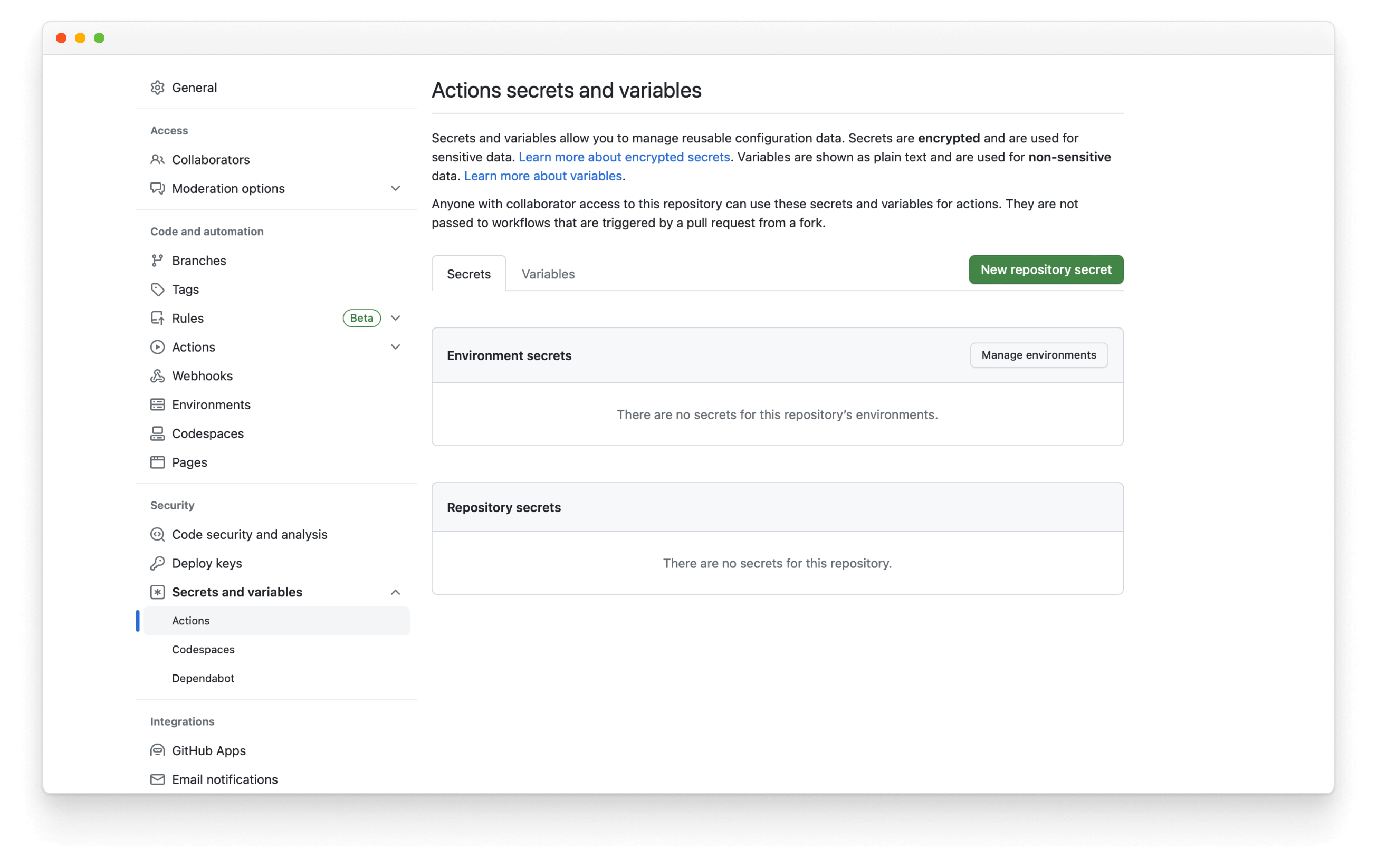
然后,点击New repository secret,命名为NPM_TOKEN,并粘贴之前生成的令牌。每当你合并一个拉取请求到默认分支时,工作流程将运行并发布一个新版本,自动递增版本号并更新更新日志。
了解更多关于 Storybook 插件生态系统的信息