
控件
Storybook 控件提供了一个图形用户界面,无需编写代码即可与组件的参数进行动态交互。使用控件面板可以编辑故事的输入,并实时查看结果。这是探索组件和测试不同状态的好方法。
控件无需修改您的组件。用于控件的故事具有以下特点:
- 方便。根据 React/Vue/Angular 等组件自动生成控件。
- 可移植。在文档、测试甚至设计中重用您的交互式故事。
- 丰富。定制控件和交互式数据以满足您的确切需求。
要使用控件,您需要使用参数来编写故事。Storybook 将根据您的参数以及它可以从组件中推断出的信息自动生成 UI 控件。不过,您可以使用argTypes进一步配置控件,详见下文。
如果您的故事采用旧的 Storybook 6 之前的风格,请查看args & controls 迁移指南,了解如何将现有故事转换为 args。
选择控件类型
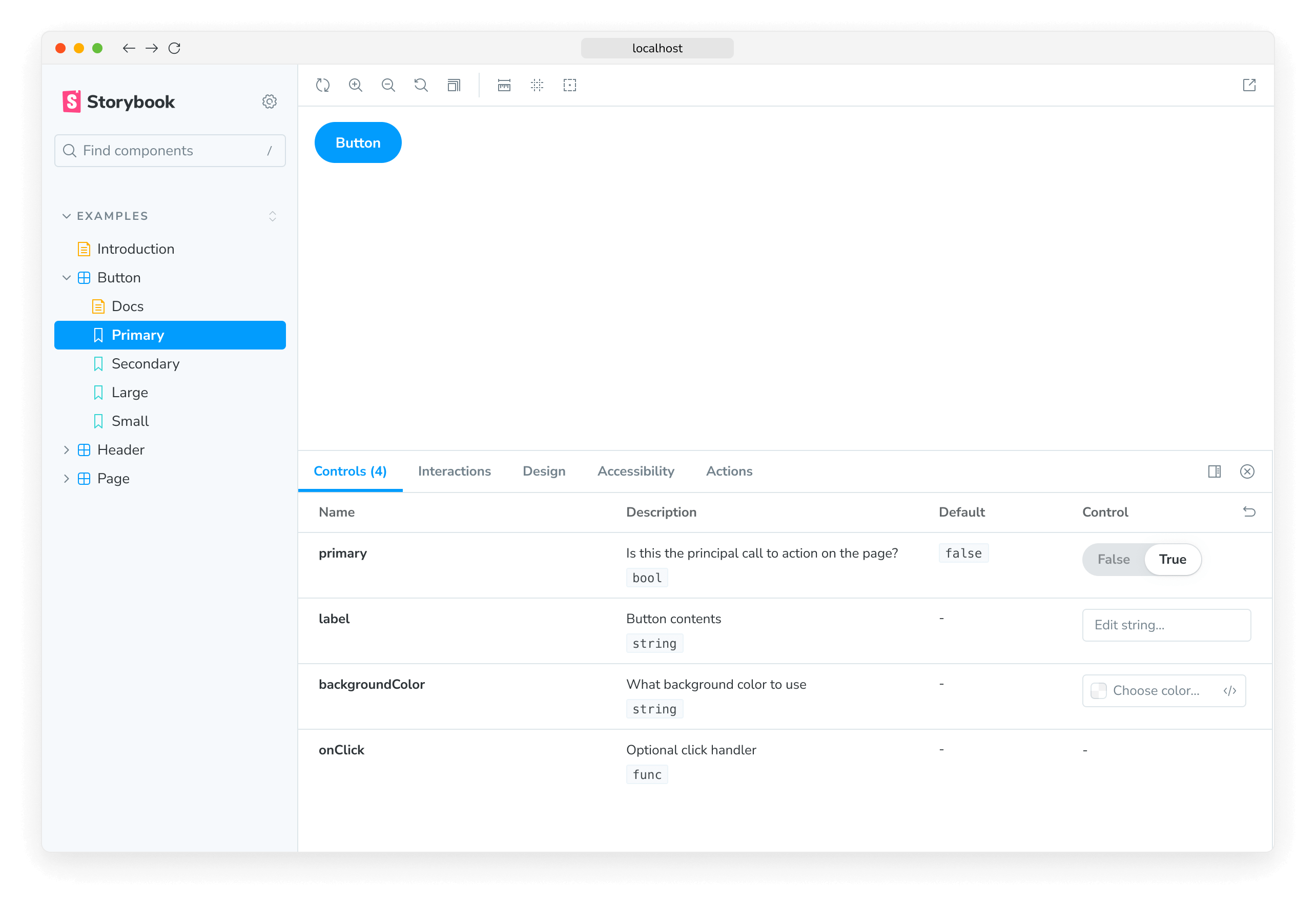
默认情况下,Storybook 会根据每个参数的初始值选择一个控件。这对于特定的参数类型(例如 boolean 或 string)非常有效。要启用它们,请将 component 注解添加到故事文件的默认导出中,它将用于推断控件并使用react-docgen为组件自动生成匹配的argTypes,react-docgen 是一个 React 组件文档生成器,也包含对 TypeScript 的一流支持。
// Replace your-framework with the framework you are using, e.g. react-vite, nextjs, nextjs-vite, etc.
import type { Meta } from '@storybook/your-framework';

import { Button } from './Button';

const meta = {
  component: Button,
} satisfies Meta<typeof Button>;

export default meta;
例如,假设您的故事中有一个 variant 参数,它应该是 primary 或 secondary
// Replace your-framework with the framework you are using, e.g. react-vite, nextjs, vue3-vite, etc.
import type { Meta, StoryObj } from '@storybook/your-framework';

import { Button } from './Button';

const meta = {
  component: Button,
} satisfies Meta<typeof Button>;

export default meta;
type Story = StoryObj<typeof meta>;

export const Primary: Story = {
  args: {
    variant: 'primary',
  },
};
默认情况下,Storybook 会为 variant 参数渲染一个自由文本输入框
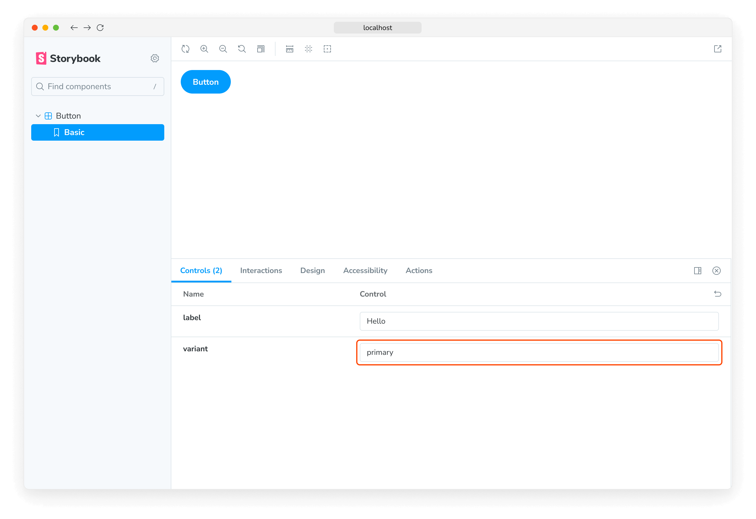
只要您在自动生成的文本控件中输入有效的字符串,它就可以工作。但是,考虑到组件只接受 primary 或 secondary 作为变体,这不是我们场景的最佳 UI。让我们用 Storybook 的单选组件替换它。
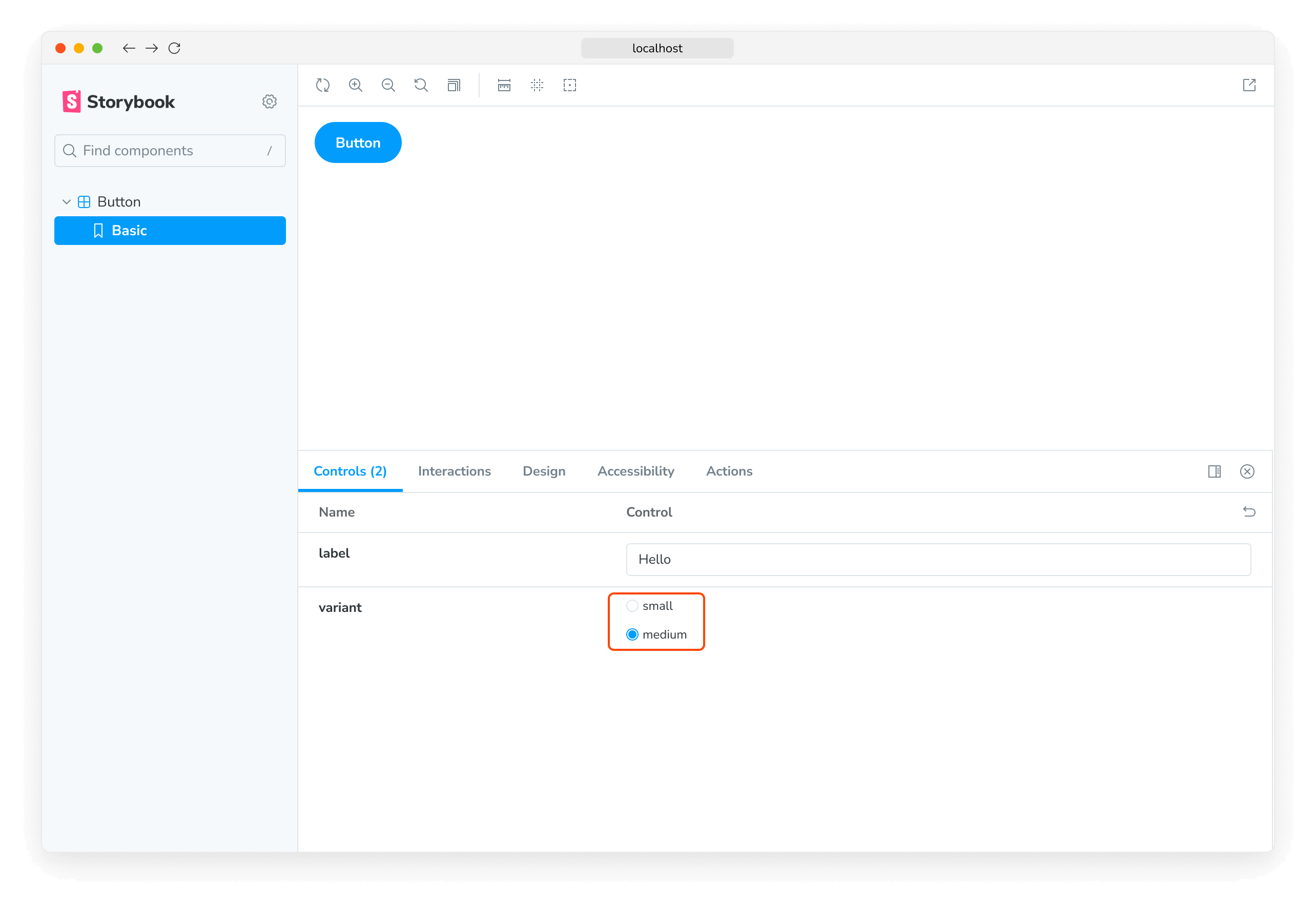
我们可以通过为 variant 属性声明自定义的 argType 来指定使用哪些控件。ArgTypes 编码参数的基本元数据,例如参数的名称、描述和默认值。这些信息会由 Storybook Docs 自动填充。
ArgTypes 还可以包含任意注解,用户可以覆盖这些注解。由于 variant 是组件属性,我们将其注解放在默认导出上。
// Replace your-framework with the framework you are using, e.g. react-vite, nextjs, vue3-vite, etc.
import type { Meta } from '@storybook/your-framework';

import { Button } from './Button';

const meta = {
  component: Button,
  argTypes: {
    variant: {
      options: ['primary', 'secondary'],
      control: { type: 'radio' },
    },
  },
} satisfies Meta<typeof Button>;

export default meta;ArgTypes 是一项强大的功能,可用于定制故事的控件。有关更多信息,请参阅有关使用 argTypes 注解定制控件的文档。
这将输入框替换为单选按钮组,提供更直观的体验。
自定义控件类型匹配器
可以通过参数名称使用正则表达式自动推断控件,但目前仅适用于颜色选择器和日期选择器控件。如果您使用 Storybook CLI 设置了项目,它应该会在 .storybook/preview.js|ts 中自动创建以下默认配置
| 控件 | 默认正则表达式 | 描述 |
|---|---|---|
| color | /(background|color)$/i | 将为匹配的参数显示颜色选择器 UI |
| date | /Date$/ | 将为匹配的参数显示日期选择器 UI |
如果您未使用 CLI 进行配置,或者想定义自己的模式,请在 controls 参数中使用 matchers 属性
// Replace your-framework with the framework you are using, e.g. react-vite, nextjs, vue3-vite, etc.
import type { Preview } from '@storybook/your-framework';

const preview: Preview = {
  parameters: {
    controls: {
      matchers: {
        color: /(background|color)$/i,
        date: /Date$/,
      },
    },
  },
};

export default preview;
完全自定义参数
到目前为止,我们只使用了根据为其编写故事的组件自动生成的控件。如果我们编写复杂的故事,我们可能希望为不属于组件的参数添加控件。例如,您可以这样使用 footer 参数来填充子组件
// Replace your-framework with the framework you are using, e.g. react-vite, nextjs, nextjs-vite, etc.
import type { Meta, StoryObj } from '@storybook/your-framework';

import { Page } from './Page';

type PagePropsAndCustomArgs = React.ComponentProps<typeof Page> & { footer?: string };

const meta = {
  component: Page,
  render: ({ footer, ...args }) => (
    <Page {...args}>
      <footer>{footer}</footer>
    </Page>
  ),
} satisfies Meta<PagePropsAndCustomArgs>;
export default meta;

type Story = StoryObj<typeof meta>;

export const CustomFooter = {
  args: {
    footer: 'Built with Storybook',
  },
} satisfies Story;
默认情况下,Storybook 会为所有满足以下条件的参数添加控件
-
它从组件定义中推断出来(如果您的框架支持)。
-
出现在故事的参数列表中。
使用 argTypes,您可以更改每个控件的显示和行为。
处理复杂值
处理非原始值时,您会发现存在一些限制。最明显的问题是并非所有值都可以表示为 URL 中的 args 参数的一部分,从而失去了共享和深度链接到此类状态的能力。除此之外,复杂值(如 JSX)无法在管理器(例如控件面板)和预览(您的故事)之间同步。
一种处理方法是使用原始值(例如字符串)作为参数值,并添加一个自定义的 render 函数,以便在渲染之前将它们转换为对应的复杂值。这并不是最好的方法(见下文),但绝对是最灵活的方法。
// Replace your-framework with the framework you are using, e.g. react-vite, nextjs, nextjs-vite, etc.
import type { Meta, StoryObj } from '@storybook/your-framework';

import { YourComponent } from './your-component';

const meta = {
  component: YourComponent,
  //👇 Creates specific argTypes with options
  argTypes: {
    propertyA: {
      options: ['Item One', 'Item Two', 'Item Three'],
      control: { type: 'select' }, // Automatically inferred when 'options' is defined
    },
    propertyB: {
      options: ['Another Item One', 'Another Item Two', 'Another Item Three'],
    },
  },
} satisfies Meta<typeof YourComponent>;

export default meta;
type Story = StoryObj<typeof meta>;

const someFunction = (valuePropertyA, valuePropertyB) => {
  // Do some logic here
};

export const ExampleStory: Story = {
  render: (args) => {
    const { propertyA, propertyB } = args;
    //👇 Assigns the function result to a variable
    const someFunctionResult = someFunction(propertyA, propertyB);

    return <YourComponent {...args} someProperty={someFunctionResult} />;
  },
  args: {
    propertyA: 'Item One',
    propertyB: 'Another Item One',
  },
};
除非您需要函数的灵活性,否则在渲染之前将原始值映射到复杂值的更简单方法是定义一个 mapping;此外,您可以指定 control.labels 来为您的复选框、单选按钮或选择输入框配置自定义标签。
// Replace your-framework with the framework you are using, e.g. react-vite, nextjs, vue3-vite, etc.
import type { Meta } from '@storybook/your-framework';

import { Button } from './Button';

import { ArrowUp, ArrowDown, ArrowLeft, ArrowRight } from './icons';

const arrows = { ArrowUp, ArrowDown, ArrowLeft, ArrowRight };

const meta = {
  component: Button,
  argTypes: {
    arrow: {
      options: Object.keys(arrows), // An array of serializable values
      mapping: arrows, // Maps serializable option values to complex arg values
      control: {
        type: 'select', // Type 'select' is automatically inferred when 'options' is defined
        labels: {
          // 'labels' maps option values to string labels
          ArrowUp: 'Up',
          ArrowDown: 'Down',
          ArrowLeft: 'Left',
          ArrowRight: 'Right',
        },
      },
    },
  },
} satisfies Meta<typeof Button>;

export default meta;请注意,mapping 和 control.labels 不必详尽。如果当前选定的选项未列出,则按原样使用。
从控件创建和编辑故事
您可以直接从控件面板创建或编辑故事。
创建新故事
打开故事的控件面板,调整控件的值。然后将这些更改保存为一个新故事。
如果您正在处理尚未有任何故事的组件,可以单击侧边栏中的 ➕ 按钮来搜索您的组件并为您创建一个基本故事。
编辑故事
您还可以更新控件的值,然后将更改保存到故事中。故事文件的代码将自动为您更新。
禁用故事的创建和编辑
如果您不想允许从控件面板创建或编辑故事,可以通过将 .storybook/preview.js|ts 文件中的 parameters.controls 参数下的 disableSaveFromUI 参数设置为 true 来禁用此功能。
配置
控件可以通过两种方式进行配置
- 单个控件可以通过控件注解进行配置。
- 面板的外观可以通过参数进行配置。
注解
如上所示,您可以在组件或故事的argTypes字段中使用“control”注解配置单个控件。下面是一个精简的示例和表格,列出了所有可用的控件。
| 数据类型 | 控件 | 描述 |
|---|---|---|
| boolean | boolean | 提供一个切换开关,用于在可能的状态之间切换。argTypes: { active: { control: 'boolean' }} |
| number | number | 提供一个数字输入框,包含所有可能值的范围。argTypes: { even: { control: { type: 'number', min:1, max:30, step: 2 } }} |
range | 提供一个范围滑块组件,包含所有可能的值。argTypes: { odd: { control: { type: 'range', min: 1, max: 30, step: 3 } }} | |
| object | object | 提供一个基于 JSON 的编辑器组件来处理对象的值。 也允许在原始模式下编辑。 argTypes: { user: { control: 'object' }} |
| array | object | 提供一个基于 JSON 的编辑器组件来处理数组的值。 也允许在原始模式下编辑。 argTypes: { odd: { control: 'object' }} |
file | 提供一个文件输入组件,返回 URL 数组。 可以进一步定制以接受特定文件类型。 argTypes: { avatar: { control: { type: 'file', accept: '.png' } }} | |
| enum | radio | 根据可用选项提供一组单选按钮。argTypes: { contact: { control: 'radio', options: ['email', 'phone', 'mail'] }} |
inline-radio | 根据可用选项提供一组内联单选按钮。argTypes: { contact: { control: 'inline-radio', options: ['email', 'phone', 'mail'] }} | |
check | 提供一组复选框组件,用于选择多个选项。argTypes: { contact: { control: 'check', options: ['email', 'phone', 'mail'] }} | |
inline-check | 提供一组内联复选框组件,用于选择多个选项。argTypes: { contact: { control: 'inline-check', options: ['email', 'phone', 'mail'] }} | |
select | 提供一个下拉列表组件,用于处理单个值选择。argTypes: { age: { control: 'select', options: [20, 30, 40, 50] }} | |
multi-select | 提供一个允许选择多个值的下拉列表。argTypes: { countries: { control: 'multi-select', options: ['USA', 'Canada', 'Mexico'] }} | |
| string | text | 提供一个自由文本输入框。argTypes: { label: { control: 'text' }} |
color | 提供一个颜色选择器组件来处理颜色值。 可以额外配置以包含一组颜色预设。 argTypes: { color: { control: { type: 'color', presetColors: ['red', 'green']} }} | |
date | 提供一个日期选择器组件来处理日期选择。argTypes: { startDate: { control: 'date' }} |
date 控件在值更改时会将日期转换为 UNIX 时间戳。这是一个已知限制,将在未来的版本中修复。如果您需要表示实际日期,则需要更新故事的实现并将值转换为日期对象。
// Replace your-framework with the framework you are using, e.g. react-vite, nextjs, vue3-vite, etc.
import type { Meta } from '@storybook/your-framework';

import { Gizmo } from './Gizmo';

const meta = {
  component: Gizmo,
  argTypes: {
    canRotate: {
      control: 'boolean',
    },
    width: {
      control: { type: 'number', min: 400, max: 1200, step: 50 },
    },
    height: {
      control: { type: 'range', min: 200, max: 1500, step: 50 },
    },
    rawData: {
      control: 'object',
    },
    coordinates: {
      control: 'object',
    },
    texture: {
      control: {
        type: 'file',
        accept: '.png',
      },
    },
    position: {
      control: 'radio',
      options: ['left', 'right', 'center'],
    },
    rotationAxis: {
      control: 'check',
      options: ['x', 'y', 'z'],
    },
    scaling: {
      control: 'select',
      options: [10, 50, 75, 100, 200],
    },
    label: {
      control: 'text',
    },
    meshColors: {
      control: {
        type: 'color',
        presetColors: ['#ff0000', '#00ff00', '#0000ff'],
      },
    },
    revisionDate: {
      control: 'date',
    },
  },
} satisfies Meta<typeof Gizmo>;

export default meta;数值数据类型将默认为 number 控件,除非提供了额外的配置。
参数
控件支持以下配置参数,可以是全局的,也可以是每个故事单独配置的
显示每个属性的完整文档
由于控件与 Storybook Docs 构建在相同的引擎上,它也可以使用 expanded 参数(默认为 false)在控件旁边显示属性文档。这意味着您可以在控件面板中嵌入一个完整的Controls文档块。描述和默认值的渲染可以像文档块一样定制。
要全局启用扩展模式,请将以下内容添加到 .storybook/preview.js|ts
// Replace your-framework with the framework you are using, e.g. react-vite, nextjs, vue3-vite, etc.
import type { Preview } from '@storybook/your-framework';

const preview: Preview = {
  parameters: {
    controls: { expanded: true },
  },
};

export default preview;
这是结果 UI 的外观
指定初始预设颜色样本
对于 color 控件,您可以指定 presetColors 数组,可以在 argTypes 中的 control 上指定,也可以作为 controls 命名空间下的参数指定
// Replace your-framework with the framework you are using, e.g. react-vite, nextjs, vue3-vite, etc.
import type { Preview } from '@storybook/your-framework';

const preview: Preview = {
  parameters: {
    controls: {
      presetColors: [{ color: '#ff4785', title: 'Coral' }, 'rgba(0, 159, 183, 1)', '#fe4a49'],
    },
  },
};

export default preview;
颜色预设可以定义为包含 color 和 title 的对象,或者一个简单的 CSS 颜色字符串。然后这些将作为颜色选择器中的样本可用。当您将鼠标悬停在颜色样本上时,您可以看到其标题。如果未指定标题,则默认为最接近的 CSS 颜色名称。
过滤控件
在特定情况下,您可能需要在控件面板中只显示有限数量的控件,或显示除了特定集合之外的所有控件。
为了实现这一点,您可以在 controls 参数中使用可选的 include 和 exclude 配置字段,您可以将其定义为字符串数组或正则表达式。
考虑以下故事片段
// Replace your-framework with the framework you are using, e.g. react-vite, nextjs, vue3-vite, etc.
import type { Meta, StoryObj } from '@storybook/your-framework';

import { YourComponent } from './YourComponent';

const meta = {
  component: YourComponent,
} satisfies Meta<typeof YourComponent>;

export default meta;
type Story = StoryObj<typeof meta>;

export const ArrayInclude: Story = {
  parameters: {
    controls: { include: ['foo', 'bar'] },
  },
};

export const RegexInclude: Story = {
  parameters: {
    controls: { include: /^hello*/ },
  },
};

export const ArrayExclude: Story = {
  parameters: {
    controls: { exclude: ['foo', 'bar'] },
  },
};

export const RegexExclude: Story = {
  parameters: {
    controls: { exclude: /^hello*/ },
  },
};
排序控件
默认情况下,控件是无序的,使用参数数据处理的顺序(none)。此外,您还可以按参数名称按字母顺序排序(alpha)或将必需参数排在前面(requiredFirst)。
考虑以下片段以强制必需参数排在前面
// Replace your-framework with the framework you are using, e.g. react-vite, nextjs, vue3-vite, etc.
import type { Meta } from '@storybook/your-framework';

import { YourComponent } from './YourComponent';

const meta = {
  component: YourComponent,
  parameters: { controls: { sort: 'requiredFirst' } },
} satisfies Meta<typeof YourComponent>;

export default meta;
禁用特定属性的控件
除了此处已记录的功能外,还可以为单个属性禁用控件。
假设您想在组件的故事中关闭名为 foo 的属性的控件。以下示例说明了如何操作
// Replace your-framework with the framework you are using, e.g. react-vite, nextjs, vue3-vite, etc.
import type { Meta } from '@storybook/your-framework';

import { YourComponent } from './YourComponent';

const meta = {
  component: YourComponent,
  argTypes: {
    // foo is the property we want to remove from the UI
    foo: {
      table: {
        disable: true,
      },
    },
  },
} satisfies Meta<typeof YourComponent>;

export default meta;
导致 Storybook UI 中发生以下变化
前面的示例也从表格中删除了属性文档。在某些情况下,这没问题。但是,有时您可能希望在没有控件的情况下渲染属性文档。以下示例说明了如何操作
// Replace your-framework with the framework you are using, e.g. react-vite, nextjs, vue3-vite, etc.
import type { Meta } from '@storybook/your-framework';

import { YourComponent } from './YourComponent';

const meta = {
  component: YourComponent,
  argTypes: {
    // foo is the property we want to remove from the UI
    foo: {
      control: false,
    },
  },
} satisfies Meta<typeof YourComponent>;

export default meta;与其他 Storybook 属性(例如装饰器)一样,您可以在故事级别应用相同的模式,以处理更精细的情况。
条件控件
在某些情况下,根据另一个控件的值有条件地排除控件非常有用。控件通过 if 支持这些用例的基本版本,if 可以接受一个简单的查询对象来确定是否包含该控件。
考虑一组“高级”设置,仅当用户切换“高级”开关时才可见。
// Replace your-framework with the framework you are using, e.g. react-vite, nextjs, vue3-vite, etc.
import type { Meta } from '@storybook/your-framework';

import { Button } from './Button';

const meta = {
  component: Button,
  argTypes: {
    label: { control: 'text' }, // Always shows the control
    advanced: { control: 'boolean' },
    // Only enabled if advanced is true
    margin: { control: 'number', if: { arg: 'advanced' } },
    padding: { control: 'number', if: { arg: 'advanced' } },
    cornerRadius: { control: 'number', if: { arg: 'advanced' } },
  },
} satisfies Meta<typeof Button>;

export default meta;
或者考虑一种限制,如果用户设置了一个控件值,那么用户设置另一个值就没有意义。
// Replace your-framework with the framework you are using, e.g. react-vite, nextjs, vue3-vite, etc.
import type { Meta } from '@storybook/your-framework';

import { Button } from './Button';

const meta = {
  component: Button,
  argTypes: {
    // Button can be passed a label or an image, not both
    label: {
      control: 'text',
      if: { arg: 'image', truthy: false },
    },
    image: {
      control: { type: 'select', options: ['foo.jpg', 'bar.jpg'] },
      if: { arg: 'label', truthy: false },
    },
  },
} satisfies Meta<typeof Button>;

export default meta;
查询对象必须包含 arg 或 global 目标
| 字段 | 类型 | 含义 |
|---|---|---|
| arg | string | 要测试的 arg ID。 |
| global | string | 要测试的 global ID。 |
它还可以包含以下最多一个运算符
| 运算符 | 类型 | 含义 |
|---|---|---|
| truthy | boolean | 目标值是否为 truthy? |
| exists | boolean | 目标值是否已定义? |
| eq | any | 目标值是否等于提供的值? |
| neq | any | 目标值是否不等于提供的值? |
如果未提供运算符,则等同于 { truthy: true }。
故障排除
控件未更新自动生成的文档中的故事
如果您通过 inline 配置选项关闭了故事的内联渲染,您会遇到相关控件未更新文档页面中故事的情况。这是当前实现的一个已知限制,将在未来的版本中解决。
API
参数
此功能在 controls 命名空间下为 Storybook 贡献了以下参数
disable
类型:boolean
禁用此功能的行为。如果您希望禁用整个 Storybook 的此功能,应在主配置文件中进行设置。
此参数最适用于在更具体的级别进行覆盖。例如,如果在项目级别将此参数设置为 true,则可以在 meta(组件)或故事级别将其重新启用为 false。
exclude
类型:string[] | RegExp
指定要从控件面板中排除的属性。名称匹配正则表达式或属于数组的任何属性都将被排除。参见上面的使用示例。
expanded
类型:boolean
在控件面板中显示每个属性的完整文档,包括描述和默认值。参见上面的使用示例。
include
类型:string[] | RegExp
指定要包含在控件面板中的属性。名称不匹配正则表达式或不属于数组的任何属性都将被排除。参见上面的使用示例。
presetColors
类型:(string | { color: string; title?: string })[]
为颜色选择器控件指定预设颜色样本。颜色值可以是任何有效的 CSS 颜色。参见上面的使用示例。
sort
类型:'none' | 'alpha' | 'requiredFirst'
默认值:'none'
指定控件的排序方式。
- none:不排序,按 arg 类型处理的顺序显示
- alpha:按 arg 类型的名称按字母顺序排序
- requiredFirst:与
alpha相同,但任何必需的 arg 类型优先显示
disableSaveFromUI
类型:boolean
默认值:false
禁用从控件面板创建或编辑故事的功能。