
插件类型
每个 Storybook 插件被分为两大类:基于 UI 的插件(UI-based addons)或预设插件(Presets)。这里记录了每种插件类型的特性。在创建自己的插件时,请以此作为参考。
基于 UI 的插件
基于 UI 的插件允许您使用以下元素来自定义 Storybook 的 UI。
面板
面板插件允许您在 Storybook 的插件面板中添加自己的 UI。这是生态系统中最常见的插件类型。例如,官方插件 @storybook/addon-a11y 就使用了这种模式。
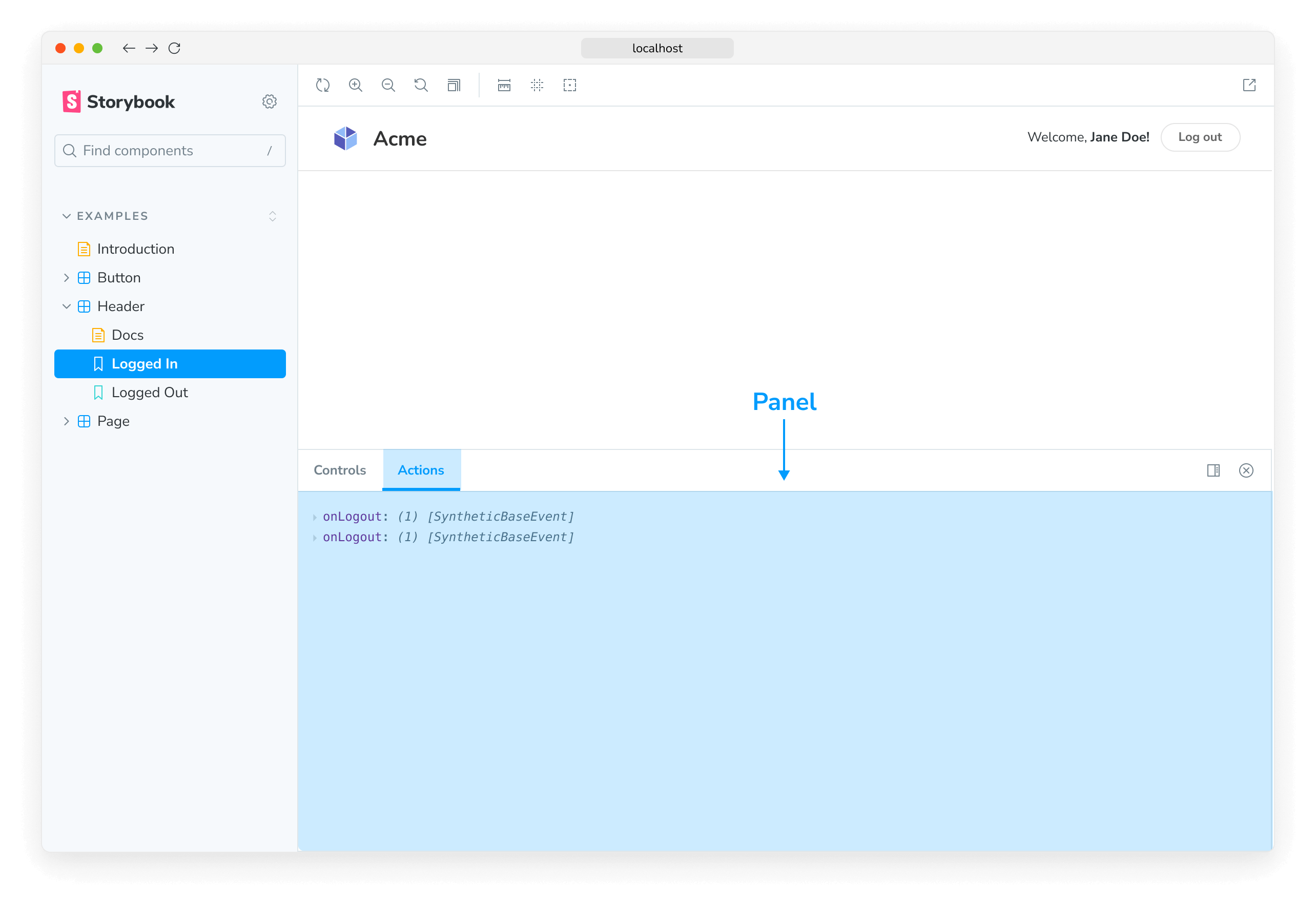
使用这段样板代码(boilerplate code)向 Storybook 的 UI 添加一个新的 Panel
addon-panel/manager.js
import React from 'react';

import { AddonPanel } from 'storybook/internal/components';

import { useGlobals, addons, types } from 'storybook/manager-api';

addons.register('my/panel', () => {
  addons.add('my-panel-addon/panel', {
    title: 'Example Storybook panel',
    //👇 Sets the type of UI element in Storybook
    type: types.PANEL,
    render: ({ active }) => (
      <AddonPanel active={active}>
        <h2>I'm a panel addon in Storybook</h2>
      </AddonPanel>
    ),
  });
});
工具栏
工具栏插件允许您在 Storybook 的工具栏中添加自定义工具。例如,官方插件 @storybook/addon-themes 就使用了这种模式。
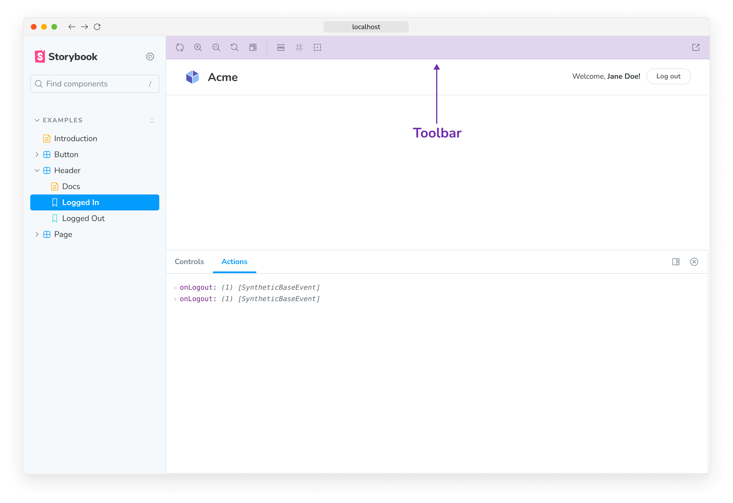
使用这段样板代码向 Storybook 的工具栏添加一个新的 button
addon-toolbar/manager.js
import React from 'react';

import { addons, types } from 'storybook/manager-api';
import { IconButton } from 'storybook/internal/components';
import { OutlineIcon } from '@storybook/icons';

addons.register('my-addon', () => {
  addons.add('my-addon/toolbar', {
    title: 'Example Storybook toolbar',
    //👇 Sets the type of UI element in Storybook
    type: types.TOOL,
    //👇 Shows the Toolbar UI element if the story canvas is being viewed
    match: ({ tabId, viewMode }) => !tabId && viewMode === 'story',
    render: ({ active }) => (
      <IconButton active={active} title="Show a Storybook toolbar">
        <OutlineIcon />
      </IconButton>
    ),
  });
});标签页
标签页插件允许您在 Storybook 中创建自定义标签页。
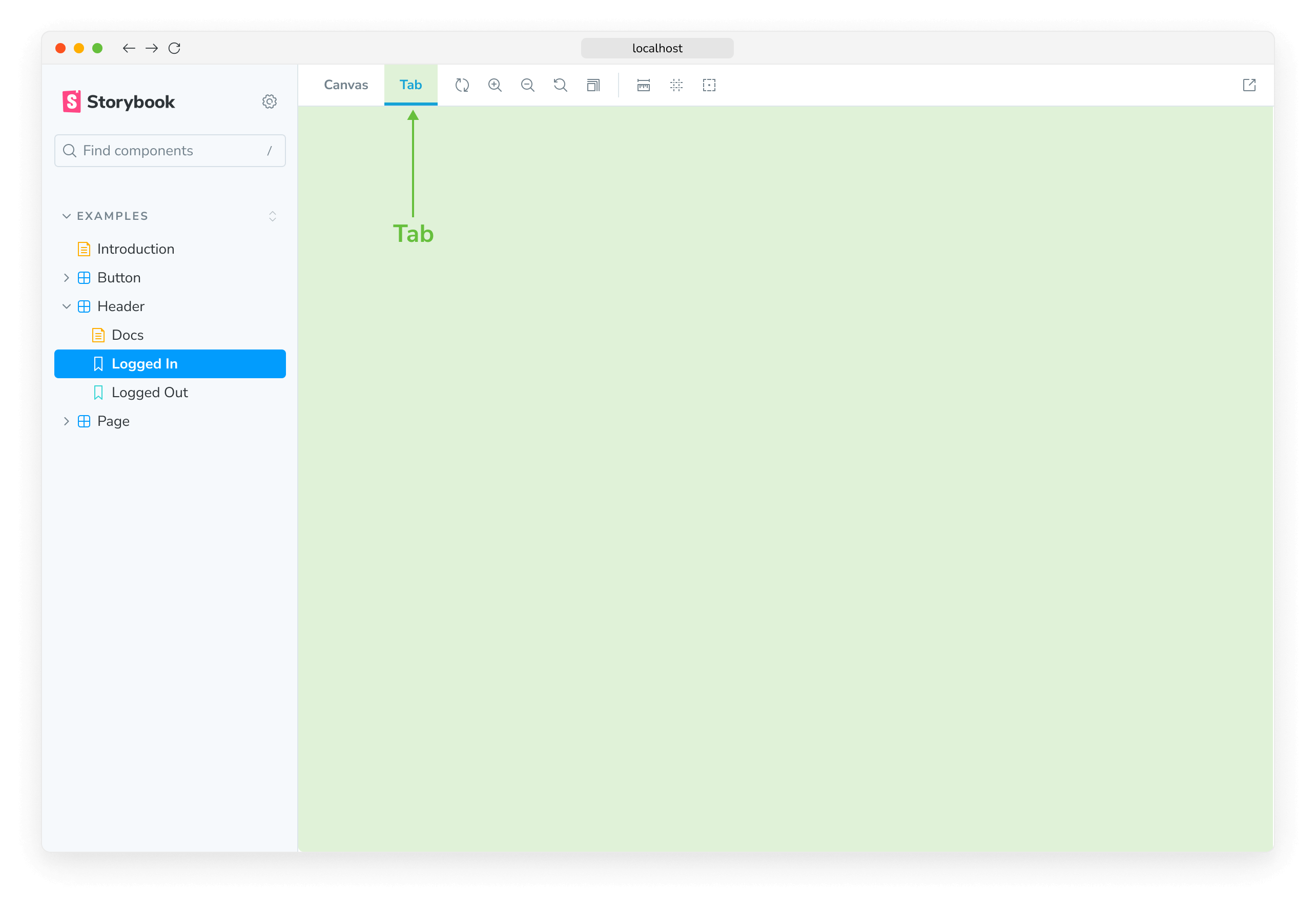
使用这段样板代码向 Storybook 的 UI 添加一个新的 Tab
addon-tab/manager.js
import React from 'react';

import { addons, types } from 'storybook/manager-api';

addons.register('my-addon', () => {
  addons.add('my-addon/tab', {
    type: types.TAB,
    title: 'Example Storybook tab',
    render: () => (
      <div>
        <h2>I'm a tabbed addon in Storybook</h2>
      </div>
    ),
  });
});了解如何在此处编写包含这些 UI 元素的自己的插件。
预设插件
Storybook 预设插件是 babel、webpack 和 addons 配置的集合,用于集成 Storybook 和其他技术。例如,官方的 preset-create-react-app。
在编写自己的预设插件时,请使用这段样板代码。
.storybook/my-preset.js
export default {
  managerWebpack: async (config, options) => {
    // Update config here
    return config;
  },
  webpackFinal: async (config, options) => {
    return config;
  },
  babel: async (config, options) => {
    return config;
  },
};
了解更多关于 Storybook 插件生态系统的信息