
Doc blocks
Storybook 提供了多种文档块,可帮助您记录组件和项目的其他方面。
在 Storybook 中使用文档块的两种常见方式是:在 MDX 中以及作为文档页面模板的一部分。
在 MDX 中
这些块最常用于 Storybook 的 MDX 文档中。
import { Meta, Primary, Controls, Story } from '@storybook/addon-docs/blocks';
import * as ButtonStories from './Button.stories';
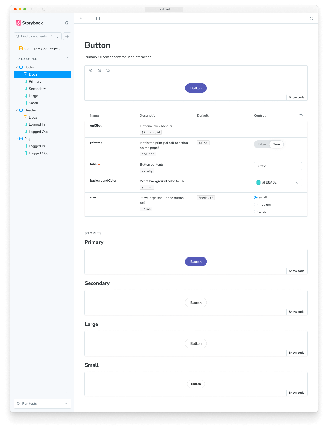
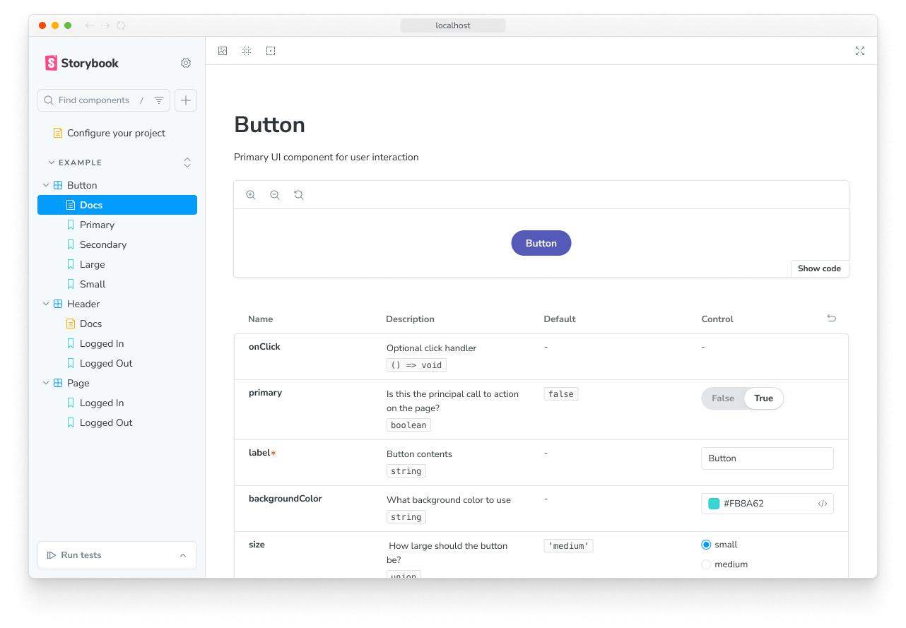
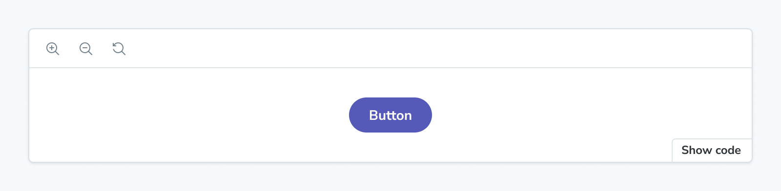
<Meta of={ButtonStories} />
# Button
A button is ...
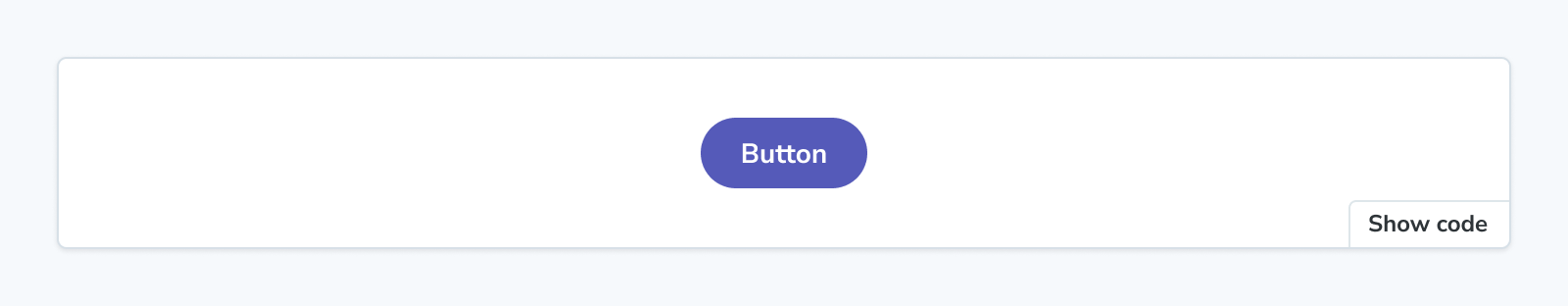
<Primary />
## Props
<Controls />
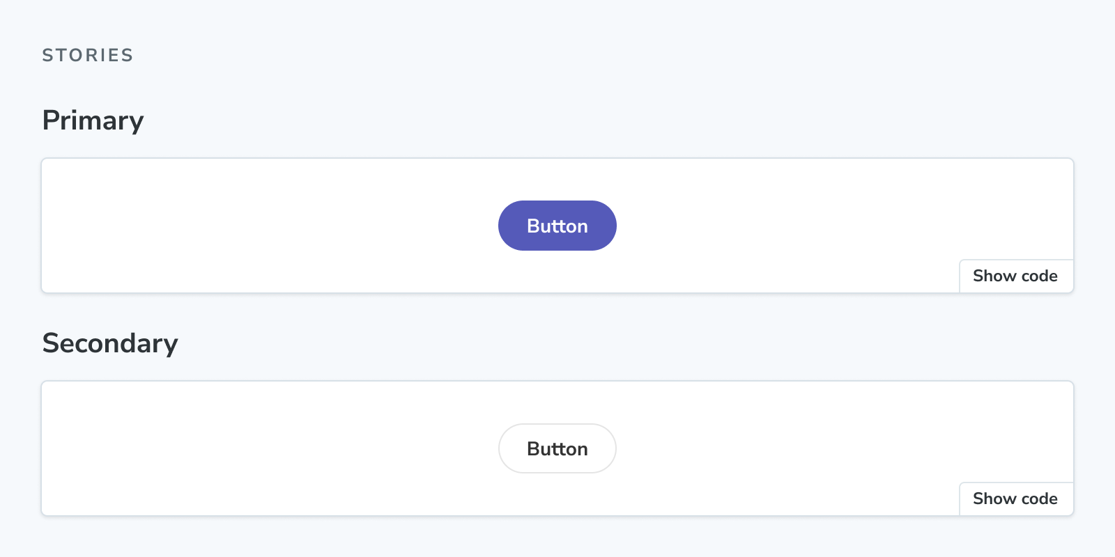
## Stories
### Primary
A button can be of primary importance.
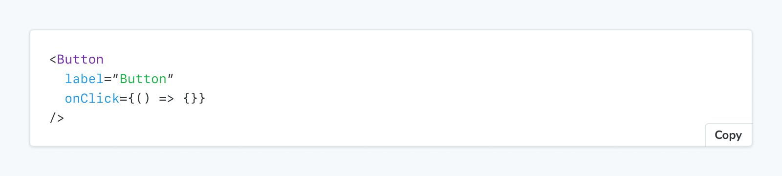
<Story of={ButtonStories.Primary} />
A button can be of secondary importance.
<Story of={ButtonStories.Secondary} />
{/* ... */}自定义自动文档页面
这些块也用于定义自动文档的页面模板。例如,这是默认模板
import { Title, Subtitle, Description, Primary, Controls, Stories } from '@storybook/addon-docs/blocks';

export const autoDocsTemplate = () => (
  <>
    <Title />
    <Subtitle />
    <Description />
    <Primary />
    <Controls />
    <Stories />
  </>
);如果您覆盖默认页面模板,您可以同样使用文档块来构建您项目的完美文档页面。
请注意,某些文档块会渲染其他块。例如,<Stories /> 块会展开为
## Stories

<Canvas>
  ### Story name
  <Description />
  <Story />
  <Source />
</Canvas>

{/* ... repeat <Canvas> for each story */}因此,例如,通过参数(请参阅下一节)自定义Source 块也会影响渲染为Canvas 块一部分的 Source 块。
自定义文档块
在两种用例(MDX 和自动文档)中,许多文档块都可以通过参数进行自定义。
例如,您可以从所有Controls 表格中过滤掉 style 属性,通过您的 Storybook
// Replace your-framework with the framework you are using, e.g. react-vite, nextjs, vue3-vite, etc.
import type { Preview } from '@storybook/your-framework';

const preview: Preview = {
  parameters: {
    docs: {
      controls: { exclude: ['style'] },
    },
  },
};

export default preview;可以在下面可用块列表中标记接受参数自定义的块。
在 MDX 中使用文档块时,它也可以通过其 props 进行自定义
<Controls exclude={['style']}>可用块
每个块都有一个专门的 API 参考页面,详细说明了用法、可用选项和技术细节。
ArgTypes
接受命名空间 parameters.docs.argTypes 下的参数。
ArgTypes 块可用于显示给定组件的参数类型的静态表格,以记录其接口。
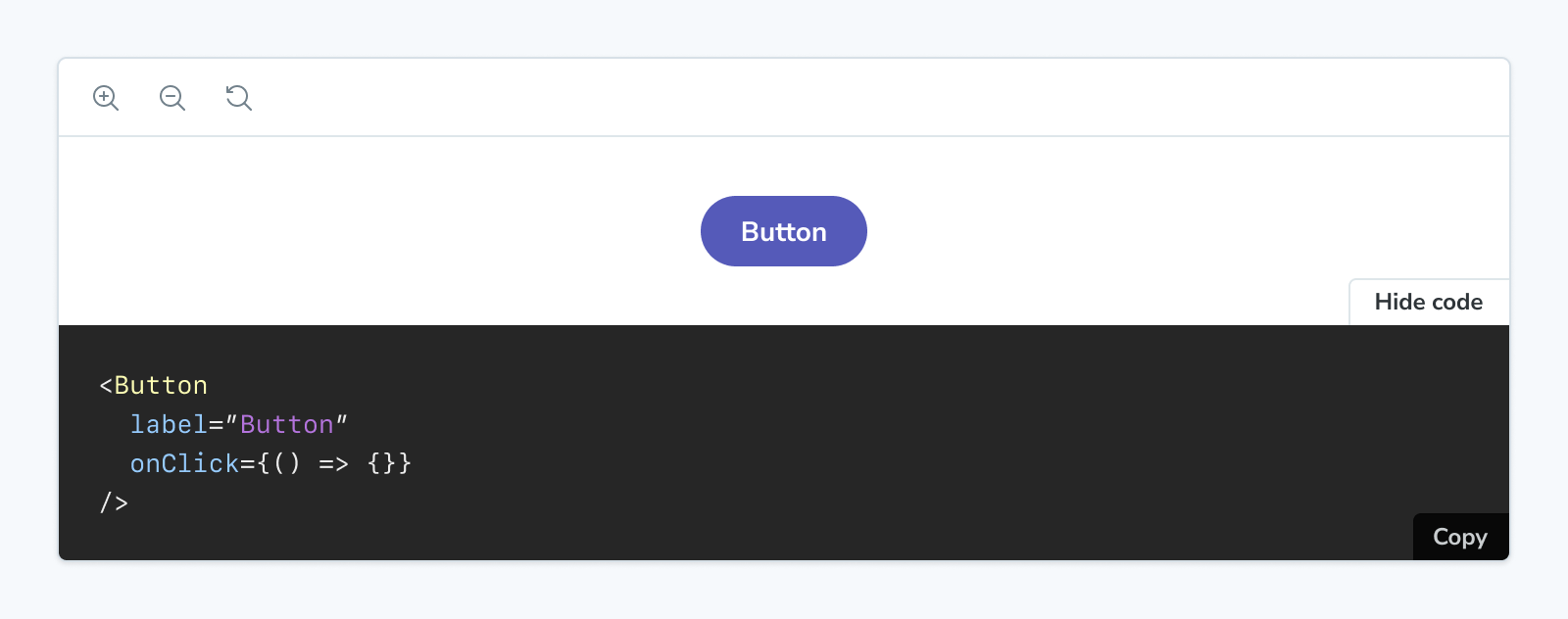
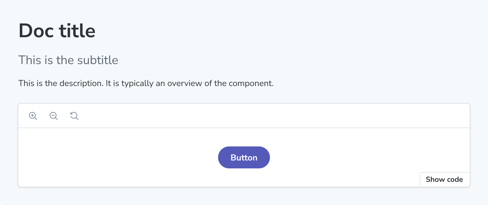
Canvas
接受命名空间 parameters.docs.canvas 下的参数。
Canvas 块是一个 Story 的包装器,带有工具栏,可让您与之交互,同时自动提供所需的 Source 代码片段。
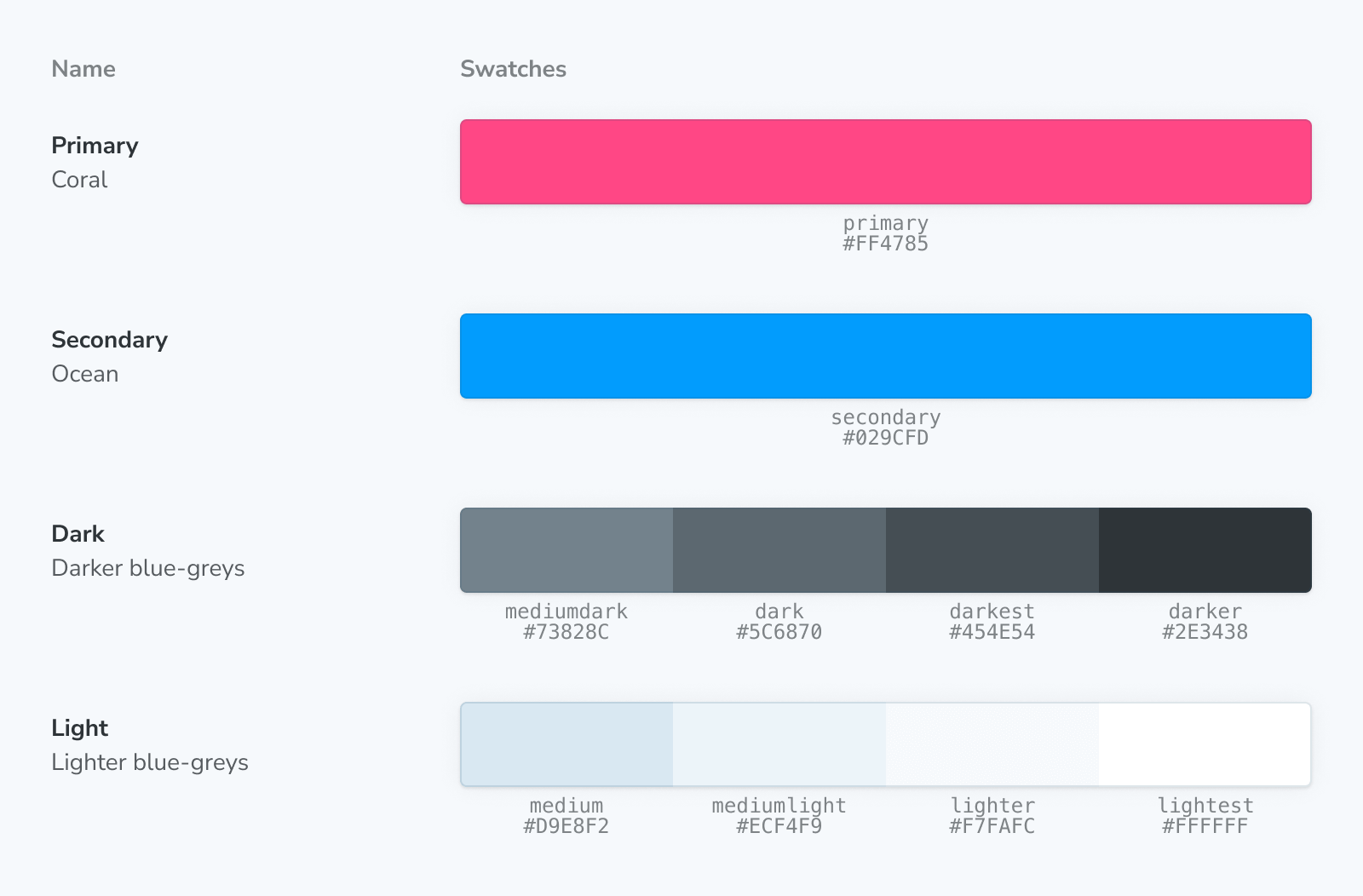
ColorPalette
The ColorPalette block allows you to document all color-related items (e.g., swatches) used throughout your project.
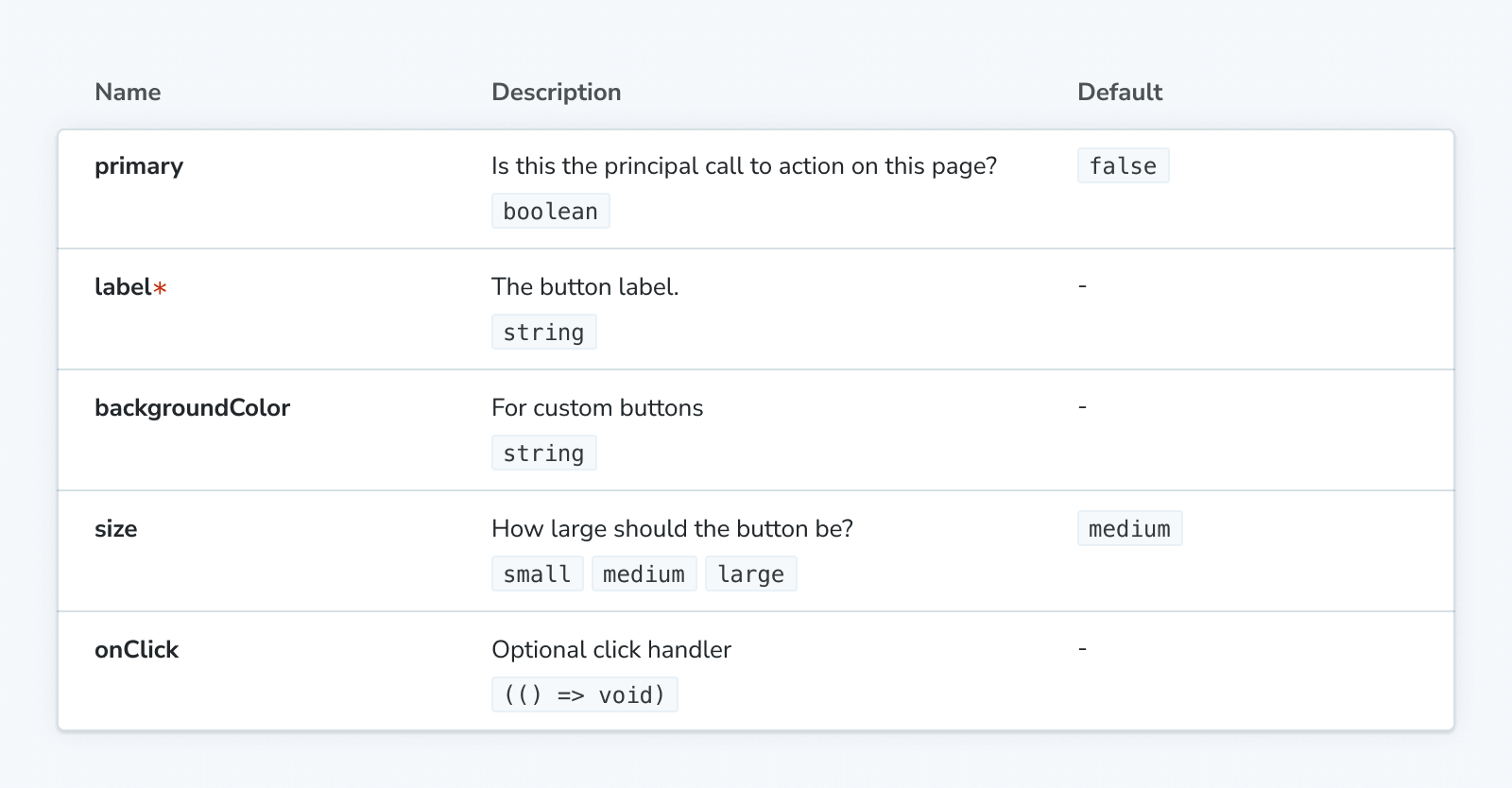
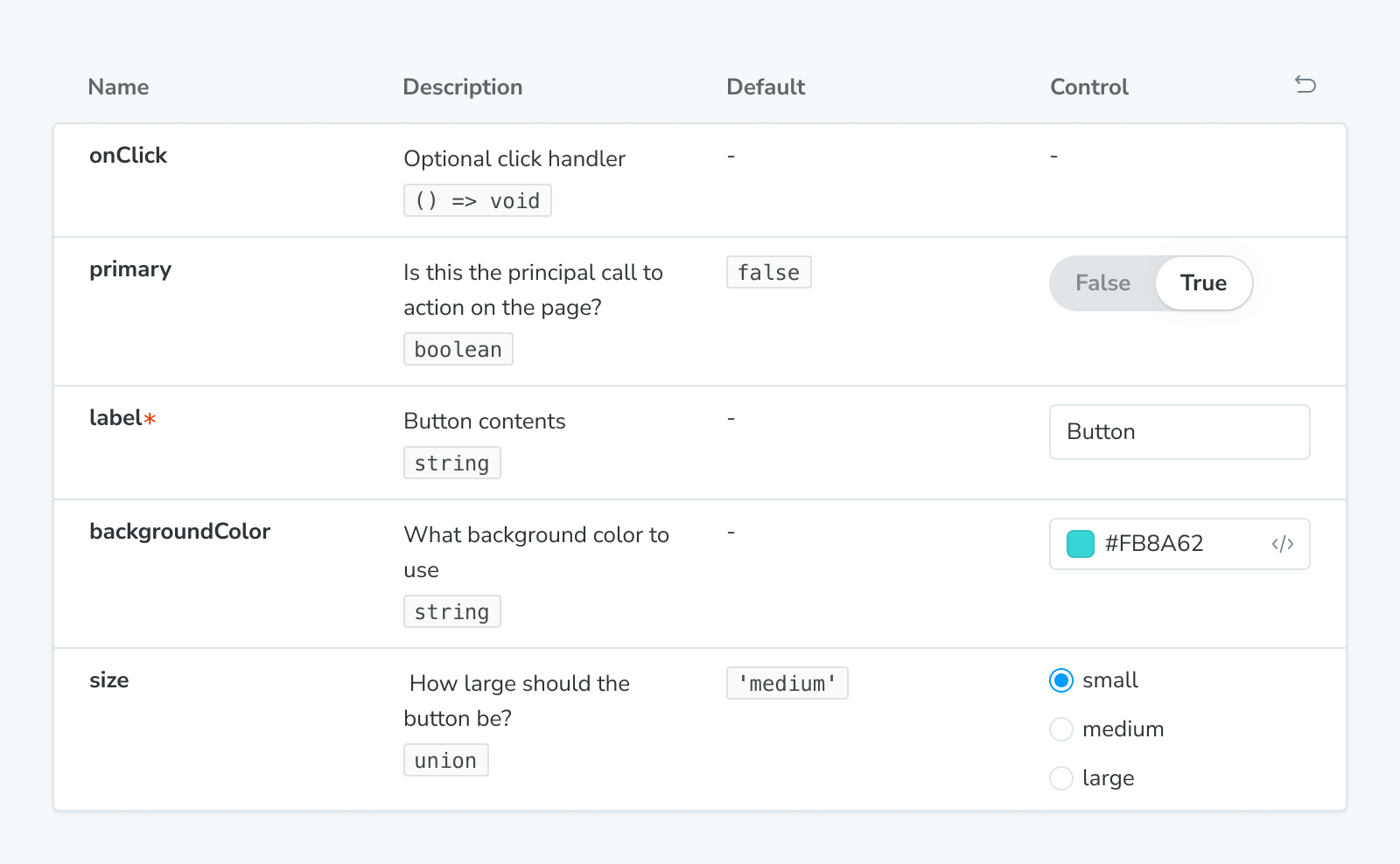
Controls
接受命名空间 parameters.docs.controls 下的参数。
The Controls block can be used to show a dynamic table of args for a given story, as a way to document its interface, and to allow you to change the args for a (separately) rendered story (via the Story or Canvas blocks).
Description
The Description block displays the description for a component, story, or meta obtained from their respective JSDoc comments.
IconGallery
The IconGallery block lets you quickly document all icons associated with your project, displayed in a neat grid.

Markdown
The Markdown block allows you to import and include plain markdown in your MDX files.
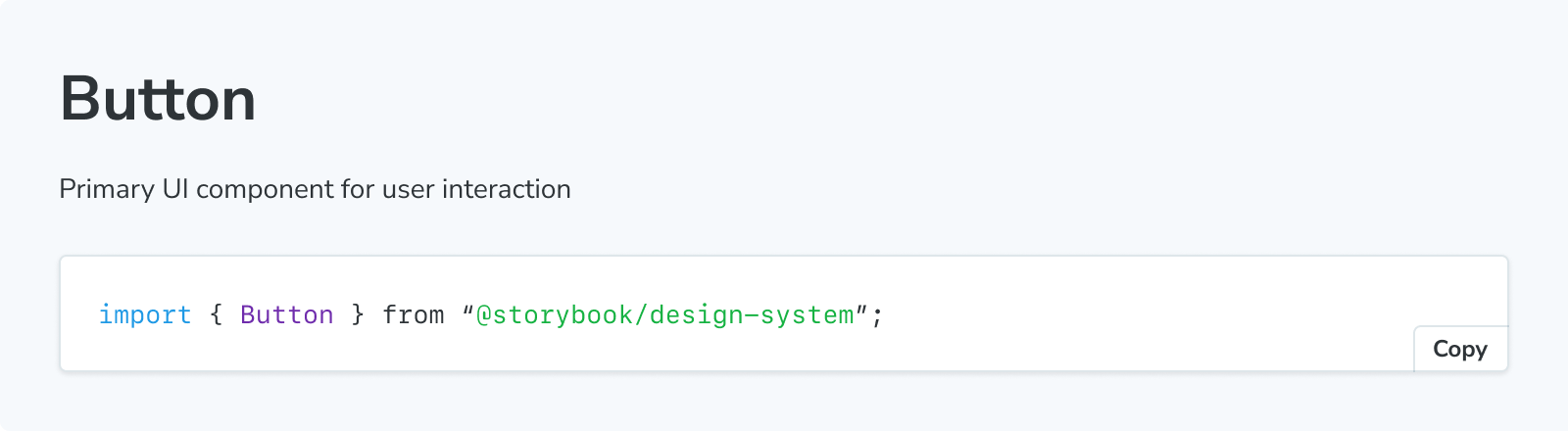
Meta
The Meta block is used to attach a custom MDX docs page alongside a component’s list of stories. It doesn’t render any content but serves two purposes in an MDX file
- Attaches the MDX file to a component and its stories, or
- Controls the location of the unattached docs entry in the sidebar.
Primary
The Primary block displays the primary (first defined in the stories file) story in a Story block. It is typically rendered immediately under the title in a docs entry.
Source
接受命名空间 parameters.docs.source 下的参数。
The Source block is used to render a snippet of source code directly.
Stories
The Stories block renders the full collection of stories in a stories file.
Story
接受命名空间 parameters.docs.story 下的参数。
Stories are Storybook's fundamental building blocks.
In Storybook Docs, you can render any of your stories from your CSF files in the context of an MDX file with all annotations (parameters, args, loaders, decorators, play function) applied using the Story block.
Subtitle
The Subtitle block can serve as a secondary heading for your docs entry.
Title
The Title block serves as the primary heading for your docs entry. It is typically used to provide the component or page name.
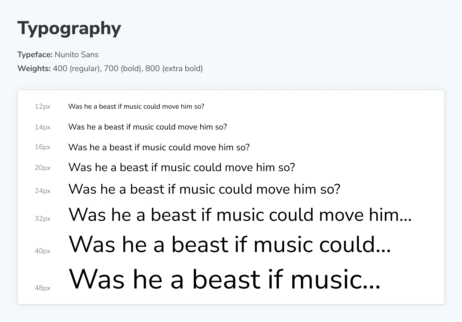
Typeset
The Typeset block helps document the fonts used throughout your project.
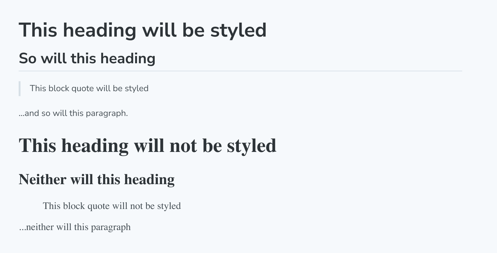
Unstyled
The Unstyled block is a unique block that disables Storybook's default styling in MDX docs wherever it is added.
By default, most elements (like h1, p, etc.) in docs have a few default styles applied to ensure the docs look good. However, sometimes you might want some of your content not to have these styles applied. In those cases, wrap the content with the Unstyled block to remove the default styles.
制作您自己的文档块
Storybook 还提供了 useOf hook,使创建自己的块(功能类似于内置块)更加容易。
故障排除
为什么我不能在我的故事中使用文档块?
Storybook's Doc Blocks are highly customizable and helpful building blocks to assist you with building your custom documentation. Although most of them enable you to customize them with parameters or globally to create custom documentation templates, they are primarily designed for MDX files. For example, if you try to add the ColorPalette block to your stories as follows, you'll get an error message when the story loads in Storybook.
// Replace your-framework with the framework you are using, e.g. react-vite, nextjs, vue3-vite, etc.
import type { Meta } from '@storybook/your-framework';

import { ColorItem, ColorPalette } from '@storybook/addon-docs/blocks';

import { MyComponent } from './MyComponent';

const meta = {
  component: MyComponent,
} satisfies Meta<typeof MyComponent>;

export default meta;
type Story = StoryObj<typeof meta>;

const theme = {
  colors: {
    primaryDark: {
      value: '#1C1C1C',
    },
    primaryRegular: {
      value: '#363636',
    },
    primaryLight1: {
      value: '#4D4D4D',
    },
    primaryLight2: {
      value: '#878787',
    },
    primaryLight3: {
      value: '#D1D1D1',
    },
    primaryLight4: {
      value: '#EDEDED',
    },
  },
};

// ❌ Don't use the Doc Blocks inside your stories. It will break Storybook with a cryptic error.
export const Colors: Story = {
  render: () => (
    <ColorPalette>
      {Object.entries(theme.colors).map(([key, { value }]) => (
        <ColorItem
          colors={{
            [key]: value,
          }}
          key={key}
          subtitle={`theme.colors.${key}`}
          title={key}
        />
      ))}
    </ColorPalette>
  ),
};
详细了解 Storybook 文档