Storybook Web Component HTML 插件
一个 Storybook 插件,用于从 Web Component 中提取并显示带有语法高亮的 HTML
开发脚本
npm run start在观察模式下运行 babel 并启动 Storybooknpm run build构建并打包你的插件代码
从 TypeScript 切换到 JavaScript
不想使用 TypeScript?我们提供了一个便捷的 eject 命令:npm run eject-ts
这将把所有代码转换为 JS。这是一个破坏性过程,因此建议在开始编写任何代码之前运行此命令。
包含什么?
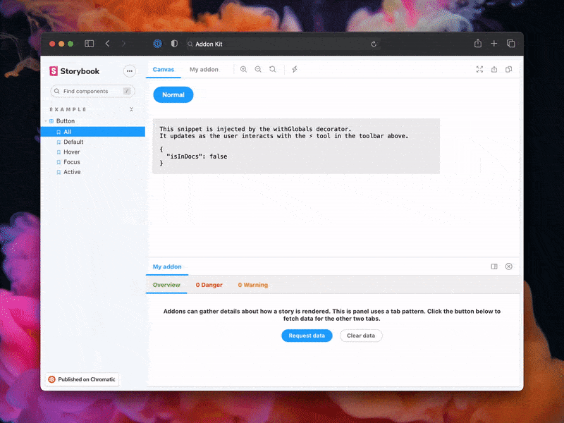
插件代码位于 src 中。它演示了所有核心插件相关的概念。三种 UI 范例
src/Tool.tsxsrc/Panel.tsxsrc/Tab.tsx
它与插件本身一起在 src/manager.ts 中注册。
管理状态和与故事互动
src/withGlobals.ts&src/Tool.tsx演示如何使用useGlobals来管理全局状态并修改故事的内容。src/withRoundTrip.ts&src/Panel.tsx演示如何使用通道进行双向通信。src/Tab.tsx演示如何使用useParameter来访问当前故事的参数。
你的插件可能使用这些模式中的一种或多种。随意删除未使用的代码。相应地更新 src/manager.ts 和 src/preview.ts。
最后,在 src/constants.ts 中配置你的插件名称。
打包
插件可以通过多种方式与 Storybook 项目互动。建议在开始之前熟悉基础知识。
- Manager 入口用于向 Storybook Manager UI 添加 UI 或行为。
- Preview 入口用于向渲染故事的预览 iframe 添加 UI 或行为。
- Presets 用于修改 Storybook 配置,类似于用户如何配置其
main.ts文件。
由于这些位置中的每一个都代表着具有不同特性和模块的不同环境,因此建议相应地拆分和构建你的模块。此插件工具包提供了一个预配置的打包配置,支持这种拆分,你可以根据需要自由修改和扩展。
你可以在package.json#bundler 属性中定义哪些模块匹配哪些环境
exportEntries是一个模块入口列表,用户可以根据需要在任何地方手动导入。例如,你可以有用户需要导入到其preview.ts文件中的装饰器,或者可以在其main.ts文件中使用的实用函数。managerEntries是一个模块入口列表,仅用于 Manager UI。这些模块将打包为 ESM,并且不包含类型,因为它们主要由 Storybook 直接加载。previewEntries是一个模块入口列表,仅用于 Preview UI。这些模块将打包为 ESM,并且不包含类型,因为它们主要由 Storybook 直接加载。
Manager 和 Preview 入口仅在浏览器中使用,因此它们只输出 ESM 模块。Export 入口根据其用例可以在浏览器和 Node 中使用,因此它们同时输出 ESM 和 CJS 模块。
全局化包
Storybook 提供了一组预定义的包,可在 Manager UI 和 Preview UI 中使用。在你的插件的最终打包中,不应包含这些包。相反,导入应保留原样,以便 Storybook 在构建过程中用实际的包替换这些导入。
包列表在 Manager 和 Preview 之间有所不同,这就是 managerEntries 和 previewEntries 之间存在细微差别的原因。最值得注意的是,react 和 react-dom 在 Manager 中是预打包的,但在 Preview 中不是。这意味着你的 Manager 入口可以使用 React 构建 UI,而无需打包它或直接引用它。因此,即使你在生产环境中使用 React,将其作为 devDependency 也是安全的。要求将 React 作为 peer dependency 会不必要地强制用户安装 React。
这条规则的一个例外是,如果你使用 React 将 UI 注入到 Preview 中,而 Preview 不预打包 React。在这种情况下,你需要将 react 和 react-dom 移至 peer dependency。然而,我们通常不建议使用这种模式,因为它会将你的插件的使用限制在基于 React 的 Storybook 中。
元数据
Storybook 插件在目录中列出并通过 npm 分发。目录通过查询 npm 注册表中 package.json 中的 Storybook 特有元数据来填充。本项目已配置了示例数据。在插件元数据文档中了解有关可用选项的更多信息。
文档
为了帮助社区使用你的插件并了解其功能,请彻底地编写文档。
要开始,请用此示例模板中的内容替换此 README,该模板模仿了重要插件(如 Actions)的文档编写方式。然后更新内容以描述你的插件。
示例文档模板
# My Addon

## Installation

First, install the package.

```sh
npm install --save-dev my-addon
```

Then, register it as an addon in `.storybook/main.js`.

```js
// .storybook/main.ts

// Replace your-framework with the framework you are using (e.g., react-webpack5, vue3-vite)
import type { StorybookConfig } from '@storybook/your-framework';

const config: StorybookConfig = {
  // ...rest of config
  addons: [
    '@storybook/addon-essentials'
    'my-addon', // 👈 register the addon here
  ],
};

export default config;
```

## Usage

The primary way to use this addon is to define the `exampleParameter` parameter. You can do this the
component level, as below, to affect all stories in the file, or you can do it for a single story.

```js
// Button.stories.ts

// Replace your-framework with the name of your framework
import type { Meta } from '@storybook/your-framework';

import { Button } from './Button';

const meta: Meta<typeof Button> = {
  component: Button,
  parameters: {
    myAddon: {
      exampleParameter: true,
      // See API section below for available parameters
    }
  }
};

export default meta;
```

Another way to use the addon is...

## API

### Parameters

This addon contributes the following parameters to Storybook, under the `myAddon` namespace:

#### `disable`

Type: `boolean`

Disable this addon's behavior. This parameter is most useful to allow overriding at more specific
levels. For example, if this parameter is set to true at the project level, it could then be
re-enabled by setting it to false at the meta (component) or story level.

### Options

When registering this addon, you can configure it with the following options, which are passed when
registering the addon, like so:

```ts
// .storybook/main.ts

// Replace your-framework with the framework you are using (e.g., react-webpack5, vue3-vite)
import type { StorybookConfig } from '@storybook/your-framework';

const config: StorybookConfig = {
  // ...rest of config
  addons: [
    '@storybook/essentials',
    {
      name: 'my-addon',
      options: {
        // 👈 options for my-addon go here
      },
    },
  ],
};

export default config;
```

#### `useExperimentalBehavior`

Type: `boolean`

Enable experimental behavior to...
发布管理
设置
此项目配置为使用 auto 进行发布管理。它会生成一个更新日志并将其推送到 GitHub 和 npm。因此,你需要配置对两者的访问权限:
然后打开你的 package.json 并编辑以下字段:
名称作者仓库
本地
要 在本地使用 auto,请在项目根目录创建一个 .env 文件并添加你的令牌。
GH_TOKEN=<value you just got from GitHub>
NPM_TOKEN=<value you just got from npm>
最后,在 GitHub 上创建标签。将来更改包时会使用这些标签。
npx auto create-labels
如果你在 GitHub 上查看,你现在会看到一组 auto 希望你使用的标签。使用这些标签来标记未来的拉取请求。
GitHub Actions
此模板已配置好 GitHub Actions,以便在任何人推送到你的仓库时发布你的插件。
转到 Settings > Secrets,点击 New repository secret,并添加你的 NPM_TOKEN。
创建发布
要 在本地创建发布,你可以运行以下命令,否则 GitHub Actions 将为你创建发布。
npm run release
这将
- 构建并打包插件代码
- 提升版本号
- 将发布推送到 GitHub 和 npm
- 将更新日志推送到 GitHub
