
storybook-conditional-toolbar-selector
一个 Storybook 辅助插件,用于定义故事特定的工具栏下拉菜单,以便在自定义装饰器中使用,类似于 globals,但具有多个变体。
例如,针对后端 vs 公共站点特定的故事,可以使用不同的语言或主题集,或者某些选项并非适用于所有故事。
设置 / 使用
使用 npm
npm install --save-dev storybook-conditional-toolbar-selector
使用 yarn
yarn add -D storybook-conditional-toolbar-selector
在 .storybook/main.js 或 .storybook/main.ts 中注册插件
module.exports = {
  // ...
  addons: [
    'storybook-conditional-toolbar-selector',
    // ...
  ],
};
在 .storybook/preview.js 或 .storybook/preview.ts 中定义可用的集合和选项
export const parameters = {
actions: { argTypesRegex: '^on[A-Z].*' },
customConditionalToolbar: {
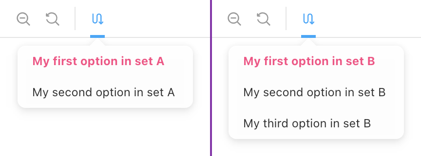
/** Defines the possible sets that can be shown */
sets: [
{
id: 'set-a',
options: [
{ id: 'a1', title: 'My First Option in Set A' },
{ id: 'a2', title: 'My Second Option in Set B' },
],
},
{
id: 'set-b',
options: [{ id: 'b1', title: 'Set B Option 1' }, { id: 'b2' }],
},
],
/** Icon to use in toolbar, defaults to `switchalt`. All possible icons here: https://storybookjs.netlify.app/official-storybook/?path=/story/basics-icon--labels */
icon: 'redirect',
/** title when hovering over the icon */
title: 'Test title',
/** Setting disable to true makes the addon disabled by default */
// disable: true,
},
};
在你的故事中使用 customConditionalToolbar 参数来定义是否使用以及使用哪个集合
export const MyStory = Template.bind({});
MyStory.parameters = {
  customConditionalToolbar: {
    setToUse: 'set-b',
    defaultOption: 'b2',
  },
};
预览参数 API(全局)
{
  /** Title for the toolbar icon - (Optional) */
  title?: string;

  /** Icon to use in toolbar, defaults to `switchalt`. All possible icons here: https://storybookjs.netlify.app/official-storybook/?path=/story/basics-icon--labels - (Optional) */
  icon?: IconsProps["icon"];

  /** Sets of dropdown options */
  sets: DropdownSet[];

  /** Default set to use `null | undefined` do disable theme selection if not explicitly set - (Optional) */
  default?: string | null;

  /** If nothing is selected the first option is auto-selected - defaults to `true` - (Optional)*/
  autoSelectFirstOption?: boolean;

  /** If `true` toolbar item is disabled (hidden) - (Optional) */
  disable?: boolean;
};
Typescript 类型 ConditionalToolbarSelectorParameter
故事参数 API(每个故事)
预览参数 API(全局)提供的所有选项(全部可选),外加以下选项
{
  /** Set to pick the theme from - (Optional)*/
  setToUse?: string | null;

  /** default option to select - (Optional) */
  defaultOption?: string | null;
}
Typescript 类型 CustomConditionalToolbarStoryParameter
使用
注意事项
- 每个集合的选择会跨故事持久化,直到刷新/重新加载 Storybook
- 如果需要,默认值和回退值需要手动设置(示例)
- 所有示例均使用 React,但理论上应适用于所有框架
