集成Material UI与 Storybook
1. 添加 @storybook/addon-themes
要开始,您需要安装 @storybook/addon-themes。
运行以下脚本来安装并注册该插件
npx storybook@latest add @storybook/addon-themes配置脚本失败了吗?
在后台,这会运行 npx @storybook/auto-config themes,它会读取您的项目并尝试使用正确的装饰器配置您的 Storybook。如果直接运行该命令不能解决您的问题,请在 @storybook/auto-config 仓库中提交 bug,以便我们进一步改进。要手动添加此插件,请先安装它,然后在您 .storybook/main.ts 的插件数组中添加它。
2. 打包字体和图标以提高性能
Material UI 依赖两种字体来正常渲染:Google 的 Roboto 和 Material Icons。虽然您可以直接从 Google Fonts CDN 加载这些字体,但将字体与 Storybook 打包可以提高性能。
- 🏎️ 字体加载更快,因为它们与您的应用来自同一来源
- ✈️ 字体将离线加载,因此您可以在任何地方继续开发您的故事
- 📸 不再有不一致的快照测试,因为字体可以立即加载
要开始,请将字体安装为依赖项。
yarn add @fontsource/roboto @fontsource/material-icons然后将 CSS 文件导入到 .storybook/preview.js 中,这是您的 Storybook 的入口点。
// .storybook/preview.js

import '@fontsource/roboto/300.css';
import '@fontsource/roboto/400.css';
import '@fontsource/roboto/500.css';
import '@fontsource/roboto/700.css';
import '@fontsource/material-icons';
3. 加载您的主题和全局 CSS
在 .storybook/preview.js 中,导入 <CssBaseline />、<ThemeProvider /> 和您的主题,然后使用 withThemeFromJSXProvider 装饰器将它们应用于您的故事,方法是将其添加到 decorators 数组中。
// .storybook/preview.js

import { CssBaseline, ThemeProvider } from '@mui/material';
import { withThemeFromJSXProvider } from '@storybook/addon-themes';
import { lightTheme, darkTheme } from '../src/themes.js';

/* snipped for brevity */

export const decorators = [
  withThemeFromJSXProvider({
    themes: {
      light: lightTheme,
      dark: darkTheme,
    },
    defaultTheme: 'light',
    Provider: ThemeProvider,
    GlobalStyles: CssBaseline,
  }),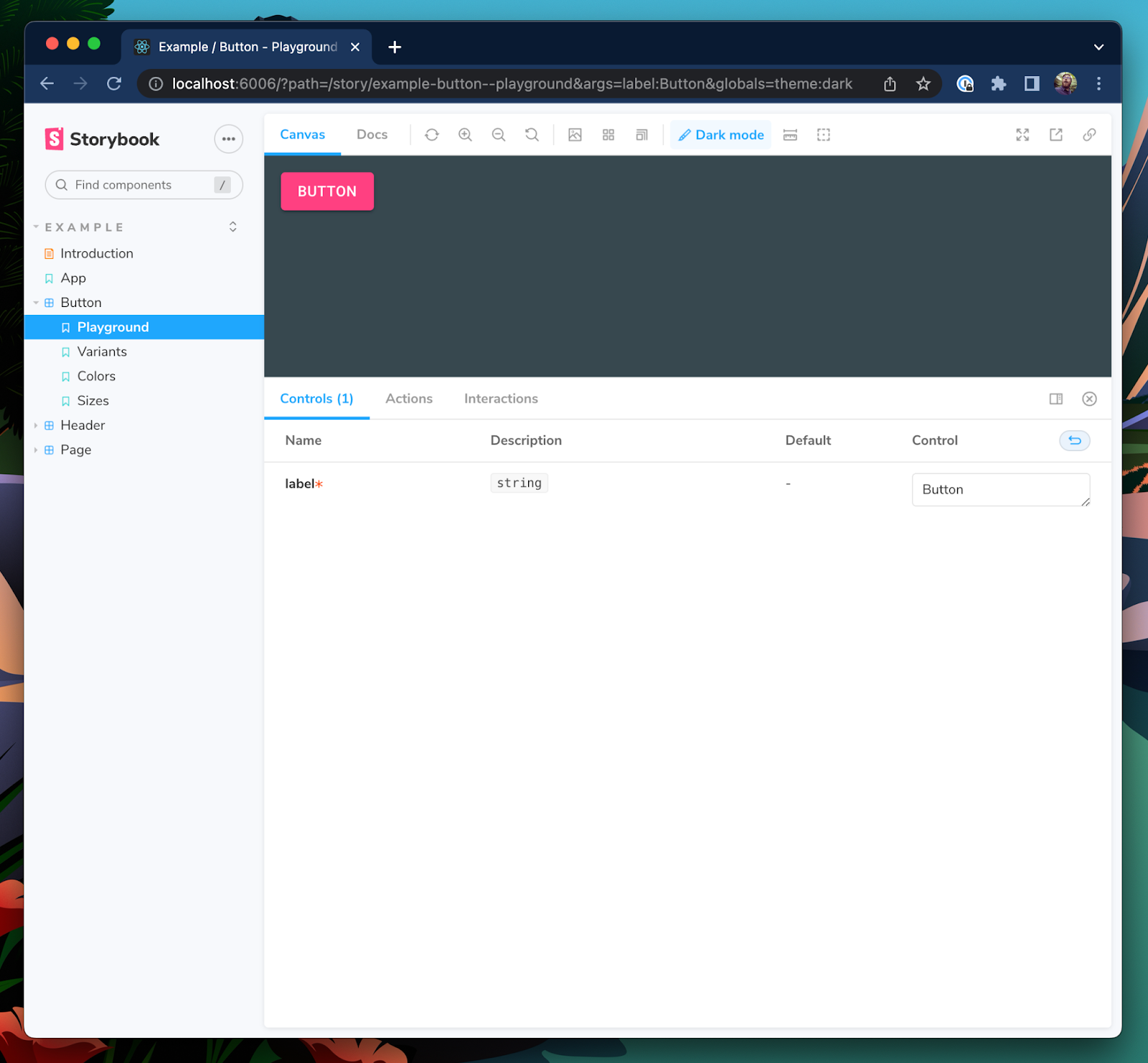
];当您提供多个主题时,Storybook UI 中将出现一个工具栏菜单,用于选择您想要为故事使用的主题。
4. 使用 Material UI prop types 以获得更好的控件和文档
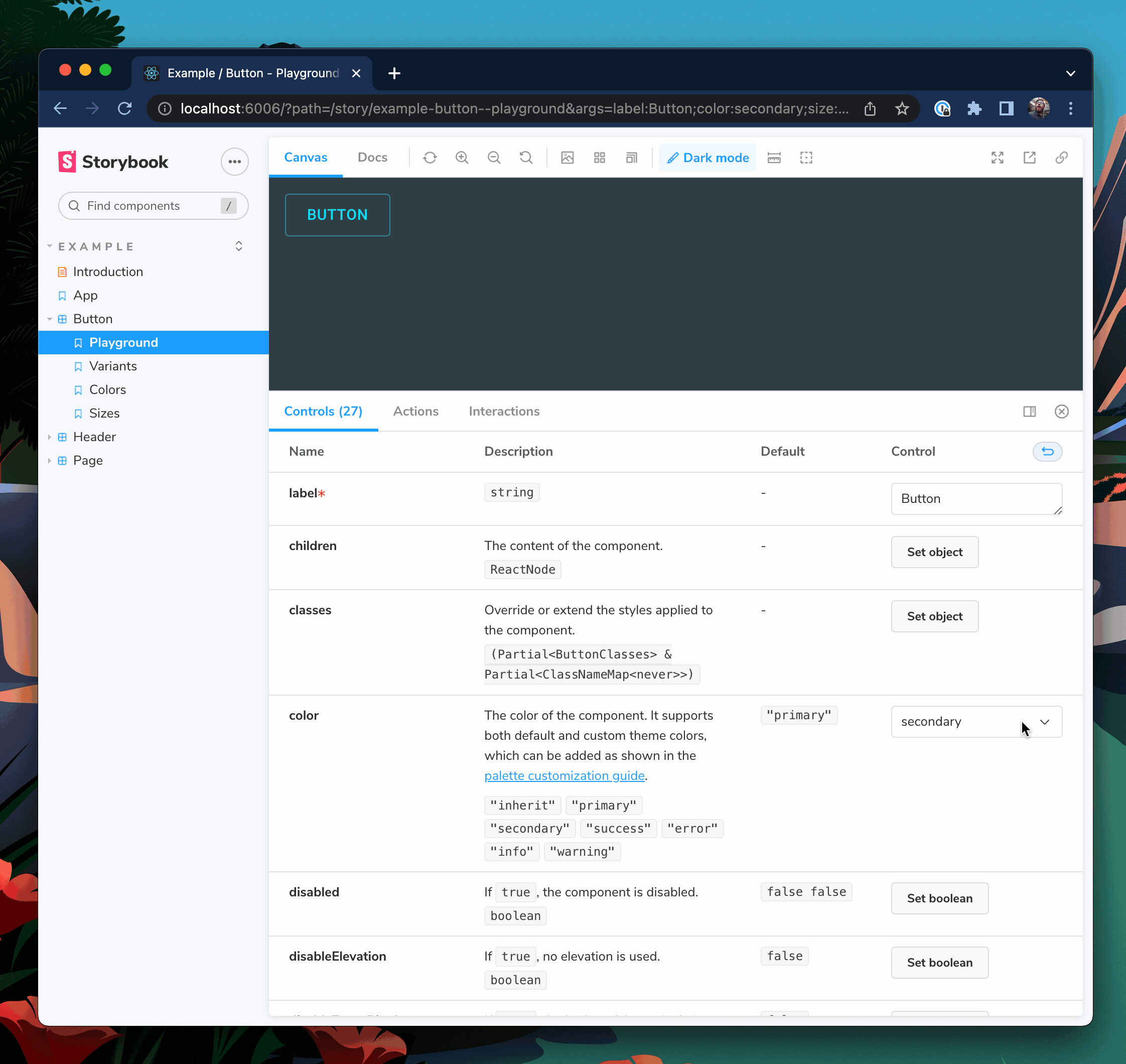
Storybook 控件为您提供了图形化控件来操作组件的 props。它们在查找组件的边缘情况和在浏览器中原型设计时非常有用。
通常,您需要手动配置控件。但如果您使用 Typescript,您可以重用 Material UI 的组件 prop types 来自动生成故事控件。作为额外的好处,这还将自动填充您文档选项卡中的 props 表。
以下面的 Button 组件为例。
// button.component.tsx

import React from 'react';
import { Button as MuiButton } from '@mui/material';

export interface ButtonProps {
  label: string;
}

export const Button = ({ label, ...rest }: ButtonProps) => <MuiButton {...rest}>{label}</MuiButton>;
在这里,我使用 label prop 作为 MuiButton 的子元素,并将所有其他 props 传递下去。但是,当我们将其渲染到 Storybook 中时,我们的控件面板只允许我们更改我们自己声明的 label prop。
这是因为 Storybook 只会将显式声明在组件 prop types 或 Story Args 中的 props 添加到控件表中。让我们更新 Storybook 的 Docgen 配置,将 Material UI 的 Button props 也引入到控件表中。
// .storybook/main.ts

module.exports = {
  stories: ['../src/**/*.mdx', '../src/**/*.stories.@(js|jsx|ts|tsx)'],
  addons: ['@storybook/addon-essentials', '@storybook/addon-styling'],
  framework: '@storybook/your-framework',
  typescript: {
    reactDocgen: 'react-docgen-typescript',
    reactDocgenTypescriptOptions: {
      // Speeds up Storybook build time
      compilerOptions: {
        allowSyntheticDefaultImports: false,
        esModuleInterop: false,
      },
      // Makes union prop types like variant and size appear as select controls
      shouldExtractLiteralValuesFromEnum: true,
      // Makes string and boolean types that can be undefined appear as inputs and switches
      shouldRemoveUndefinedFromOptional: true,
      // Filter out third-party props from node_modules except @mui packages
      propFilter: (prop) =>
        prop.parent
          ? !/node_modules\/(?!@mui)/.test(prop.parent.fileName)
          : true,
    },
  },
};
我们还想更新 .storybook/preview.js 中的参数,以便为控件表显示描述和默认列。
// .storybook/preview.js

export const parameters = {
  actions: { argTypesRegex: '^on[A-Z].*' },
  controls: {
    expanded: true, // Adds the description and default columns
    matchers: {
      color: /(background|color)$/i,
      date: /Date$/,
    },
  },
};
最后,更新 ButtonProps 类型以扩展 Material UI 的 Button props,从而将所有这些 props 添加到控件中。
// button.component.tsx

import React from 'react';
import {
  Button as MuiButton,
  ButtonProps as MuiButtonProps,
} from '@mui/material';

export interface ButtonProps extends MuiButtonProps {
  label: string;
}

export const Button = ({ label, ...rest }: ButtonProps) => (
  <MuiButton {...rest}>{label}</MuiButton>
);
重新启动您的 Storybook 服务器,以使这些配置更改生效。您现在应该可以看到 Button 具有 MuiButton 的所有 props 的控件。
选择可见的控件
我们的 Button 现在有 **27 个 props**,这对于您的用例来说可能有点太多了。要控制可见的 props,我们可以使用 TypeScript 的 Pick<type, keys> 和 Omit<type, keys> 工具。
// button.component.tsx

import React from 'react';
import {
  Button as MuiButton,
  ButtonProps as MuiButtonProps,
} from '@mui/material';

// Only include variant, size, and color
type ButtonBaseProps = Pick<MuiButtonProps, 'variant' | 'size' | 'color'>;

// Use all except disableRipple
// type ButtonBaseProps = Omit<MuiButtonProps, "disableRipple">;

export interface ButtonProps extends ButtonBaseProps {
  label: string;
}

export const Button = ({ label, ...rest }: ButtonProps) => (
  <MuiButton {...rest}>{label}</MuiButton>
);
现在,我们的 Button 将只从 MuiButton 中获取 variant、size 和 color props。
📣 感谢 Eric Mudrak 的精彩 Storybook with React & TypeScript 文章,它启发了这个技巧。
- shaunlloyd
