
Material UI 在 Storybook 中
充分利用 Material UI 和 Storybook 的三个技巧

Material UI (MUI) 基于Google的Material Design语言,提供了一套可主题化的组件,您可以直接使用它们来构建UI。通过在Storybook中隔离开发UI,您可以更快地开始。以下是如何配置Storybook来加载Material UI组件并与MUI的API进行动态交互。
- 📦 打包字体以实现快速一致的渲染
- 🎨 加载自定义主题并添加主题切换器
- ♻️ 重用Material UI类型以自动生成故事控件
开始构建
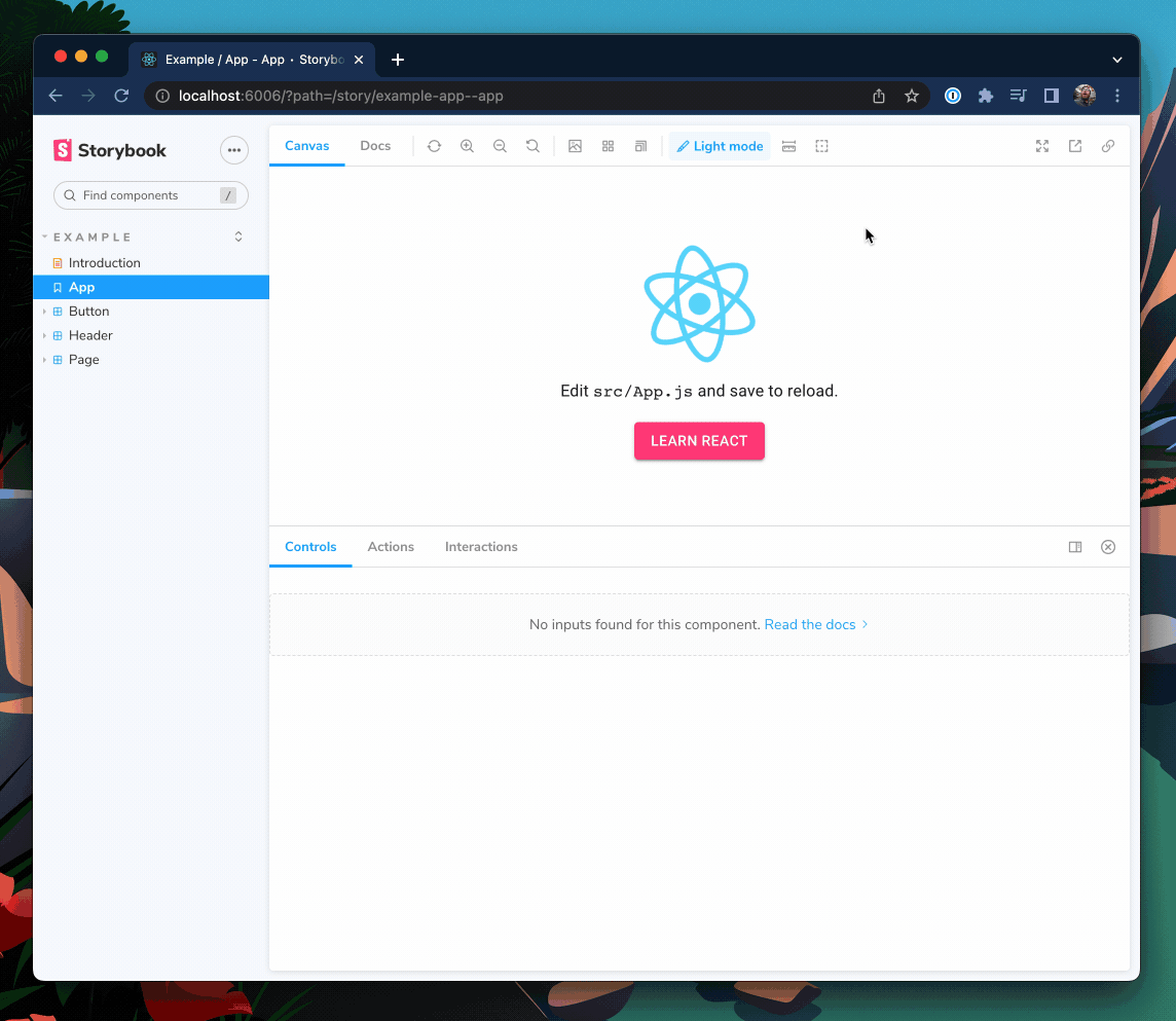
本食谱假设您已经设置了一个使用@mui/material包的React应用程序,并且已安装Storybook 6.0或更高版本。如果您还没有准备好的项目,请克隆我的示例存储库进行跟随。
打包字体和图标以获得更好的性能
Material UI依赖于两种字体才能按预期渲染:Google的Roboto和Material Icons。虽然您可以直接从Google Fonts CDN加载这些字体,但将字体与Storybook一起打包对性能更好。
- 🏎️ 字体加载速度更快,因为它们与您的应用程序来自同一个地方
- ✈️ 字体将在离线时加载,这样您就可以在任何地方继续开发您的故事
- 📸 不再出现不一致的快照测试,因为字体会立即加载
要开始,请将字体安装为依赖项
yarn add @fontsource/roboto @fontsource/material-icons然后将CSS文件导入.storybook/preview.js,这是您的Storybook的入口点
// .storybook/preview.js

import '@fontsource/roboto/300.css';
import '@fontsource/roboto/400.css';
import '@fontsource/roboto/500.css';
import '@fontsource/roboto/700.css';
import '@fontsource/material-icons';
加载自定义主题并添加主题切换器
Material UI开箱即用地带有默认主题,但您也可以创建并提供自己的主题。考虑到暗模式的流行,您很可能会有多个自定义主题。让我们看看如何加载自定义主题并通过单击即可在它们之间切换。
例如,来看这个自定义暗模式主题
// src/themes/dark.theme.js

import { createTheme } from "@mui/material";
import { blueGrey, cyan, pink } from "@mui/material/colors";

export const darkTheme = createTheme({
  palette: {
    mode: "dark",
    primary: {
      main: pink["A200"],
    },
    secondary: {
      main: cyan["A400"],
    },
    background: {
      default: blueGrey["800"],
      paper: blueGrey["700"],
    },
  },
});
为了将自定义主题应用于我们的故事,我们需要使用Material UI的ThemeProvider将其包装在装饰器中
// .storybook/preview.js

import { CssBaseline, ThemeProvider } from "@mui/material";
import { darkTheme } from "../src/themes/dark.theme";

/* snipped for brevity */

export const withMuiTheme = (Story) => (
  <ThemeProvider theme={darkTheme}>
    <CssBaseline />
    <Story />
  </ThemeProvider>
);

export const decorators = [withMuiTheme];太棒了!现在当Storybook重新加载时,您会看到我们的withMuiTheme装饰器正在提供我们的自定义暗主题。
使用globalTypes添加主题切换器
为了让这个装饰器更进一步,让我们添加一种在多个主题之间切换的方式。
为此,我们可以在.storybook/preview.js中声明一个名为theme的全局变量,并为其提供一个支持的主题列表供选择。
// .storybook/preview.js

export const globalTypes = {
  theme: {
    name: "Theme",
    title: "Theme",
    description: "Theme for your components",
    defaultValue: "light",
    toolbar: {
      icon: "paintbrush",
      dynamicTitle: true,
      items: [
        { value: "light", left: "☀️", title: "Light mode" },
        { value: "dark", left: "🌙", title: "Dark mode" },
      ],
    },
  },
};
现在我们可以更新我们的装饰器,以提供在新下拉菜单中选择的主题。
// .storybook/preview.js

import { useMemo } from "react";

/* Snipped for brevity */

// Add your theme configurations to an object that you can
// pull your desired theme from.
const THEMES = {
  light: lightTheme,
  dark: darkTheme,
};

export const withMuiTheme = (Story, context) => {
  // The theme global we just declared
  const { theme: themeKey } = context.globals;

  // only recompute the theme if the themeKey changes
  const theme = useMemo(() => THEMES[themeKey] || THEMES["light"], [themeKey]);

  return (
    <ThemeProvider theme={theme}>
      <CssBaseline />
      <Story />
    </ThemeProvider>
  );
};
现在,我们拥有了一个功能齐全的MaterialUI Storybook主题切换器。如果您想了解更多关于切换器的信息,请查看Yann Braga关于添加主题切换器的文章。
使用Material UI属性类型以获得更好的控件和文档
Storybook控件提供图形化控件来操作组件的属性。它们对于发现组件的边缘情况和在浏览器中进行原型设计非常有用。
通常,您需要手动配置控件。但如果您使用的是TypeScript,您可以重用Material UI的组件属性类型来自动生成故事控件。此外,这还将自动填充您的文档选项卡中的属性表。
以下面的Button组件为例。
// button.component.tsx

import React from 'react';
import { Button as MuiButton } from '@mui/material';

export interface ButtonProps {
  label: string;
}

export const Button = ({ label, ...rest }: ButtonProps) => (
  <MuiButton {...rest}>{label}</MuiButton>
);这里我使用label属性作为MuiButton的子项,并将所有其他属性传递下去。但是,当我们将它渲染到Storybook中时,我们的控件面板只允许我们更改我们自己声明的label属性。
这是因为Storybook只将属性添加到控件表中,这些属性明确声明在组件的属性类型或Story Args中。让我们更新Storybook的Docgen配置,将Material UI的Button属性也带入控件表中。
// .storybook/main.ts

module.exports = {
  stories: ["../src/**/*.stories.mdx", "../src/**/*.stories.@(js|jsx|ts|tsx)"],
  addons: [
    "@storybook/addon-links",
    "@storybook/addon-essentials",
    "@storybook/addon-interactions",
    "@storybook/preset-create-react-app",
  ],
  framework: "@storybook/react",
  core: {
    builder: "@storybook/builder-webpack5",
  },
  typescript: {
    check: false,
    checkOptions: {},
    reactDocgen: "react-docgen-typescript",
    reactDocgenTypescriptOptions: {
      // speeds up storybook build time
      allowSyntheticDefaultImports: false,
      // speeds up storybook build time
      esModuleInterop: false,
      // makes union prop types like variant and size appear as select controls
      shouldExtractLiteralValuesFromEnum: true,
      // makes string and boolean types that can be undefined appear as inputs and switches
      shouldRemoveUndefinedFromOptional: true,
      // Filter out third-party props from node_modules except @mui packages
      propFilter: (prop) =>
        prop.parent
          ? !/node_modules\/(?!@mui)/.test(prop.parent.fileName)
          : true,
    },
  },
};
我们还想更新.storybook/preview.js中的参数,以便在控件表中显示描述和默认列。
// .storybook/preview.js

export const parameters = {
  actions: { argTypesRegex: "^on[A-Z].*" },
  controls: {
    expanded: true, // Adds the description and default columns
    matchers: {
      color: /(background|color)$/i,
      date: /Date$/,
    },
  },
}
最后,更新ButtonProps类型以扩展Material UI的Button属性,将所有这些属性添加到控件中。
// button.component.tsx

import React from "react";
import {
  Button as MuiButton,
  ButtonProps as MuiButtonProps,
} from "@mui/material";

export interface ButtonProps extends MuiButtonProps {
  label: string;
}

export const Button = ({ label, ...rest }: ButtonProps) => (
  <MuiButton {...rest}>{label}</MuiButton>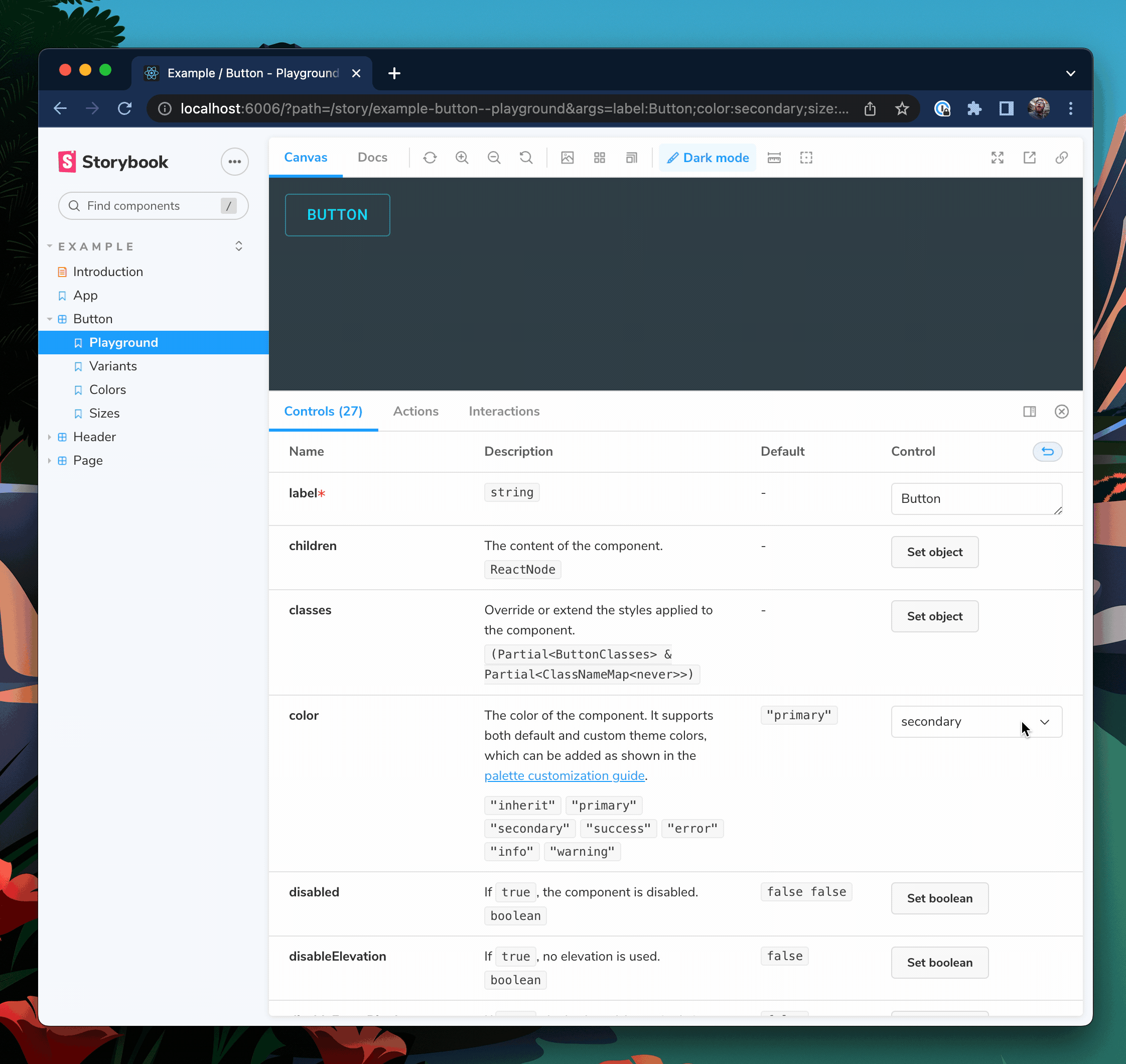
);重启您的Storybook服务器,以便这些配置更改生效。您现在应该会看到Button具有MuiButton所有属性的控件。
选择可见的控件
我们的按钮现在有27个属性,这可能对您的用例来说有点多。要控制哪些属性可见,我们可以使用TypeScript的Pick<type, keys>和Omit<type, keys>实用工具。
// button.component.tsx

import React from "react";
import {
  Button as MuiButton,
  ButtonProps as MuiButtonProps,
} from "@mui/material";

// Only include variant, size, and color
type ButtonBaseProps = Pick<MuiButtonProps, "variant" | "size" | "color">;

// Use all except disableRipple
// type ButtonBaseProps = Omit<MuiButtonProps, "disableRipple">;

export interface ButtonProps extends ButtonBaseProps {
  label: string;
}

export const Button = ({ label, ...rest }: ButtonProps) => (
  <MuiButton {...rest}>{label}</MuiButton>
);现在,我们的Button将只从MuiButton中获取variant、size和color属性。
📣 感谢Eric Mudrak的精彩Storybook与React和TypeScript文章,它启发了这个技巧。
总结
Material UI提供了很多功能——广泛的组件、强大的主题引擎和图标系统。与其重新发明轮子,不如利用这些构建块快速启动。通过一些配置调整,您的Storybook可以解锁Material UI的全部潜力。
可以使用Storybook装饰器提供自定义Material UI主题,并通过添加一个工具栏项,您可以切换多个主题。这使得在构建应用程序时,可以轻松地切换主题并验证UI的外观和感觉。此外,重用Material UI的TypeScript类型,可以免费为您的故事生成动态控件和文档。
如果您正在寻找我在这里介绍的内容的代码示例,请查看我在GitHub上的storybook-mui-example存储库。如果您正在寻找一个可以为您处理主题的Storybook插件,请查看由了不起的社区成员Usulpro和Smartlight开发的React Theming Addon。
您想看什么?
我们希望听到您的声音!
您喜欢这个食谱吗?您还想看其他Storybook集成食谱吗?
在@storybookjs上发推文,或在Storybook Discord服务器上联系我们!我们迫不及待地想见到您🤩
📦 打包字体和图标以获得更好的性能。为什么?
— Storybook (@storybookjs) 2022年10月6日
🏎️ 字体加载速度更快 因为它们与您的应用程序来自同一个地方
✈️ 字体将在离线时加载 这样您就可以在任何地方继续开发您的故事
📸 不再出现不一致的快照测试 因为字体会立即加载
2/ pic.twitter.com/gPuXx8q4Vt