
如何为 Storybook 添加主题切换器
通过将故事连接到装饰器和工具栏项,学习如何控制故事的渲染方式

主题控制 UI 的视觉特征——调色板、排版、空白、边框样式、阴影、圆角等。主题越来越受欢迎,因为应用程序需要支持多种颜色模式和品牌要求。
但主题开发可能很繁琐。你必须跟踪应用程序中无数的状态,然后乘以你支持的主题数量。同时不断地在主题之间来回切换,以检查 UI 是否看起来正确。
使用 Storybook,你可以控制哪个主题应用于你的组件,并通过工具栏点击在不同主题之间切换。本文将向你展示如何做到。
- 🎁 使用装饰器将主题对象传递给你的组件
- 🎛 从工具栏或使用故事参数动态切换主题
- 🖍 自动更新故事背景以匹配主题
- 🍱 在一个故事中并排渲染多个主题
我们正在构建什么?
与作为组件输入传入的数据不同,主题通过上下文提供或全局配置为 CSS 变量。
我们将构建一个主题切换工具,它允许你将主题对象提供给 Storybook 中的所有组件。你将能够通过参数或工具栏中的按钮控制哪个主题处于活动状态。
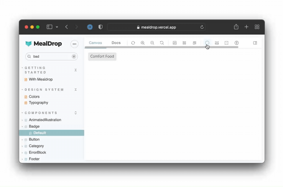
我们将使用这个 Badge 组件进行演示——来自 Mealdrop 应用——使用 React 和 styled-components 构建。
它使用主题对象中的变量来设置边框圆角、背景和颜色值。主题对象使用上下文 API 传递到组件中。
// src/components/Badge/Badge.tsx
import styled, { css } from 'styled-components'

import { Body } from '../typography'

const Container = styled.div(
  ({ theme }) => css`
    padding: 3px 8px;
    background: ${theme.color.badgeBackground};
    border-radius: ${theme.borderRadius.xs};
    display: inline-block;
    text-transform: capitalize;
    span {
      color: ${theme.color.badgeText};
    }
  `
)

type BadgeProps = {
  text: string
  className?: string
}

export const Badge = ({ text, className }: BadgeProps) => (
  <Container className={className}>
    <Body type="span" size="S">
      {text}
    </Body>
  </Container>
)
克隆仓库
让我们开始吧!克隆仓库,安装依赖项,并跟随操作。
# Clone the template
npx degit yannbf/mealdrop#theme-switcher-base mealdrop

cd mealdrop

# Install dependencies
yarn
使用装饰器为组件提供主题
第一步是为我们的组件提供主题。我们将使用装饰器来实现,它将用 ThemeProvider 包裹每个故事,并传入 lightTheme 对象。
装饰器是 Storybook 的一种机制,允许你通过额外的渲染功能来增强故事。例如,你可以提供组件依赖的上下文或其他全局配置。
让我们将 withTheme 装饰器添加到 .storybook/preview.tsx 文件中。
// .storybook/preview.tsx
import { ThemeProvider } from 'styled-components'
import { DecoratorFn } from '@storybook/react'

import { GlobalStyle } from '../src/styles/GlobalStyle'
import { lightTheme } from '../src/styles/theme'

const withTheme: DecoratorFn = (StoryFn) => {
  return (
    <ThemeProvider theme={lightTheme}>
      <GlobalStyle />
      <StoryFn />
    </ThemeProvider>
  )
}

// export all decorators that should be globally applied in an array
export const decorators = [withTheme]
在 .storybook/preview.js|tsx 文件中定义的装饰器是全局的。也就是说,它们将应用于你的所有故事。因此,这也是加载这些组件使用的 GlobalStyle 的绝佳位置。
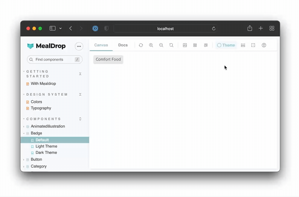
运行 yarn storybook 启动 Storybook,你应该会看到 Badge 组件在应用了 light 主题后正常渲染。
通过参数设置活动主题
目前,我们的 withTheme 装饰器只为组件提供了 light 主题。为了测试 light 和 dark 两种模式,我们需要在它们之间动态切换。我们可以使用 参数 来指定要启用哪个主题。
参数是你可以附加到故事或组件的元数据。然后 withTheme 装饰器可以从 故事上下文 对象访问它们并应用适当的主题。
更新你的装饰器以读取主题参数
// .storybook/preview.tsx
import { ThemeProvider } from 'styled-components'
import { DecoratorFn } from '@storybook/react'

import { GlobalStyle } from '../src/styles/GlobalStyle'
import { darkTheme, lightTheme } from '../src/styles/theme'

const withTheme: DecoratorFn = (StoryFn, context) => {
  // Get the active theme value from the story parameter
  const { theme } = context.parameters
  const storyTheme = theme === 'dark' ? darkTheme : lightTheme
  return (
    <ThemeProvider theme={storyTheme}>
      <GlobalStyle />
      <StoryFn />
    </ThemeProvider>
  )
}

export const decorators = [withTheme]
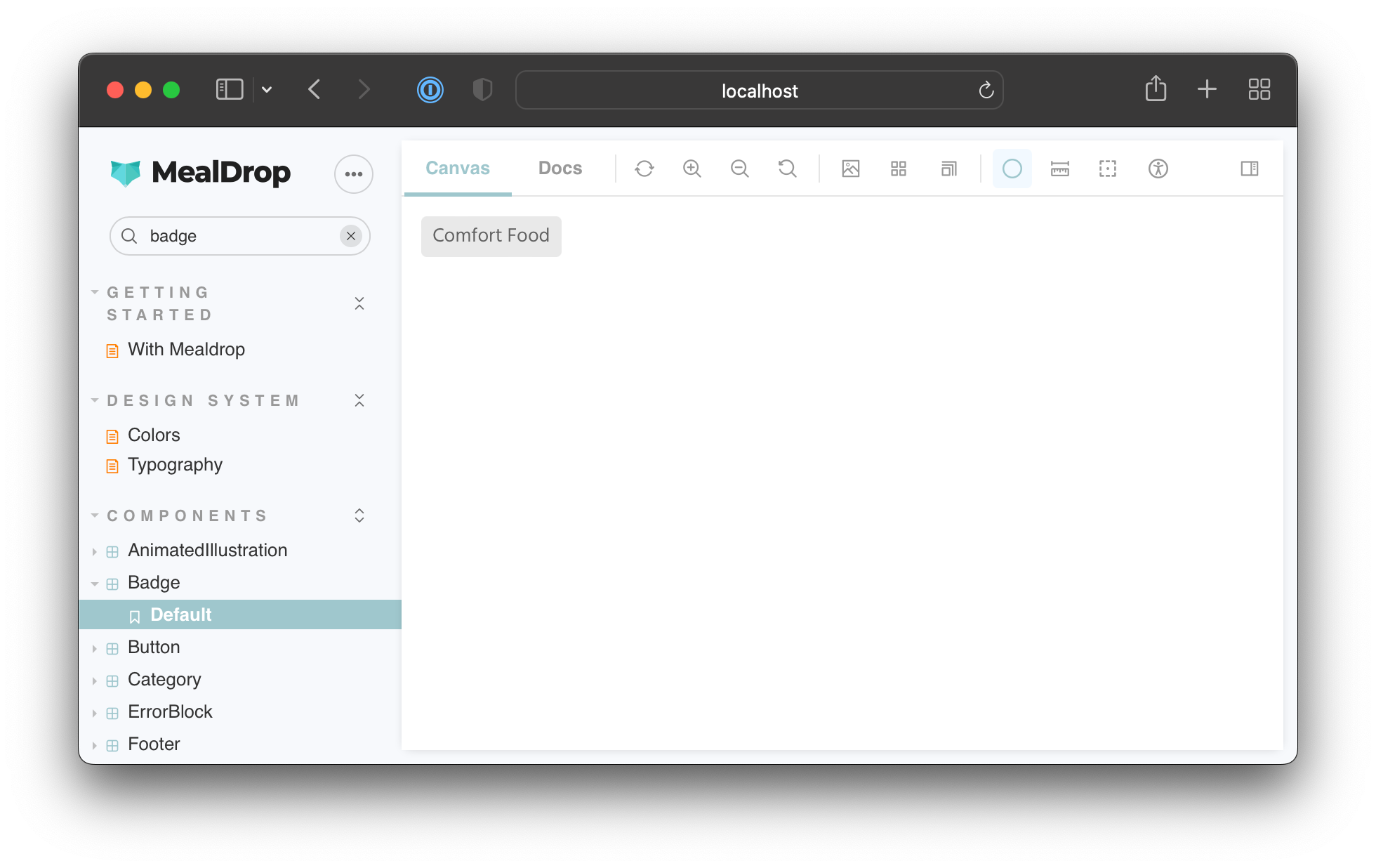
为组件编写故事时,你可以使用参数选择要应用的主题。就像这样
// src/components/Badge/Badge.stories.tsx
import { ComponentStory, ComponentMeta } from '@storybook/react'
import { Badge } from './Badge'

export default {
  title: 'Components/Badge',
  component: Badge,
} as ComponentMeta<typeof Badge>

const Template: ComponentStory<typeof Badge> = (args) => <Badge {...args} />

export const Default = Template.bind({})
Default.args = {
  text: 'Comfort food',
}

export const LightTheme = Template.bind({})
LightTheme.args = Default.args
LightTheme.parameters = {
  theme: 'light',
}

export const DarkTheme = Template.bind({})
DarkTheme.args = Default.args
DarkTheme.parameters = {
  theme: 'dark',
}
切换回你的 Storybook,你会注意到当你在这两个故事之间导航时,主题会更新。
太好了!这使我们可以灵活地为每个故事设置主题。
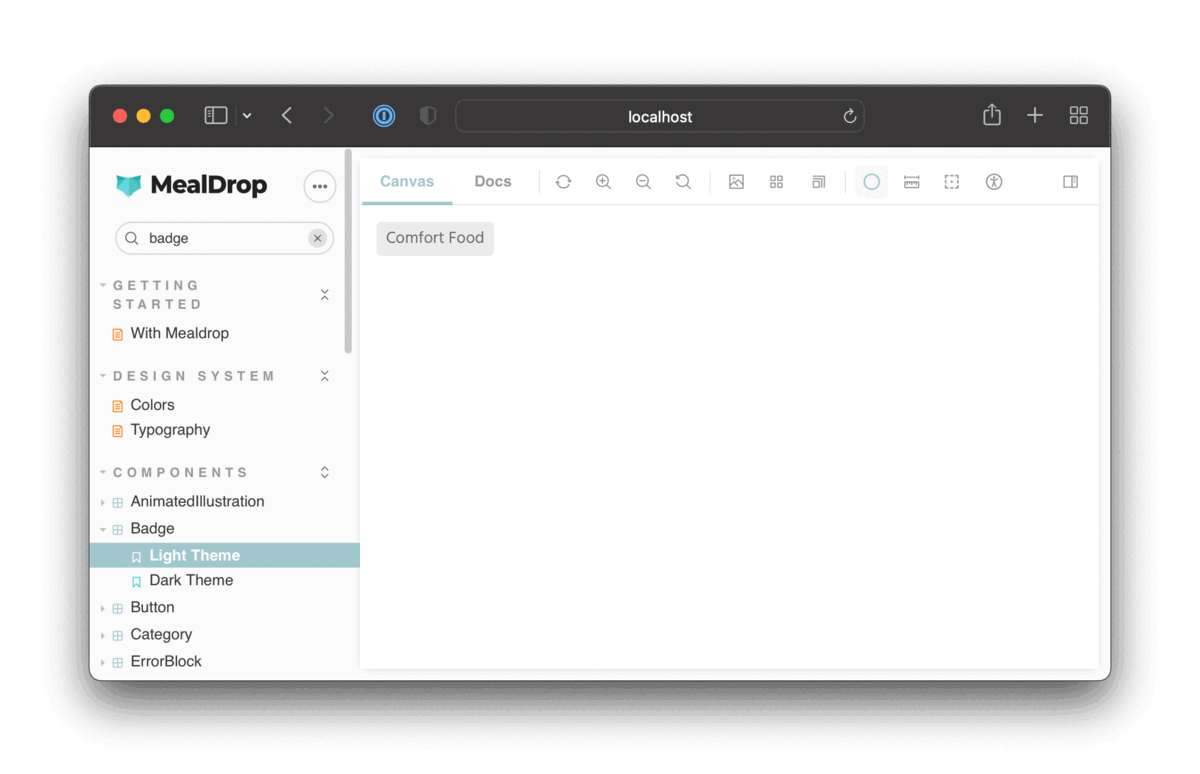
切换背景颜色以匹配主题
这是一个很好的开始。我们可以灵活地控制每个故事的主题。但是,背景保持不变。让我们更新装饰器,使故事的背景颜色与活动主题匹配。
我们现在正在用一个 ThemeBlock 组件包裹每个故事,该组件根据活动主题控制背景颜色。
// .storybook/preview.tsx
import React from 'react'
import styled, { css, ThemeProvider } from 'styled-components'
import { DecoratorFn } from '@storybook/react'

import { GlobalStyle } from '../src/styles/GlobalStyle'
import { darkTheme, lightTheme } from '../src/styles/theme'
import { breakpoints } from '../src/styles/breakpoints'

const ThemeBlock = styled.div<{ left?: boolean; fill?: boolean }>(
  ({ left, fill, theme }) =>
    css`
      position: absolute;
      top: 0;
      left: ${left || fill ? 0 : '50vw'};
      border-right: ${left ? '1px solid #202020' : 'none'};
      right: ${left ? '50vw' : 0};
      width: ${fill ? '100vw' : '50vw'};
      height: 100vh;
      bottom: 0;
      overflow: auto;
      padding: 1rem;
      background: ${theme.color.screenBackground};
      ${breakpoints.S} {
        left: ${left ? 0 : '50vw'};
        right: ${left ? '50vw' : 0};
        padding: 0 !important;
      }
    `
)

export const withTheme: DecoratorFn = (StoryFn, context) => {
  // Get values from story parameter first
  const { theme } = context.parameters
  const storyTheme = theme === 'dark' ? darkTheme : lightTheme
  return (
    <ThemeProvider theme={storyTheme}>
      <GlobalStyle />
      <ThemeBlock fill>
        <StoryFn />
      </ThemeBlock>
    </ThemeProvider>
  )
}

export const decorators = [withTheme]
现在,当你在这两个故事之间切换时,主题和背景颜色都会更新。

从工具栏切换主题
通过参数硬编码主题只是一种选择。我们还可以自定义 Storybook UI,添加一个下拉菜单,允许我们切换活动主题。
Storybook 自带 toolbars 插件,让你能够定义一个全局值并将其连接到工具栏中的菜单。
要创建一个 工具栏项 来控制活动主题,我们需要在 .storybook/preview.tsx 文件中添加一个 globalTypes 对象
// .storybook/preview.tsx

// ...code ommited for brevity...

export const withTheme: DecoratorFn = (StoryFn, context) => {
  // Get values from story parameter first, else fallback to globals
  const theme = context.parameters.theme || context.globals.theme
  const storyTheme = theme === 'dark' ? darkTheme : lightTheme
  return (
    <ThemeProvider theme={storyTheme}>
      <GlobalStyle />
      <ThemeBlock fill>
        <StoryFn />
      </ThemeBlock>
    </ThemeProvider>
  )
}

export const globalTypes = {
  theme: {
    name: 'Theme',
    description: 'Global theme for components',
    defaultValue: 'light',
    toolbar: {
      // The icon for the toolbar item
      icon: 'circlehollow',
      // Array of options
      items: [
        { value: 'light', icon: 'circlehollow', title: 'light' },
        { value: 'dark', icon: 'circle', title: 'dark' },
      ],
      // Property that specifies if the name of the item will be displayed
      showName: true,
    },
  },
}

export const decorators = [withTheme]
我们还更新了 withTheme 装饰器,使其首先从参数中获取主题值,如果未定义,则回退到全局值。
你现在应该会看到一个用于切换主题的工具栏项。
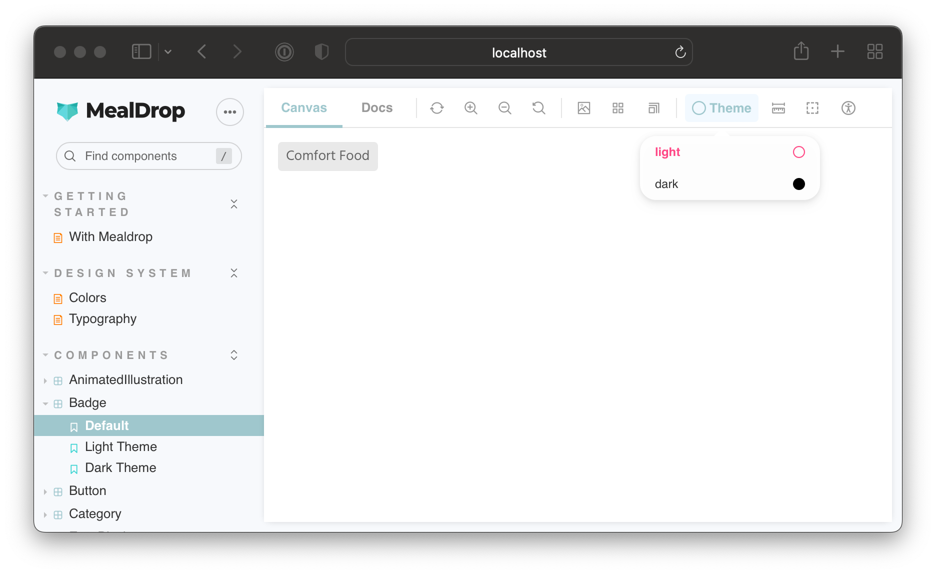
对于未指定主题参数的 Default 故事,你可以使用工具栏切换主题。但是,LightTheme 和 DarkTheme 故事将始终强制执行通过主题参数设置的值。
并排渲染主题
有时候,如果你能一次性看到组件的所有主题变体,工作起来会更容易。猜猜怎么着?你可以在一个装饰器中多次渲染故事,并为每个实例提供不同的主题对象。
更新 withTheme 装饰器和 globalTypes,添加“并排”模式
// .storybook/preview.tsx

// ...code ommited for brevity...

export const withTheme: DecoratorFn = (StoryFn, context) => {
  // Get values from story parameter first, else fallback to globals
  const theme = context.parameters.theme || context.globals.theme
  const storyTheme = theme === 'light' ? lightTheme : darkTheme

  switch (theme) {
    case 'side-by-side': {
      return (
        <>
          <ThemeProvider theme={lightTheme}>
            <GlobalStyle />
            <ThemeBlock left>
              <StoryFn />
            </ThemeBlock>
          </ThemeProvider>
          <ThemeProvider theme={darkTheme}>
            <GlobalStyle />
            <ThemeBlock>
              <StoryFn />
            </ThemeBlock>
          </ThemeProvider>
        </>
      )
    }
    default: {
      return (
        <ThemeProvider theme={storyTheme}>
          <GlobalStyle />
          <ThemeBlock fill>
            <StoryFn />
          </ThemeBlock>
        </ThemeProvider>
      )
    }
  }
}

export const globalTypes = {
  theme: {
    name: 'Theme',
    description: 'Theme for the components',
    defaultValue: 'light',
    toolbar: {
      // The icon for the toolbar item
      icon: 'circlehollow',
      // Array of options
      items: [
        { value: 'light', icon: 'circlehollow', title: 'light' },
        { value: 'dark', icon: 'circle', title: 'dark' },
        { value: 'side-by-side', icon: 'sidebar', title: 'side by side' },
      ],
      // Property that specifies if the name of the item will be displayed
      showName: true,
    },
  },
}

export const decorators = [withTheme]
最终结果如下
并排模式对于使用 Chromatic 等工具进行视觉回归测试也非常方便。你可以通过参数启用它,一次性测试组件所有基于主题的变体。
结论
构建 UI 时,你必须考虑应用程序状态、区域设置、视口大小、主题等无数排列组合。Storybook 使测试 UI 变体变得容易。你可以使用数百种 插件 之一,或自定义 Storybook 以满足你的需求。

装饰器 使你能够完全控制故事渲染,并允许你设置提供者并使用参数或通过将其连接到工具栏项来控制它们的行为。切换主题只是这项技术的一个应用。你可以使用它来添加语言切换器或管理多租户配置的菜单。
你可以在 Mealdrop Storybook 中看到主题切换器的实际效果,并在 Github 上浏览其源代码。

本教程最初是我课程 Storybook for React Apps 的一个章节。它涵盖了从核心 Storybook 概念到更高级的工作流程,例如在 Storybook 中添加页面、模拟 API 请求、将故事连接到 Figma、测试可访问性等等。
使用 Storybook 开发主题?了解如何添加一个方便强大的主题切换器。
— Storybook (@storybookjs) June 22, 2022
⚡️ 一键热切换主题
🎁 通过参数控制活动主题
🎛 使用工具栏动态切换主题
🍱 并排渲染多个主题https://#/erZMx0Na4P pic.twitter.com/oiN2WjBLz8