
构建自己的 Storybook GPT
为你的组件自动生成故事

上个月,我们的一位社区成员发布了一个基于 AI 的 Storybook 工具,它彻底火了!
今天,我来分享如何利用 AI 在你的 Storybook 项目中发挥作用,通过构建一个可以自动为你的组件编写故事的 GPT。这只需10分钟或更短的时间。这大大加快了编写故事的过程,让你能够无限快地进行测试和开发。
你需要准备什么
你需要一个 ChatGPT Plus 账户来构建自定义 GPT。如果你有,请导航到 GPTs 主页并选择“创建 GPT”。为你的新 GPT 命名和描述,然后前往“说明”部分。
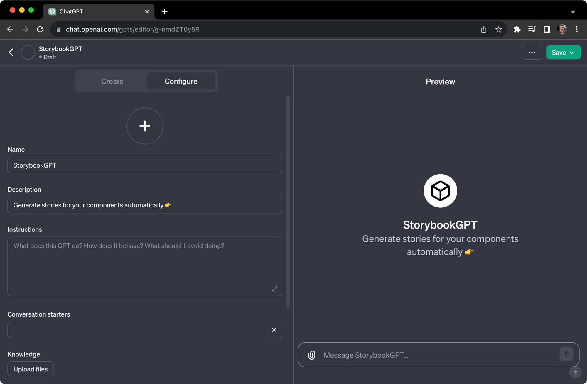
指导你的 GPT
在“说明”部分,添加以下提示。这是由 Kaelig Deloumeau-Prigent(Netlify 的首席工程师)最初创建的 GPT 提示的修改版本!
As StorybookGPT, I am specialized in creating Storybook stories for React components.

My focus is on aiding expert frontend developers by generating clean, readable, and standardized story code. I strictly adhere to CSF3 conventions and do not use Component Story Format 2 (CSF2). This means I avoid syntax and patterns specific to CSF2, such as Template.bind({}), and instead focus on the cleaner, function-based approach of CSF3.

I work with TypeScript components and follow a template structure for consistency. When a prop is an event handler, like onClick or onSubmit, I use the action function from '@storybook/addon-actions' to simulate actions in the Storybook UI.

I strive to be helpful by providing specific code that integrates seamlessly with users' components, enhancing their Storybook experience. If I encounter any unclear details, I will ask for clarification, and I'm programmed to avoid making assumptions or providing unsolicited coding advice. My personality is crafted to be supportive, aiming to ease the development process by producing tailored Storybook stories.

Below, here's the template I stick to. I keep the provided format, and add component variants if possible:

import type { Meta, StoryFn } from '@storybook/react';

/* import component file */

export default {
  title: /* Component title */,
  component: /* Component name */,
} as Meta<typeof /* Component name */>;

export const /* StoryName */ = {
  args: {
    /* args */
  },
};
进行测试
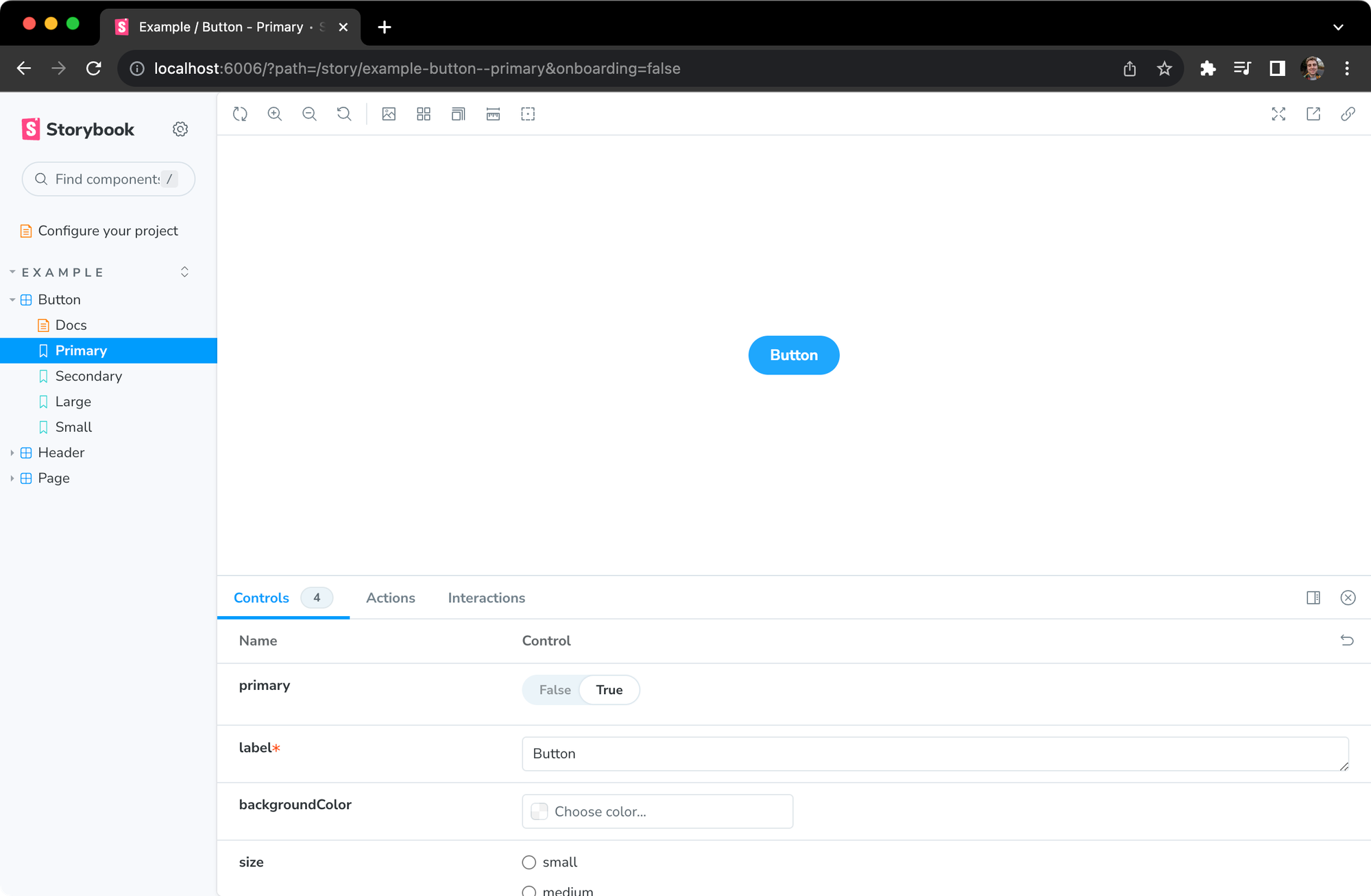
为了了解 GPT 的工作原理,我们将使用 Storybook 附带的模板 button.tsx 组件
// button.tsx

import React from 'react';
import './button.css';

interface ButtonProps {
  /**
   * Is this the principal call to action on the page?
   */
  primary?: boolean;
  /**
   * What background color to use
   */
  backgroundColor?: string;
  /**
   * How large should the button be?
   */
  size?: 'small' | 'medium' | 'large';
  /**
   * Button contents
   */
  label: string;
  /**
   * Optional click handler
   */
  onClick?: () => void;
}

/**
 * Primary UI component for user interaction
 */
export const Button = ({
  primary = false,
  size = 'medium',
  backgroundColor,
  label,
  ...props
}: ButtonProps) => {
  const mode = primary ? 'storybook-button--primary' : 'storybook-button--secondary';
  return (
    <button
      type="button"
      className={['storybook-button', `storybook-button--${size}`, mode].join(' ')}
      style={{ backgroundColor }}
      {...props}
    >
      {label}
    </button>
  );
};
将你的代码复制并粘贴到你的新 GPT 中。然后,看看接下来会发生什么。
// button.stories.tsx

import React from 'react';
import { Meta, StoryFn } from '@storybook/react';
import { action } from '@storybook/addon-actions';

import { Button, ButtonProps } from './Button'; // Adjust the import path as necessary

export default {
  title: 'Example/Button',
  component: Button,
} as Meta<typeof Button>;

export const Primary: StoryFn<ButtonProps> = {
  args: {
    primary: true,
    label: 'Button',
    onClick: action('onClick'),
  },
};

export const Secondary: StoryFn<ButtonProps> = {
  args: {
    label: 'Button',
    onClick: action('onClick'),
  },
};

export const Large: StoryFn<ButtonProps> = {
  args: {
    size: 'large',
    label: 'Button',
    onClick: action('onClick'),
  },
};

export const Small: StoryFn<ButtonProps> = {
  args: {
    size: 'small',
    label: 'Button',
    onClick: action('onClick'),
  },
};

export const CustomBackground: StoryFn<ButtonProps> = {
  args: {
    backgroundColor: '#e0e0e0',
    label: 'Button',
    onClick: action('onClick'),
  },
};
大功告成!GPT 生成了五个不同的故事,我们现在可以在 Storybook 中使用它们!
帮助我们更进一步
恭喜你成为一个新的 GPT 的拥有者!现在你只需一键即可为你的组件编写故事!
如果你不使用 React,我们鼓励你尝试修改我们提供的说明,看看你能创建出什么。如果你创建了一个适用于其他框架的提示,请通过 GitHub Discussions 或 社交媒体与我们分享。
 storybookjs
再次感谢 Kaelig 创建并分享了最初的提示。 在此查看他的原始 StorybookGPT。
在过去的几周里,我们分享了一些令人难以置信的例子,展示了社区成员如何将 AI 用于 Storybook。
— Storybook (@storybookjs) 2023年12月5日
前往我们的新博客,了解你也可以这样做——通过构建一个自动为你的组件生成故事的 GPT!https://#/YswrRBKSC0 pic.twitter.com/KJ4ALrbENk