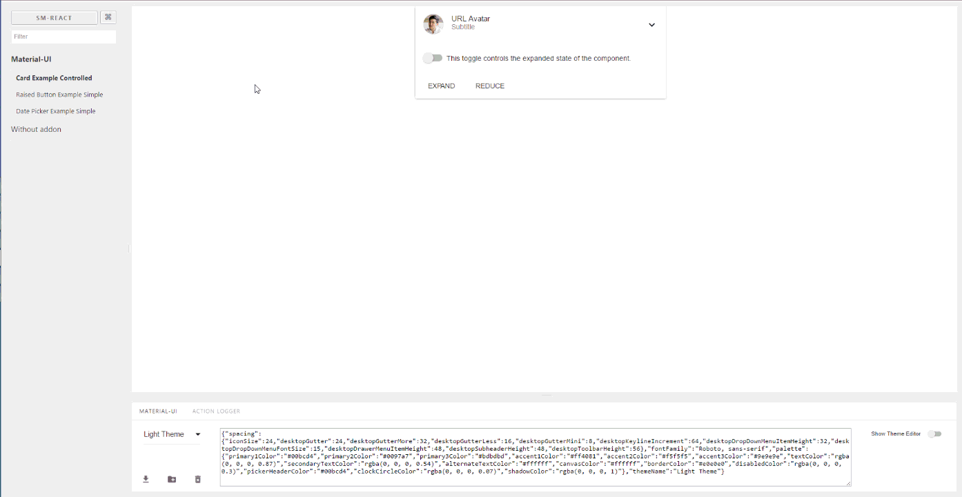
Storybook Addon Material-UI
提供有助于创建 Material-UI 组件 的开发环境。这是用于 React Storybook 的插件,它将你的组件包装到 MuiThemeProvider 中。这加快并简化了基于 Material-UI 的应用的 开发 过程。
你可以使用此项目演示页面来发现任何组件的 Material-UI 主题设置,并在线创建你自己的 新主题。但要充分利用此项目,请在你的工作环境中本地运行它。
特性
- 包装在主题提供程序中。只需使用基本浅色主题即可开始开发。
- 注入 TapEvent 插件。在移动设备上测试。
- 切换主题。一键查看效果。
- 创建你的自定义主题。通过代码或在可视化编辑器中。
- 动态可视化主题编辑。发现所有可用的主题属性。
- Google Material 颜色 调色板 选择器
- 保存所做的更改并下载为 JSON 文件
- React Theming 的一部分。创建可设置主题的 React 组件。
- 兼容 Storybook 3.0
快速开始
为了快速开始使用最新的 storybook-addon-material-ui,你可以查看 create-material-ui-app
它包含以下工作设置:
- create-react-app
- Storybook
- Material-UI
- storybook-addon-material-ui
入门指南
首先,安装插件
npm i storybook-addon-material-ui --save-dev
Storybook 6.1
将 storybook-addon-material-ui 添加到 Storybook 插件中
//.storybook/main.js

module.exports = {
  stories: ['../stories/**/*.stories.(js|mdx)'],
  addons: [
    'storybook-addon-material-ui'
  ],
};
将装饰器添加到 Storybook 预览中
//.storybook/preview.js

import { muiTheme } from 'storybook-addon-material-ui'

export const decorators = [
	muiTheme()
];
注意:你可以在加载的主题之间切换。开箱即用时,你有两个基本主题,但你可以像这样简单地添加你的自定义主题
//.storybook/preview.js

import { muiTheme } from 'storybook-addon-material-ui'

// Create your own theme like this.
// Note: you can specify theme name in `themeName` field. Otherwise it will be displayed by the number.
// you can specify only required fields overriding the `Light Base Theme`
const newTheme = {
    themeName: 'Grey Theme',
    palette: {
        primary1Color: '#00bcd4',
        alternateTextColor: '#4a4a4a',
        canvasColor: '#616161',
        textColor: '#bdbdbd',
        secondaryTextColor: 'rgba(255, 255, 255, 0.54)',
        disabledColor: '#757575',
        accent1Color: '#607d8b',
    },
};


export const decorators = [
	muiTheme([newTheme])
];
甚至从其他地方导入
//.storybook/preview.js

import { muiTheme } from 'storybook-addon-material-ui'

import theme1 from './src/theme/theme1'
import theme2 from './src/theme/theme2'

export const decorators = [
	muiTheme([theme1, theme2])
];
Storybook 5(及更旧版本)
现在,使用 Material-UI 插件编写你的 stories。默认情况下,你的 stories 将提供 Light Base Theme 和 Dark Base Theme。
import React from 'react';
import { storiesOf, addDecorator } from '@storybook/react';
import {muiTheme} from 'storybook-addon-material-ui';

// Import some examples from react-theming https://github.com/react-theming/react-theme-provider/blob/master/example/
import CardExampleControlled from '../CardExampleControlled.jsx';
import RaisedButtonExampleSimple from '../RaisedButtonExampleSimple.jsx';
import DatePickerExampleSimple from '../DatePickerExampleSimple.jsx';

storiesOf('Material-UI', module)
// Add the `muiTheme` decorator to provide material-ui support to your stories.
// If you do not specify any arguments it starts with two default themes
// You can also configure `muiTheme` as a global decorator.
    .addDecorator(muiTheme())
    .add('Card Example Controlled', () => (
            <CardExampleControlled />
        ))
    .add('Raised Button Example Simple', () => (
            <RaisedButtonExampleSimple />
        ))
    .add('Date Picker Example Simple', () => (
            <DatePickerExampleSimple />
        ));
注意:你可以在加载的主题之间切换。开箱即用时,你有两个基本主题,但你可以像这样简单地添加你的自定义主题
import React from 'react';
import { storiesOf, addDecorator } from '@storybook/react';

import {muiTheme} from 'storybook-addon-material-ui';

import CardExampleControlled from '../CardExampleControlled.jsx';
import RaisedButtonExampleSimple from '../RaisedButtonExampleSimple.jsx';
import DatePickerExampleSimple from '../DatePickerExampleSimple.jsx';

// Create your own theme like this.
// Note: you can specify theme name in `themeName` field. Otherwise it will be displayed by the number.
// you can specify only required fields overriding the `Light Base Theme`
const newTheme = {
    themeName: 'Grey Theme',
    palette: {
        primary1Color: '#00bcd4',
        alternateTextColor: '#4a4a4a',
        canvasColor: '#616161',
        textColor: '#bdbdbd',
        secondaryTextColor: 'rgba(255, 255, 255, 0.54)',
        disabledColor: '#757575',
        accent1Color: '#607d8b',
    },
};


storiesOf('Material-UI', module)
    .addDecorator(muiTheme([newTheme]))
    .add('Card Example Controlled', () => (
            <CardExampleControlled />
        ))
    .add('Raised Button Example Simple', () => (
            <RaisedButtonExampleSimple />
        ))
    .add('Date Picker Example Simple', () => (
            <DatePickerExampleSimple />
        ));
反馈
你可以通过匿名调查对本项目留下你的意见。
查询字符串参数
当你选择主题和其他选项时,它们会存储在地址栏中。因此,刷新页面时会保留此状态,并且你可以使用直达链接到所需状态。
https://:9001/?theme-ind=0&theme-sidebar=true&theme-full=true
贡献
开发者
我们的团队欢迎所有贡献、测试、错误修复。如果你想帮助贡献本项目,请随时创建 issue、PR 或与我联系。
设计师
我们非常欢迎设计师参与本项目。我们对您关于使用此工具的看法、设计师与开发者协同工作的可能性以及其外观和功能非常感兴趣。
